Business
Dow Jones Near Highs Signals Strength Until Volatility Returns
The Dow Jones stayed below all-time highs all week, signaling continued strength while it remains in “scoring position.” Since November 2023, it has posted record closes and may keep rising until volatility returns. A surge in 2% moves could trigger declines, prompting Federal Reserve intervention, as past behavior suggests policymakers act to stabilize falling markets.
The Dow Jones didn’t make a new all-time high this week. But everyday it closed ridiculously close to one, less than a half of a percent from one. So, what should we conclude from a week of trading like that? As we are looking at a Bear’s Eye View (BEV) chart, as long as the Dow Jones continues closing inside scoring position, inside the red rectangle, we should anticipate additional new all-time highs.
Since the Dow Jones entered scoring position in November 2023, so far it has seen ninety-one new BEV Zeros / new all-time highs in the chart below. It will see more before this advance is over.
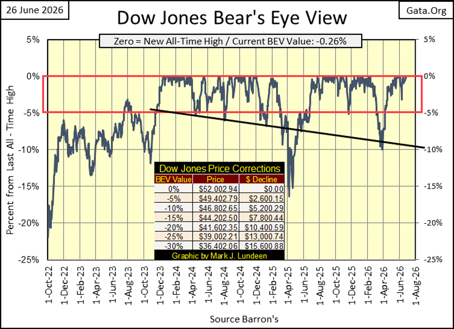
And then what? Just speculating on my part, I’m going to assume the path of least resistance for the Dow Jones, my proxy for the broad-stock market, will continue to be up, until it once again sees its dreaded 2% days, days of extreme volatility. At that point, daily volatility for the Dow Jones begins to rise, and valuation begin to decline. Should valuations for the Dow Jones in the BEV chart above, break below its BEV -30% line, will the idiots at the FOMC want to “stabilize market valuations” yet one more time in the 21st century; a QE#5?
Looking at market history for the past few decades, that is what these idiots have always done before. To think they would now allow market valuations to find their own, free-market levels, in a developing selling panic is being ignorant of what the FOMC is all about; price “stability” in the market place.
Well damn it, the bubble being popped is their bubble, they’ve worked long and hard inflating it. It is hard believing they’ll do nothing to keep it inflated. They also have their reputation to defend, and defend it they will, with as many “injections of liquidity” as it takes to once again “stabilize market valuations.”
That is how I see things. My question is; does daily volatility for the Dow Jones begin to rise before, or after October 2026? Not always, but October has a history of Mr Bear paying his respects to the New York Stock Exchange. Will October 2026 be a reprise of October 1929, or October 1987, or October 2008? Most likely not. But I’m putting Mr Bear on notice that I’m watching him, should he start any funny stuff!
Here is the Dow Jones in daily bars. Its last all-time high was 52,002.94 on June 16th. All week it closed within 340 points of making a new all-time high, an easy one-day advance if it wanted too. But it didn’t. What is the problem; fear of heights?
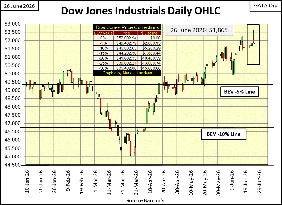
Currently, it’s best assuming this advance will continue to 53,000 and beyond. But this isn’t my first rodeo, so after seeing this advance, that began in October 2023, that took the Dow Jones up from 29,202 in October 2023, to 52,002 just a few days ago, an almost three-year, 22,800 point advance, a three-year percentage increase of 78%, I’m no longer looking for reasons to buy. Not me! I’m now looking for reasons to sell, to lock in my profits.
I should mention that I haven’t been in this market for years, having chosen to sit this advance out, high above it in the markets’ peanut gallery. Instead, my investments have been in precious metal investment, and I’ve done good.
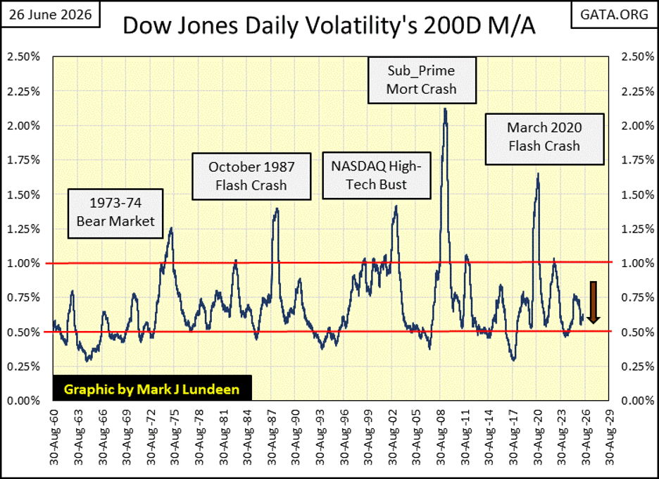
That noted, I know 60,000 on the Dow Jones is still doable. Maybe even likely. But after three years of advancing market valuations, I’m keeping my eyes on the Dow Jones daily volatility’s 200D M/A below, because I know all parties in the stock market, no matter how much booze is served, must one day end.
And since the 1960s in the chart below, they end as rising daily volatility approaches, too then spikes above the 1.00% line. But that isn’t happening right now. Still, I’m watching the plot below like a hawk!
It wasn’t only the Dow Jones this week that was boring me to death. In the table below, listing the BEV values for the major stock market indexes I follow, this week there were only five new all-time highs. That plus, the week ended with only eleven of these indexes closing in scoring position. A good number, but a reduced number from recent weeks. If this is a developing trend; indexes falling below scoring position, below there BEV -5% lines, it’s a very bearish developing trend.
Look at the NASDAQ 100 (#13). On Monday it closed with a BEV of -1.02%, well within scoring position. On Friday it closed outside of scoring position, with a BEV of -5.03%. Are some of the bulls now running amuck over at the NASDAQ, beginning to feel a bit nauseous? Maybe not. Still, I believe the SpaceX IPO will prove to be a bearish market milestone in the months to come. I’ve been wrong before. Time will tell if I’m wrong on SpaceX flagging a market top.
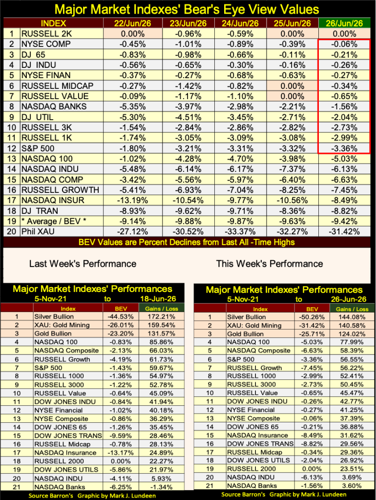
Look at the BEV values for the top three items in this week’s performance table above;
• silver -50.26%,
• XAU -31.42%,
• gold -25.71%.
BEV values tell us how far these assets’ valuations have fallen from their last all-time highs. Silver, with a BEV of -50.26%, has lost half of its valuation since its last all-time high, yet it remains number one in the table, really? Yes, really! The same goes for the XAU and gold.
Now look at the BEV values for the other indexes seen above. Most are within scoring position, and have been that way for a long time, meaning they are currently advancing to new all-time highs. Yet the top three indexes above, currently enduring a significant correction in their valuation, lead the pack.
On a long-term basis, if you are going to make the big money in the market; you must first buy low, before you can sell high. That is a hard thing to do. Market psychology is such that, buying low is buying an unwanted, frequently ridiculed asset.
The price is low, as no one in their right mind wants it. “No one else is buying that trash, so why are you?”
And selling high creates anxieties that leaving the market now as prices continue rising, is leaving before things get really exciting. Buying low, to then sell high, is not as easy as most people think it is.
Looking at the performance tables above, and their BEV values, the old monetary metals, and their miners’ valuations are currently very low, while valuations for the stock indexes are very high. Humm; what to do, what to do?
Crude oil prices are coming down. As far as crude oil’s crisis-high prices go, they’ve stayed contained since our current operation against the IRGC began in late February, as seen below. During the sub-prime mortgage crisis, crude oil prices peak at something over $140 a barrel. In June 2022, crude oil increased to over $120 a barrel. What was that crisis about, was there some sort of crisis in 2022? If so, I forgot what it was. Now in 2026, crude oil prices surged to over $100, and this week closed at under $80 a barrel.
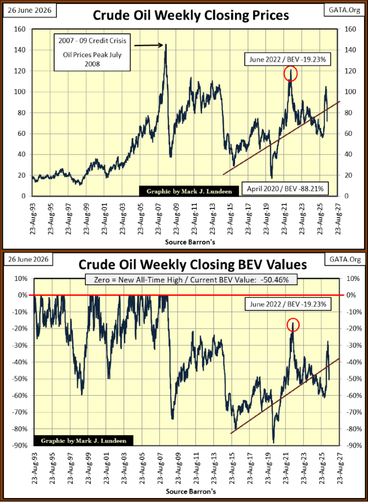
Above is the Bear’s Eye View for the crude oil price data seen in the top chart, where every new all-time high register as a 0.0% on the red line. Daily closes not at a new all-time high, register as a negative percentage claw-back from their previous last all-time high. Crude oil’s last all-time high price was seen in July 2008. So, in the BEV chart above, all the BEV values since July 2008, are percentage claw-backs from July 2008. At this week’s close, crude oil was 50.46% below its last all-time high from eighteen years ago.
It appears the highs of July 2008 will remain crude oil’s all-time high price for a while, but eventually they will be taken out. New all-time high crude oil prices won’t need an international crisis to produce them. Crude oil prices are in dollars, and the dollar is managed by the idiots at the FOMC. Idiots who year after year, increase the volume of dollars circulating in the global economy, come hell, high water, or the price of crude oil.
Next is a plot of the nineteen commodities I track on a weekly basis. They are indexed to 1.00 = 23 August 1993, and their indexed values averaged to construct the plot seen below, which at this week’s close, was a factor of 4.74. Or an averaged percentage increase of 474% since August 1993.
That doesn’t seem like much, but over time these compound increases in prices will eventually shock even members of Congress, who will then pass legislation to stop this price inflation, legislation which will do no such thing. If Congress was actually serious about stopping price inflation in the dollar economy, they’d terminate the Federal Reserve System. Something the Congress could do, but won’t do.
Anyway, in the table on the chart below, I included a few stock indexes for comparison to rising commodity prices. These stock indexes indexed values * ARE NOT * included in the computation of the average plotted below.
The top two in the table are the NASDAQ Composite, and S&P 500 indexes, which since August 1993, are up by a factor of 36.28 for the NASDAQ Composite, and 16.44 for the S&P 500. Amazingly, #3 in the table is an ounce of silver, up by a factor of 16.10. Had this table been made last winter, when silver was trading for $116, silver would have been #2 in the table, up by a factor of 23 since August 1993. Silver is followed by the Dow Jones at #4, and then an ounce of gold at #5 in the table.
Where is the XAU? Way down at #16 in the table. A pound of coffee (#15) has seen more inflationary price pressure than the share values for the miners of gold and silver. To my way of understanding the markets, the miners of gold and silver provide a compelling valuation to risk your hard-earned money on, possibly the XAU is the most compelling asset in the table below. Just keep it in mind that somethings, like bull markets, don’t happen overnight.
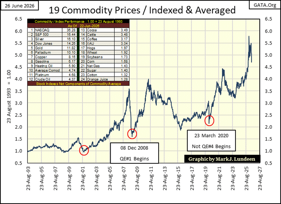
One other insightful observation can be gained by studying this chart, the impact of market-stabilizing plans by the idiots at the FOMC, on consumer prices.
Not spoken about today, a quarter of a century after the fact the sub-prime mortgage fiasco, was originally a scheme, a monetary mechanism to “inject liquidity” into stock market valuations, following the NASDAQ High-Tech bust in October 2002 (far left red circle). From 2002 to 2007, as home values and stock valuations were inflated ever higher by the FOMC, commodity prices followed.
Like home prices from October 2007 to December 2008, commodity prices also deflated during the sub-prime mortgage debacle. In December 2008 (middle red circle), as FOMC Idiot Primate Bernanke implemented his first of three QEs to “stabilize market valuations,” he also “stabilized” the market valuations of the commodities I follow, as seen above.
The implementation of FOMC Idiot Primate Powell’s Not QE#4, in March 2020, again to “stabilized” market valuations, again also “stabilized” commodity prices. So, if you are wondering why CPI inflation is so much higher that it was a decade ago, you need not look any farther than the chart above, to see exactly why that is so.
The more things change, the more they stay the same. This is especially so with housing, or Washington’s eternal striving to provide “affordable housing” to tax paying voters.
House passes affordable housing bill, sends it to Trump’s desk
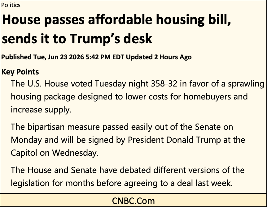
It was much the same seven decades ago, when Congress passed The Housing Act of 1954.
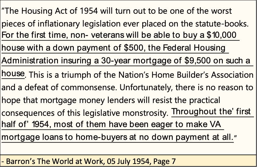
Note: homes going for $10,000 in 1954, may today sell for over $200,000, or more depending upon location.
One thing both these acts of legislation have in common, is they provide prospective “homeowners,” with access to the unlimited credit creation possessed by the Federal Reserve. What is wrong with that? The Federal Reserve is the Great Engine of Inflation. If for the working class, prices today are rising faster than their income, it is because of the Federal Reserve.
But banks have dallied with fractional reserves to back their credit creation for a long, long time. Below is a quote from William Durant’s Caesar & Christ, published in 1944.
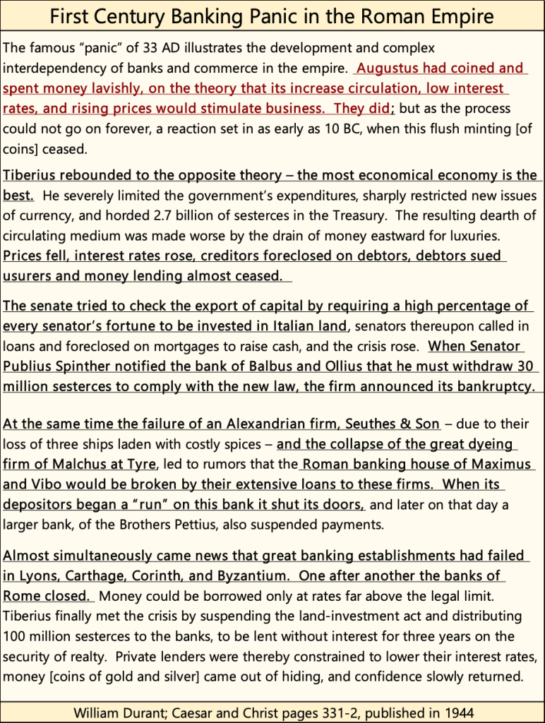
I love Durant! Where else but in his eleven-volume set of “The Story of Civilization” could anyone read the details of a 1st century, Roman bank run? I’ve read all eleven volumes, each written in an entertaining fashion, with page after page of fascinating information, as seen above. This monumental chronicling of human effort, was a fifty-year labor of love for Durant, and well worth anyone’s effort to read it.
That said, a reprise of the Roman banking disaster of 33AD would have happened in the aftermath of the sub-prime mortgage debacle of 2007 – 2009, if FOMC Idiot Primate Bernanke hadn’t created his program of quantitative easing (QE).
“Injecting” massive volumes of “liquidity” into the banking system to keep it afloat in banking panic, didn’t save the banking system. It only pushed the crisis to sometime in the future, and magnifying this still pending crisis, by the volume of “liquidity injected” into the banking system.
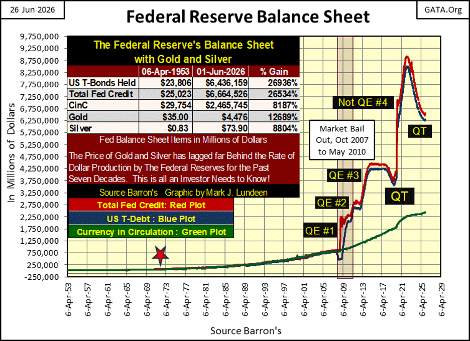
This chart of the Federal Reserve’s balance sheet, is an inflationary horror show.
I have news for Congress; * IF THEY REALLY WANTED “AFFORDABLE HOUSING” * they should have allowed Mr Bear to have had his way with Wall Street in 2009. He would have reduced the price of housing by 60% to 90%, as he thrashed J.P. Morgan, and Goldman Sachs’ balance sheets, as thoroughly as he had to Maximus & Vibo’s, in first century Rome.
But that didn’t happen. So now in 2026, Congress is once again passing legislation to provide “affordable housing” to the working class. A fools’ errand since the 1950s. Somethings never change, until the day comes when they finally do.
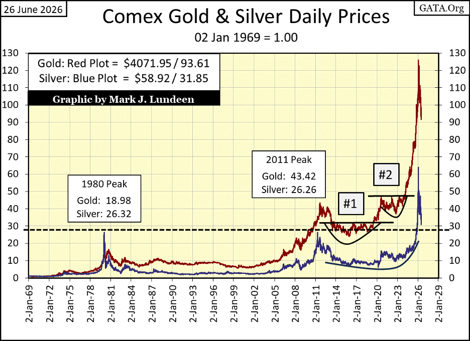
Here is gold’s BEV chart. Gold continues correcting, meaning from what I see below, gold has yet to hit the bottom of this now six-month correction. On Wednesday, gold closed at $3997, three dollars below $4000. I was hoping $4000 gold would be a floor to this correction. But does a close only $3 below it mean gold correction still has more go do before it terminates? Maybe, maybe not.
I’m just going to begin treating these corrections in gold, silver and the XAU as a spectator sport. Trying to call a bottom in these corrections is an exercise in futility. But when gold finally breaks above its BEV -15%, and especially its BEV -10% lines below, I think it will safe to assume the bull market advance has resumed.
But before that, how far will gold go down before it bottoms? Now that is the question I wish I had an answer too.
Studying gold’s long-term BEV chart above, the correction gold saw in the 1970s was deeper than the correction gold saw from 2011 to 2020. Though, the 2011 to 2020 correction took nine years to complete.
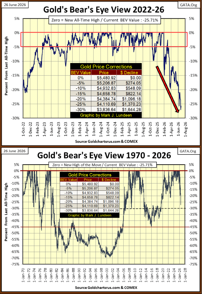
Looking at our current correction, in the proper context of history, so far gold’s current correction is no big thing. That isn’t saying its not annoying or frustrating, because it is. But all bull market advances see occasional corrections, and that is what is happening to gold now in June 2026.
Below is a chart of gold and silver indexed to 1.00 = 02 January 1969. Look at their amazing advances since 2024. With advances like that, one can’t be surprised these remarkable valuation spikes are now being corrected.
For gold in its step sum table below, declining days continue dominating advancing days. But looking at gold’s 15-count, in the past five trading weeks, it never got below a -3, suggesting the selling pressure is not as bad as it could have been. Actually, I’d like to see gold’s 15-count decline to a -7, or better yet a -9. That would strongly suggest a selling climax in the gold market, and a soon to come bullish turn in the gold market. But will that happen? Ask someone else, as I don’t have a clue.
I don’t have much to say about gold’s table, other than it continues to be bearish. One of these days, gold’s table will look like the Dow Jones’ step sum table; many more advancing than declining days, and lots of pretty blue BEV Zeros, new all-time highs.
I’ve been saying this since March, thinking the market for gold and silver would turn by June or July. So far it hasn’t. Well, there is always September and October. Like everyone else who is investing in precious metal assets, this correction is getting old. Not that the market cares about how I feel about it. It really doesn’t. Still, I’m keeping an iron hand on the tiller.
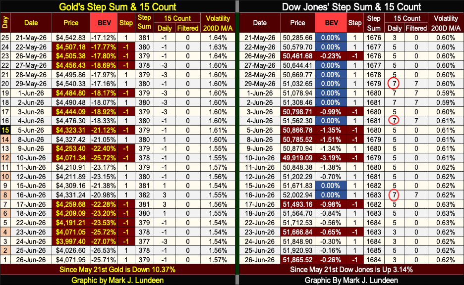
On the Dow Jones side of the table above, it continues looking good. Three times the Dow Jones became overbought; 15-counts of +7. Markets don’t like being overbought. Seeing a 15-count of +7 typically results in little pullback in the market. We’ve not seen much of a pullback in the Dow Jones, but the new all-time highs have slowed down. Maybe Mr Bear will be satisfied with that.
Looking at the Dow Jones daily volatility’s 200D M/A, it closed the week with a 0.62%. That is low volatility, and stock-bull markets thrive on low volatility. Until this metric of daily volatility begins to rise up towards 1.0%, I’ll find it difficult speaking ill of this advance in the Dow Jones.
__
(Featured image by Veli Yunus Unal via Unsplash)
DISCLAIMER: This article was written by a third party contributor and does not reflect the opinion of Born2Invest, its management, staff or its associates. Please review our disclaimer for more information.
This article may include forward-looking statements. These forward-looking statements generally are identified by the words “believe,” “project,” “estimate,” “become,” “plan,” “will,” and similar expressions, including with regards to potential earnings in the Empire Flippers affiliate program. These forward-looking statements involve known and unknown risks as well as uncertainties, including those discussed in the following cautionary statements and elsewhere in this article and on this site. Although the Company may believe that its expectations are based on reasonable assumptions, the actual results that the Company may achieve may differ materially from any forward-looking statements, which reflect the opinions of the management of the Company only as of the date hereof. Additionally, please make sure to read these important disclosures.


Avant Devices Moves Toward Electric Wheelchair Kit Production with New Funding Drive
Murcia-based Avant Devices is seeking €260,000 in crowdfunding to launch mass production of its electric wheelchair conversion kit. The funds...


Legend Biotech: Growth Driven by CAR-T Innovation and Carvykti Expansion
Legend Biotech's stock reflects demand for innovative CAR-T cancer therapies. The US biotech focuses on commercializing Carvykti with partner Janssen...


Senegal’s Debt Strategy: Choosing Between Restructuring and Financial Innovation
Senegal’s upcoming choice of debt advisor, with Lazard reportedly leading the race, reflects a broader strategic decision. Rather than pursuing...


Pictet Raises $253 Million for Environmental Investment Fund
Pictet Group closed its Environment Co-Investment Fund I at $253 million, surpassing its $200 million goal. The Article 8 SFDR...


Virginia Cannabis Market Could Reshape Regional Competition
Virginia’s planned recreational cannabis market could reshape the Washington region’s economic landscape. With nine million residents, it may draw consumers...
 |
|
 |  |
 |
|
-
 Crypto1 week ago
Crypto Markets Shaken by Geopolitics and Industry Tensions
-

 Markets6 days ago
Dow Jones Pauses Near Record Highs as Precious Metals Lead
-

 Africa2 weeks ago
Fes-Meknes Sees Strong Recovery in Cereal Production Thanks to Increased Rainfall
-

 Fintech3 days ago
Advanced Blockchain Under Pressure Amid Crypto Market Shifts