Business
Dow Jones Rally Faces Uncertainty Amid NASDAQ Reversal
Over nine NYSE sessions, the Dow Jones recorded seven new highs, totaling 89 since November 2023, with most closes remaining in strong territory. A new upward phase may be forming, but NASDAQ weakness, after highs reversed sharply, raises concern. Friday’s pullback could signal volatility ahead, though its significance remains uncertain until coming sessions clarify direction.

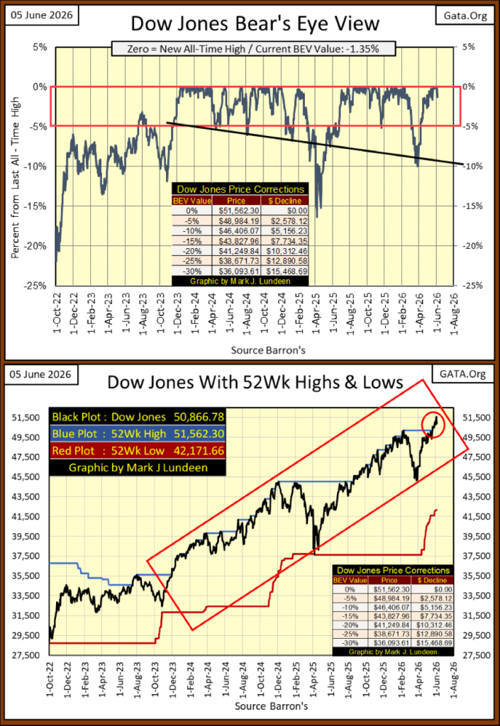
It has been nine NYSE trading sessions since my last article, with seven of those closings with the Dow Jones at a new all-time high. Not bad. Also, since the Dow Jones entered scoring position in November 2023 below, two and a half years ago, at this week’s close, it has seen 89 new all-time highs in this advance. That is 89 times the Dow Jones closed on the BEV 0.00% line, seen in its BEV chart below.
And for those days in the past two and a half years, that didn’t close at a BEV Zero, where did they close? Most above the Dow Jones’s BEV -5% line, or in scoring position. That is what a two-and-a-half-year advance looks like.
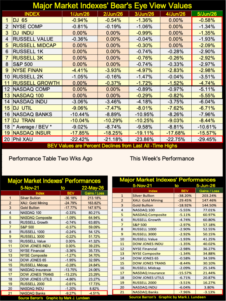
Looking at the Dow Jones in the dollars it’s published in, with its 52Wk High and Low lines above, it’s obvious in the past two weeks, the Dow Jones has begun a new phase in this advance (Red Circle). What isn’t so obvious is how much longer, and how much higher this new phase in this advance will take the Dow Jones into market history.
My concern for the Dow Jones comes from what happened at the NASDAQ this week. On Monday and Tuesday, the NASDAQ’s Composite and 100 indexes closed at new all-time highs, #12 & 13 in the table below. Then on Friday’s close, Mr Bear clawed both of them back below scoring position entirely, below their BEV -5% lines. Is Mr Bear trying to tell us something?
Will deflation at the NASDAQ bleed over into the NYSE in the weeks to come? Time will tell us all about that. Who knows, maybe in the next few weeks the NASDAQ’s Composite and 100 indexes will once again be making new all-time highs. With a little help from the idiots at the FOMC, anything is possible. The Good Lord knows, the idiots don’t like deflation in the financial-market’s valuations. As we speak, the FOMC is considering its options following Friday’s close at the NASDAQ.
In the performance tables above, precious metal assets remain in the top three spots. But since last February, week after week their valuations are being deflated. That is how it goes sometimes. Following their tremendous advances from last August to February, a stiff correction, a steep pullback in valuation is something to be expected. Long term, I remain bullish on gold and silver, and the companies that mine them.
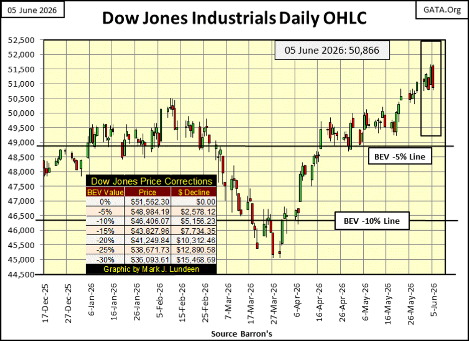
For the Dow Jones below, plotted in its daily bars, it closed above 51,500 on Thursday. Then came Friday, when Mr Bear took all that back, as he did worse to the NASDAQ’s Composite and 100 indexes.
Is Friday’s market action just a little burp in the current advance, or a warning of much worse for things to come? I can’t say what it is, other than saying we’ll know more next week.
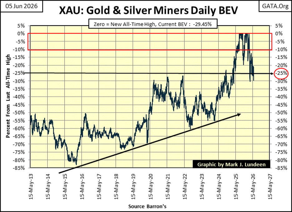
Next is the Bear’s Eye View (BEV) for the XAU. On Friday, it almost closed below its BEV -30% line, but didn’t. That was something it did do on March 20th, when it closed with a BEV of -30.21%. Last March, the XAU bounced off its BEV -30% line. Now in June, we’ll see what happens this time; break down to its BEV -35% line, or spring backup to its BEV -20% line.
What to do? I remain a bull on the gold and silver miners. If you like to buy low, this seems like a good time to do so. Just realize, this correction in the XAU may not be over.
This caught my eye; CNBC is comparing today’s advance with the January – August 1987’s advance. That was the market top prior to the October 1987 Flash Crash, where the Dow Jones, and S&P 500 saw single day declines in valuation of over 20%, traumatic daily declines never seen before, or since.
The last time the S&P 500 rose this rapidly — outside of recession periods — was before the 1987 crash
This sounds dramatic, comparing today’s market advance with that of 1987. But is that true? And if so, then what? Using the data I have, I thought I’d check it out, and constructed the following table, showing the market performances for the first eight months of 1987, the 1987’s advance, and the last eight months of today’s trading.
In the first eight months of trading of 1987, the S&P 500 (#8) advanced by 22.65%. In the right-sided table, since October 1st 2025, the S&P 500 (again #8) has advanced by only 12.55%. Today’s advance, in terms of the S&P 500 is not as aggressive as it was in 1987, not even close.
The hot major-market index in August 1987, was the Dow Jones (#4). This old fogy, blue-chip, dividend yielding index advanced by 41.25% in the first eight months of 1987, almost twice that of the S&P 500. We can be sure the editorial staff at CNBC was aware of this fact when they published this article, but for reasons best known to them, they omitted. As it is in 2026, in the last eight months of trading, the Dow Jones in the right sided table, has advanced by only 9.38% since last October 1st.
The data seen on the left table is how the stock market stood as it approached a famous market crash. Does the table on the right side justify any concerns similar to those the market faced autumn 1987? Maybe, I don’t see it.
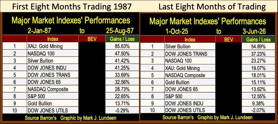
I’m happy CNBC is making an effort warning the public this stock market is overpriced, because it is – historically so! But they never show the work justifying their headlines. They only interview “market experts” to justify their conclusions, and that is just lazy of them. I created the above table in about thirty minutes of work. Had I cared to put in another thirty minutes, I could have also included these indexes’ BEV values too. Call me lazy that I didn’t.
So, why do I call this market overpriced – historically so! I’m not focused on valuations, but on market internals. Such as the Dividend Yield for the Dow Jones, which since 1990, have been below 3%. I also look at market volatility for the Dow Jones, and the advance in bond yields since 2020. Market metrics I typically show in my work. If not this week, then in the weeks and months to come, I will do so once again.
Every day, the NYSE publishes its daily breadth data, or how many issues trading at the NYSE closed higher, lower, or closed at the same price as the day before, aka unchanged (UNCH). They have been doing this for a long time. Barron’s began publishing this data in the early 1930s, however a generous individual; Dave, sent me NYSE breadth data going back to January 1926. Thanks Dave!
I like data that begins previously to the depressing 1930s, that provides insight into the market during the 1929 market crash.
It’s been said the stock market is more than just the Dow Jones, or even the S&P 500, and that is very true. The stock market is more than any stock index, and that is where NYSE breadth data comes in, as breadth data is actually what the many stocks trading at the NYSE do, day after day;
• stock valuations advance,
• stocks valuations decline,
• stock valuations remain unchanged.
Breadth data allows us to construct an Advance – Decline Line, wonderful data providing insight how the market trading at the NYSE is advancing or declining over time;
• More stocks at the NYSE advancing than declining = rising A-D Line, a bull market.
• More stocks at the NYSE declining than advancing = declining A-D Line, a bear market,
or logically it should, but sometimes doesn’t.
To construct an A-D Line, from its daily-data points, we simply subtract the daily declines from the daily advances for each day’s trading, then take the algebraic sum of all the daily nets over time. But the problem with this is; in the 1920s, the NYSE typically saw less than 600 stocks trade each day. Today, over 2,800 issues trade daily at the NYSE.
Obviously, today in 2026, daily advances or declines are larger than the total volume of issues trading at the NYSE in 1926, as seen below.
Note also, the NYSE used to trade on Saturday’s, and did so until the late 1950s, when it, and most of America went to a two-day weekend.
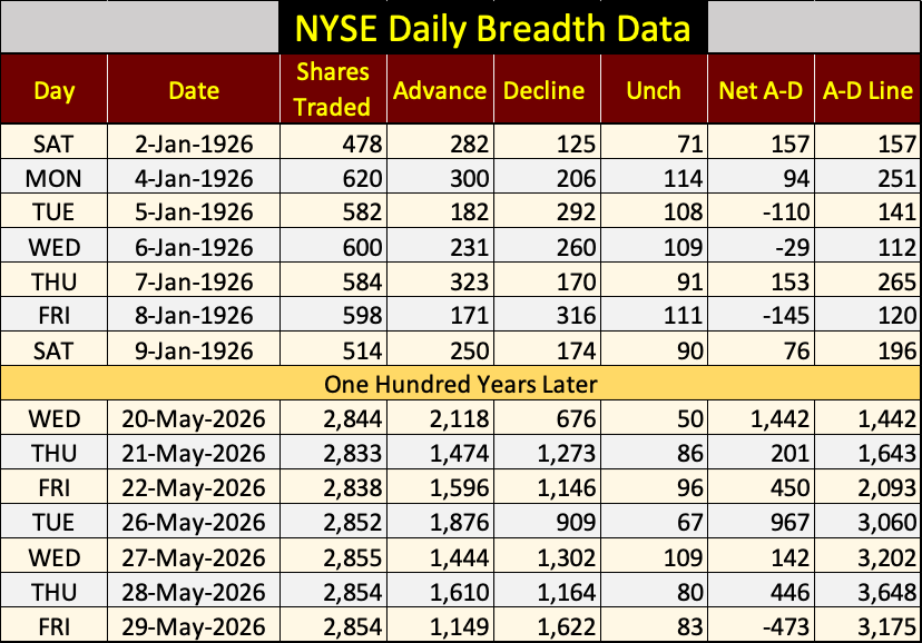
So, plotting the resulting net daily A-D since 1926, results in understating the daily nets of 1926, with those of 2026. The solution to that problem is to use the daily NYSE Daily Advance – Decline Ratio to construct a A-D Ratio line, as seen below.
It’s easy to do, take each day’s A-D net, and divided it by the total shares trading at the NYSE that day. Using this data as a ratio, gives equal weight to each day plotted in the chart below, for the past 100 years.
Looking at the Great Depression’s 89% bear market, from September 1929 to July 1932, it’s obvious how day after day, more stocks were declining than advancing during this massive bear market.
The Dow Jones (my proxy for the broad stock market) saw its best year in history, from July 1932 to July 1933, a one-year advance of 163% during the Great Depression!
Looking at the NYSE A-D Ratio below, I can’t see this ratio following this massive, one year advance in the Dow Jones. But the Dow Jones is only thirty huge, dividend yielding blue-chip stocks, while during the early 1930s, typically 600 issues traded daily at the NYSE. From July 1932 to July 1933, did most of the corporations trading at the NYSE see similar advances? Maybe, and then maybe not.
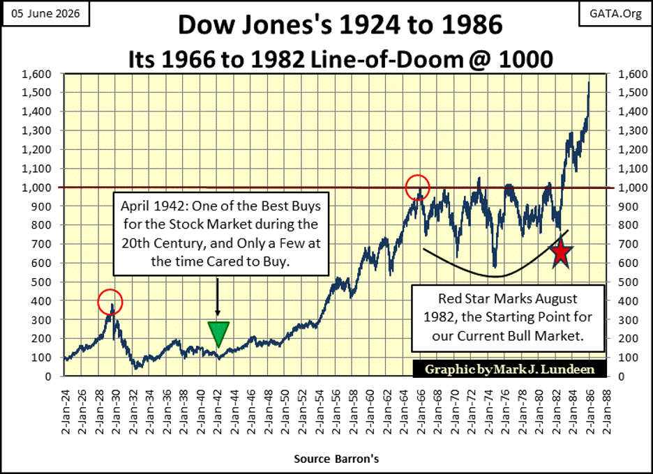
From July 1932 to March 1937, the Dow Jones saw a very nice, 370% advance that can be seen in NYSE A-D Ratio below. Then came the March 1937, to April 1942 52% bear market. Did the NYSE A-D Ratio follow that market decline? At first it did, and then it didn’t.
What the NYSE A-D Ratio did tracked closely, was the 1942 to 1966 bull market, a market advance of 970% in the Dow Jones. But note, the A-D Ratio peaked in January 1956, a full decade before the top in the Dow Jones.
I’ll give you a clue at what happened here. When every bull market finally bounces off a bear-market’s bottom, there is an explosion in market advances in most of the stocks trading at the NYSE. But as the bull market matures, it becomes selective as to which stocks the bull market favors.
In 1956, the 1942 to 1966 bull market had matured to the point where it became selective. So, investors in 1956 had best become selective too, if they wanted their profits from the stock market.
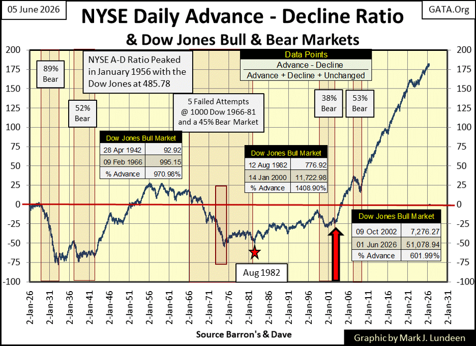
From 1966 to 1982, a period of market history of rising CPI inflation, and rising bond yields, the Dow Jones five times attempted to rise above 1000, but failed to stay there – for sixteen years, as seen below, and in the NYSE A-D Ratio above. Note; rising CPI inflation and bond yields * ARE NOT BULLISH * for the stock market, but are for gold, and silver bullion, and the precious metal miners.
Returning to my chart plotting the NYSE A-D Ratio above. The bull market advance from August 1982, to January 2000, an advance in the Dow Jones of 1409% over eighteen years, saw the A-D Ratio advance, but not as one would expect it too. Maybe the answer to that situation is the 1990s was a bull market in high-tech, and high-tech traded at the NASDAQ Exchange, not the NYSE, where this data is from.
Next, the January 2000 to October 2002 high-tech bear market, a 38% bear market decline for the Dow Jones. But the NASDAQ Composite saw a 78% bear market decline, while the NASDAQ 100 fell 83% from its last all-time highs of the 1990s bull market in high-tech. These losses at the NASDAQ are on a par with the losses seen by the Dow Jones during the Great Depression Crash. But the NYSE A-D Ratio didn’t see it that way.
Now comes the whole point of why I’m covering this 100-year history of the NYSE A-D Ratio; since the October 2002 bottom of the NASDAQ High-Tech bottom (thick Red Arrow above), the NYSE A-D Ratio has advanced in a most unnatural manner. Nothing like it has been seen since January 1926. What’s with that?
Long forgotten is the trauma suffered by investors, and the financial system itself at the bottom of the High-Tech bear market in October 2002. But I remember. I also remember an idiot from the FOMC making a public speech that was broadly covered not only in the financial media, but also in the regular news media from a quarter of a century ago. His speech gave comfort to an ailing financial industry, and suffering retail investors, highlighting the means of eliminating valuation deflation forever in the financial markets.
The idiot I’m talking about, is Doctor Benjamin Bernanke, who would become FOMC Idiot Primate in March 2006. I was told the photo below, from sources I believe credible, are of Dr. Bernanke as he hammered out the details of this most important speech, at the FOMC with a fellow idiot.
In other words, deflation is declining market valuations – and that is bad. The cure for valuation deflation, is monetary inflation “injected” into the financial markets, to counter valuation deflation – and that is good.
Returning to my chart plotting the NYSE A-D Ratio above, since October 2002, marked by that big Red Arrow, for over two decades, the NYSE has seen more daily advances than declines, because the FOMC has made inflating market valuations, with monetary inflation, one of their policies.
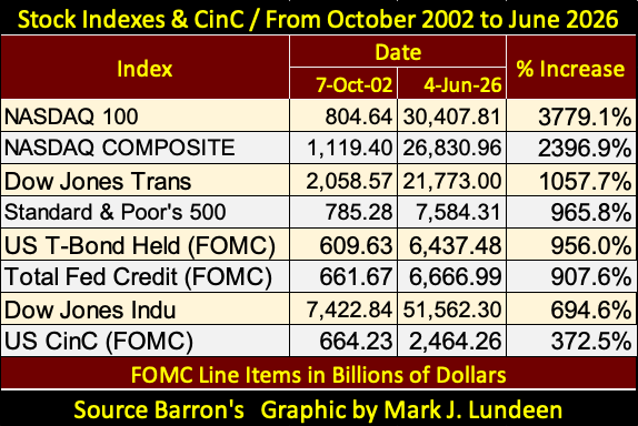
Below is a table of various major market indexes’ percentage advances, with various line items from the FOMC’s balance sheet, from 07 October 2002, to Thursday this week. Look all you care too; you won’t see a whiff of deflation anywhere in the table below.
Below is a chart plotting the FOMC line items in the table above. The sub-prime mortgage bear market of 2007-2009, provided Dr. Bernanke an opportunity to test his theory of countering valuation deflation with monetary inflation, with his QE#1 to 3, seen below.
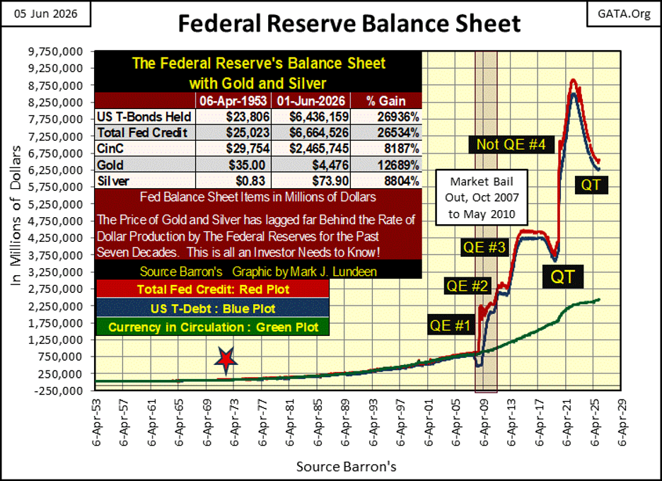
Doc Bernanke is a bit of a weasel. When asked under oath in Congressional testimony if the Federal Reserve was going to “monetized” the national debt, he said no, it was not.
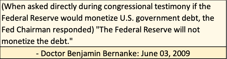
But by June of 2009, looking at the data published by the Federal Reserve in the chart above, it was very obvious that in fact, Doctor Bernanke’s QE#1 was all about monetizing the national debt. Congress didn’t care if Doc B lied to them, as they hated deflation in market valuation as much as the idiots at the FOMC did, and they still do. Deflating market valuations only enrage their voters.
That in fact, all the idiots at the FOMC were doing was inflating a huge inflationary bubble in the financial markets, that one day will bring about a massive deflationary reaction in the financial markets. This inevitable outcome of “injecting liquidity” into the market was never seriously considered. Or if it was, it was with the understanding that it was someone else who would have to deal with consequences of when this inflationary boom went bust.
Is our current market overvalued? Yes, historically so! CNBC doesn’t have a clue as to how much the current market is overvalued, thanks to the idiots at the FOMC, and politicians in Washington who support their nonsense.
What else is there to say, except we are poorly led by our politicians, and poorly informed by our “news media.” That said, let’s look at some more charts.
Using January 1920 as a base for the below indexes of CinC (Green Plot), the Dow Jones (Red Plot), and the Barron’s Gold Mining Index, BGMI (Blue Plot), since 1995, the growth in CinC (paper US dollars in circulation), has far exceeded the growth in valuation for the Dow Jones and the BGMI.
The thing to note below, is how well the BGMI is doing during a time in market history, where most people believe the gold miners are still in a bear market. Well, they are not. Look at the table in the chart below. Since 23 March 2020;
• the Dow Jones is up 174.49%,
• the BGMI is up 497.60%.
Note the BGMI traded * ABOVE * CinC from 1965 to 1995, for three decades. The last time the Dow Jones traded above the green CinC line, was during the Roaring 20’s bull market. Take a moment to check this historical fact out below. The Dow Jones may have advanced by a factor of 469.22 in the past century, but it has nonetheless fallen behind the rate of inflation, as measured by CinC.
In the years to come, I expect the BGMI to once again trade above the rate of CinC inflation seen below, providing actual above the rate of inflation profits for the holders of gold and silver miners. Something the Dow Jones hasn’t provided the market since the 1920s.
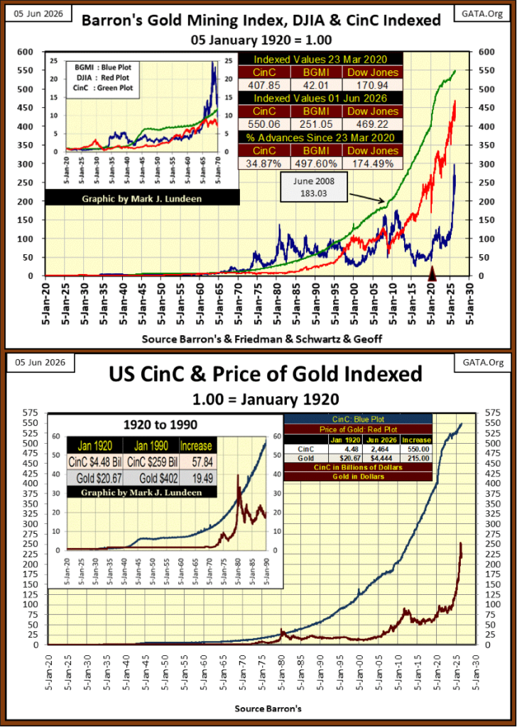
CinC has also increased above the price of gold in the chart above. Do you see the current correction in the price of gold, or in the BGMI above? I don’t. The bull market in gold and silver have much more to go before we should think otherwise.
Next are the BEV charts for gold and silver. Unfortunately, since last February gold continues its bearish pattern of lower highs, and lower lows in its BEV chart below. This too shall pass.
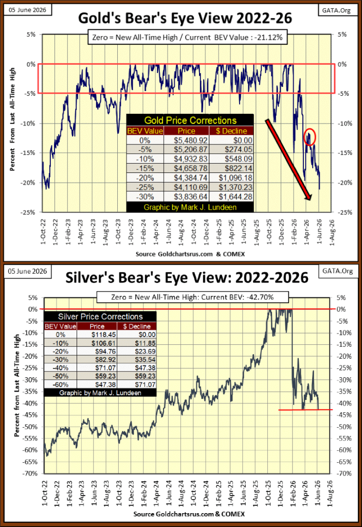
Ouch! Silver for the third time in this correction has broken below its BEV -40% line. I don’t like it, but there it is. On the other two occasions where silver broke below this key support level, it soon bounced off of it. Let’s see what silver does this time.
This article is getting a bit long winded, so I’m only going to comment on how declining days in the gold market still dominate gold’s daily advances. This is not going to go on forever. Let’s see what happens when gold’s side of the table, looks like the Dow Jones’ side.
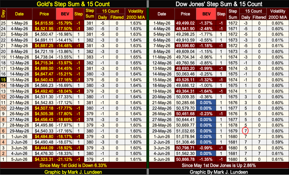
For the Dow Jones, look at all those pretty blue BEV Zeros in the table above. After all those new all-time highs, the Dow Jones 15-count became overbought, with a +7 on May 29th. Markets don’t like it when they become overbought. So, expect the current advance in the Dow Jones to slow down in the weeks to come. Especially should the NASDAQ continue seeing deflationary pressure.
Here is some bad news;
Sellers delisting homes at fastest pace since 2020
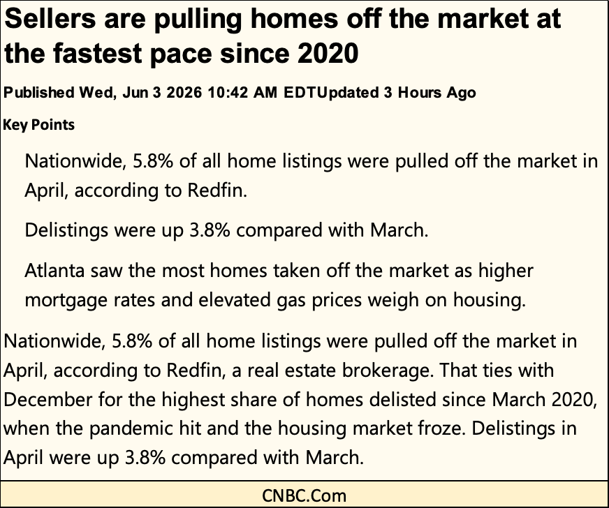
Sellers pulling their homes from the market at the fastest pace since 2020? What happened since 2020? You can see the above home sellers’ problem in the chart below; mortgage rates are rising.
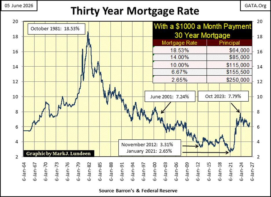
Sellers are pulling their homes from the market, because buyers don’t qualify for the required mortgages, at today’s higher mortgage rates.
Look at the table in the chart above. Per every $1,000 in monthly payment, since mortgage rates bottomed at 2.65% in January 2021, $100,000 in potential mortgage principal has been denied to buyers, and sellers, since mortgage rates increased to something above 6%. This is what happens in a bear market in real estate.
So, home sellers pull back from the market, hoping the market will turn in their favor sometime in the not to distance future.
I wish these home sellers the best of luck. But what they are actually hoping for, is for mortgage rates to decline. However, as real estate valuations are driven by the same economic engine as are bond prices; trends in interest rates, I have my doubts their hopes and desires will come true.
The rising mortgage rates seen above, are no more bullish for real estate, than rising bond yields are for bond prices. And we may have decades before mortgage rates stop trending higher.
__
(Featured image by Meric Dagli via Unsplash)
DISCLAIMER: This article was written by a third party contributor and does not reflect the opinion of Born2Invest, its management, staff or its associates. Please review our disclaimer for more information.
This article may include forward-looking statements. These forward-looking statements generally are identified by the words “believe,” “project,” “estimate,” “become,” “plan,” “will,” and similar expressions, including with regards to potential earnings in the Empire Flippers affiliate program. These forward-looking statements involve known and unknown risks as well as uncertainties, including those discussed in the following cautionary statements and elsewhere in this article and on this site. Although the Company may believe that its expectations are based on reasonable assumptions, the actual results that the Company may achieve may differ materially from any forward-looking statements, which reflect the opinions of the management of the Company only as of the date hereof. Additionally, please make sure to read these important disclosures.


Blockchain Evolves Toward AI, Finance and Quantum Security
Blockchain is evolving beyond crypto into finance, AI applications, and digital markets, while security and regulation remain challenges. Quantum threats...


The Italian Crowdinvesting Market Faces Sharp Decline in 2026
Italian crowdinvesting market continued to decline in 2026, with fundraising falling 36.8% year-on-year to €164.19 million. Platforms and active campaigns...


Sartorius Stedim Biotech Maintains Growth Momentum in H1 2026
Sartorius Stedim Biotech reported solid H1 2026 results, with revenue reaching €1.527 billion and EBITDA rising to €479 million. Growth...


Bank of Africa Launches BOA MDM Network to Boost Diaspora Investment in Morocco
Bank of Africa launched the BOA MDM Network to channel diaspora remittances into productive investment, aiming to raise their share...


Switzerland’s Medical Cannabis Reform Advances Access, But Barriers Remain
Switzerland’s 2022 medical cannabis reform improved patient access by removing federal approval requirements, but challenges remain. MEDCAN highlights barriers including...
 |
|
 |  |
 |
|
-

 Africa2 weeks ago
Morocco Cuts Card Fees to Spur Digital Payments, but Uncertainty Remains
-
 Biotech1 day ago
Sartorius Stedim Biotech Maintains Growth Momentum in H1 2026
-

 Cannabis1 week ago
Virginia Cannabis Market Could Reshape Regional Competition
-

 Impact Investing4 days ago
Ecobnb Turns Sustainable Tourism Into Measurable Impact