Business
Rising Bond Yields Signal Potential Trouble Beneath a Calm Stock Market
This week’s market was calm, but underlying conditions may be weakening. The Dow Jones has stalled without new highs, while bond yields continue rising since 2020. Though manageable so far, a critical yield threshold could trigger sharp reactions. Technical signals suggest yields may climb further, potentially pressuring stocks and pushing corporate bond prices downward significantly.


This was a slow week in the market. Nothing dramatic happened. However, I sense a gradual deterioration in the stock market. The Dow Jones hasn’t seen a new all-time high since July 6th, not that there is anything wrong with that. In the Dow Jones BEV chart below, from February to August 2025 the Dow Jones didn’t generate any new BEV Zeros, but did see a 15% correction.
What is bothering me about the stock market isn’t anything happening in the stock market itself, but bond yields are trending higher. A market trend that began in August 2020, that continues to this day. See table and charts below.
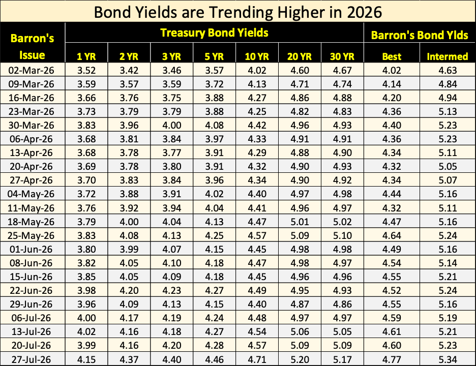
So far, bond yields trending higher hasn’t been a problem. However, there is an unknown threshold in bond yields, a point where rising bond yields will produce an oversized market reaction in the bond, as well as in the stock markets.
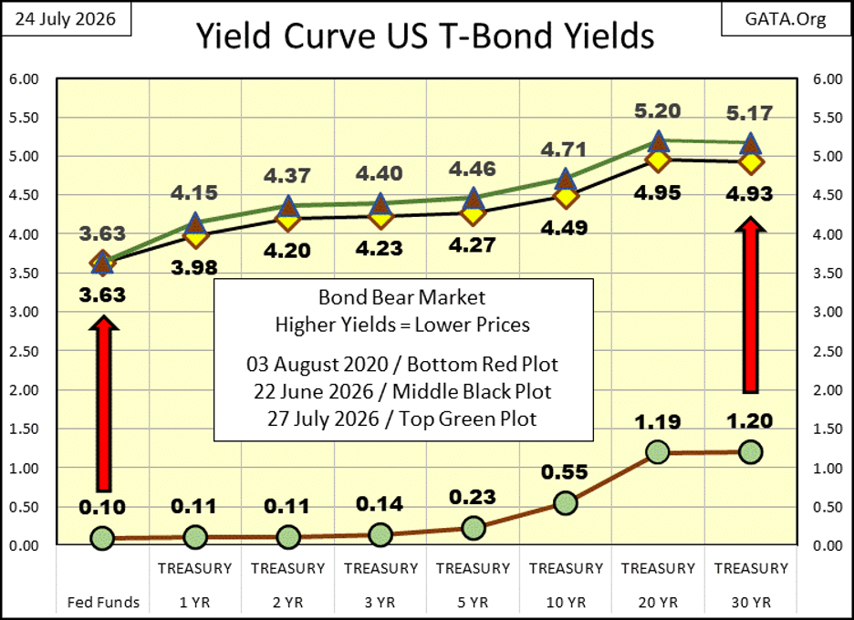
I don’t know what that threshold in bond yields is. But should we cross it, my readers won’t need me to point out that something in the market has changed! Deflation in the financial markets, will make any explanation on my part unnecessary.
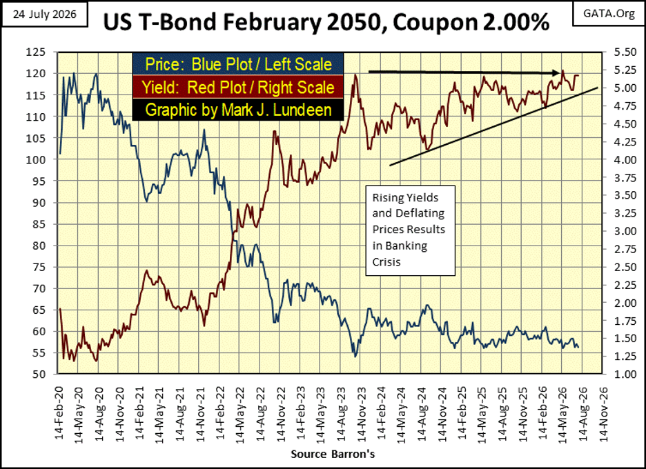
For another view of rising bond yields / declining bond prices, there is the chart below, a 30Year T-bond when issued in February 2020. Today, six years later, it is effectively a 24Year T-bond.
The red plot is the yield for this T-bond, and since November 2023, it began forming a rising pennant technical formation. A formation whose resolution is most likely to the upside. Which is not good for this, or any other bond trading in the bond market. Should this bond’s yield break above 5.50%, on its way to 6.0%, that may be a big problem for the stock market, and of course, the Treasury Market.
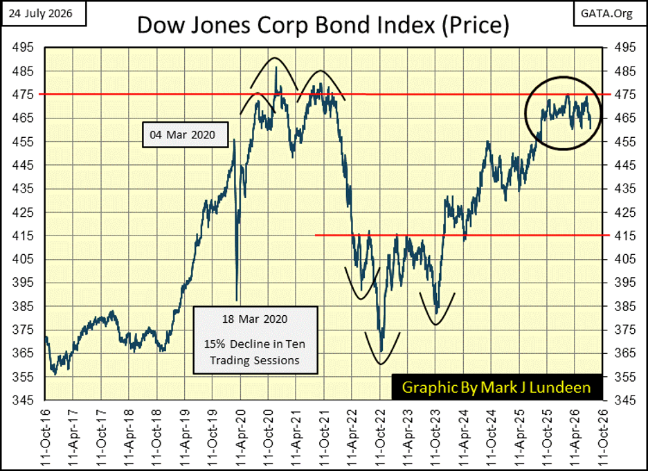
Next is a chart of the price for the Dow Jones Corporate Bond Index. Since last October, 475 has been a hard ceiling for this bond index’s price. As 475 was in 2020 & 2021.
Since April, it has attempted to trade below 460 three times. Looking at this chart, I think the path of lease resistance is to the downside. Possibly to test October 2022’s, 365, in the coming years.
But bond yields rising above a theoretical threshold-of-disaster is something lurking about in our unknown future. At the close of this week in the markets, the Dow Jones closed in scoring position, with a BEV of -2.09%. As I’ve said before, for as long as the Dow Jones continues closing in scoring position; BEVs between -0.01% to -4.99%, we must assume new all-time highs are pending.
But should (when) the Dow Jones’ BEV fall below -5% in its BEV chart below, it becomes appropriate to begin being more bearish in one’s market outlook. As we are not there yet, I remain short-term bullish on the stock market.
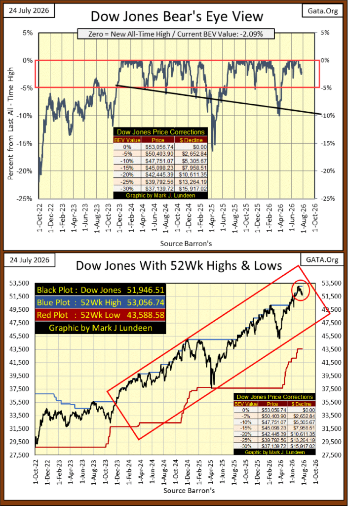
To better clarify what we are looking at with the Dow Jones in its BEV view, I included the above chart plotting the Dow Jones in the dollars it is published in, along with its 52Wk High and Low Lines. Since November 2023, in both charts above, every time the Dow Jones pushed up its 52Wk High Line in the bottom chart, it also produced a new all-time high, a BEV Zero in the BEV chart above it.
So, why bother with a BEV chart for the Dow Jones? Because, unlike the Dow Jones plotted in dollars, with the BEV view, I can take any period of Dow Jones history, since February 1885, and directly compare it to any other period of Dow Jones History; in terms of new all-time highs (BEV Zeros), and negative percentage claw-backs from those new all-time highs.
To understand the history of the Dow Jones, the Bear’s Eye View (BEV) is a very powerful tool.
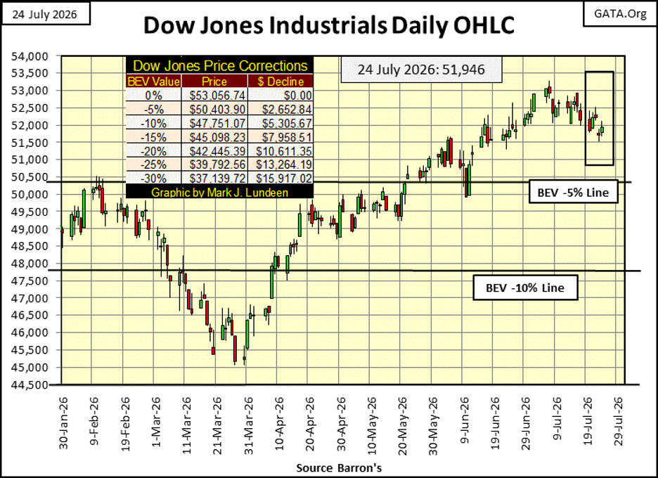
Moving to the Dow Jones in daily bars below, this week again, the old geezer is taking it easy after its last all-time high on July 6th. It continues creeping slowly down towards its BEV -5% line. A few more weeks like this, and the Dow Jones will find itself outside of scoring position. Then again, the Dow Jones in the next few weeks, may just as likely to have resumed its now three-year habit of generating new all-time highs.
Which will it be;
• another 10%, or more correction,
• another series of new all-time highs,
in the weeks and months to come for the Dow Jones?
Don’t ask me, as I don’t know. I’m not risking my reputation predicting it will be one, or the other possibility seen above. Geeze Louise, this is a market advance that began in August 1982. An advance that took the Dow Jones from below 800, to now over 53,000 forty-four years later.
It just isn’t reasonable expecting the next few decades in the stock market, to be as we’ve seen since 1982. If that is true, and it is, why is anyone fooling around with a tank of gasoline and a book of matches, by being long-term bullish on the stock market?
In my table below listing the BEV values for the major market indexes I follow, there were NO NEW ALL-TIME HIGHS this week. Though, the week closed with thirteen of these market indexes in scoring position. So, I can’t get too bearish at this week’s close.
Except maybe pointing out, the big NASDAQ indexes, its Composite & 100 indexes (#15 & 16) closed the week outside of scoring position. Since their last BEV Zeros on June 2nd, both these major market indexes have drifted into, and out of scoring position in the past two months, without generating a new all-time high for the big high-tech stocks these indexes represent.
Having the high-tech bull market advance stalling, isn’t a positive factor for the bulls. The thing to watch for now, will the NASDAQ Composite and 100 indexes remain above their BEV -10% lines in the months to come?
These indexes represent massive companies, companies with multi-trillion-dollar market caps. To see the Dow Jones’ BEV deflate to its BEV -10% line is one thing. Having the NASAQ’s Composite, and 100 indexes deflate below their BEV -10% lines is a completely different thing.
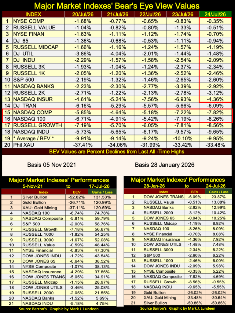
Note in the performance tables above, I switched the basis date from November 2021, to January 2026. November 2021, was the market top for the Not QE#4 bubble advance, where FOMC Idiot Primate, Powell “injected” several trillion dollars of “liquidity” in a couple of weeks, into the financial system, in response to the March 2020 Flash Crash.
In November 2021, all that was still big news. In July 2026, no one remembers, or cares about that anymore. That plus, it looked ridiculous having the top three spots in the table; gold, silver and the XAU, while they were in big bear market declines.
So, I switch the basis date to 28 January 2026, as that was the date gold, silver and the XAU saw their last all-time high in 2026. Doing this rotated them from the top three spots, to the bottom three. But in July 2026, that is how the market actually feels like; everything is doing better than gold, silver, or their miners.
In the coming year, I anticipate precious metal assets to once again rise to the top three spots in my performance table, as everything else moves down. Time will tell if I am right.
In Korea, they want their money back? Don’t those guys remember what they did with it? They placed their hard-earned money into the stock market, exposing it to market risk, at the top of a prolonged market advance in a HOT SECTOR of the market; AI. Not just that, but in leveraged AI, ETFs, that doubled any gains seen in this sector. But no – there is more; they then purchased these leveraged AI, ETFs on Margin. They then sat back, and laughed with glee as the capital gains came pouring in.
That was when these AI stocks were going up. But now they are going down, in a very leveraged way. So, these bulls are no longer laughing with glee. There are stories of people committing suicide, as their brokerage accounts became massive losses. All their money is gone, having been replaced with unpayable debts to their brokers.
It’s a story as old as the stock market; at the top of a prolonged market advance, where risks become maximum, and the potential for the generation of any profits shrinks to Zero, the public chooses that exact time to become enthralled with the market, and margin debt.

‘Give me my money back’: South Korean traders’ leveraged bets unravel
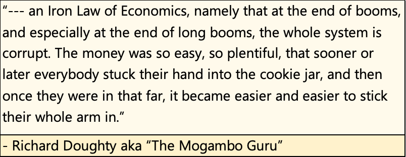
Below is a quote from Richard Doughty, aka the Mogambo Guru, explaining not just what happened in Korea, but I believe also the situation now in the United States.
Is the American stock market in July 2026, overvalued? If so, how much is it overvalued?
I would say that is so, based on the data see in the tables below; displaying the top twenty market caps of 1975 & 2026. The largest American company in 1975 was IBM (“Big Blue”), with a massive market cap of 30.96 billion. In 1975, IBM was the giant traded at the NYSE. Its market cap of 30.96 billion dollars, was an astounding valuation of dollars.
But 1975 was only four years following the 1971 termination of the US$ from its $35 gold peg. In 1975, the ability of the “policy makers” to inflate the economy with inflationary dollars was still limited. So, in 1975, the largest American manufacturer / high-tech company; IBM, had a market cap of only 30.96 billion dollars. Note too, Abbott Labs in 1975. With a market cap of only 1.03 billion dollars, was #50 on the list.
The combined market cap for the top twenty companies trading in the United States in 1975, was only 210.82 billion dollars. In 2026, a single company with a market cap of 210.82 billion dollars, won’t get that company on the list of the top twenty market caps.
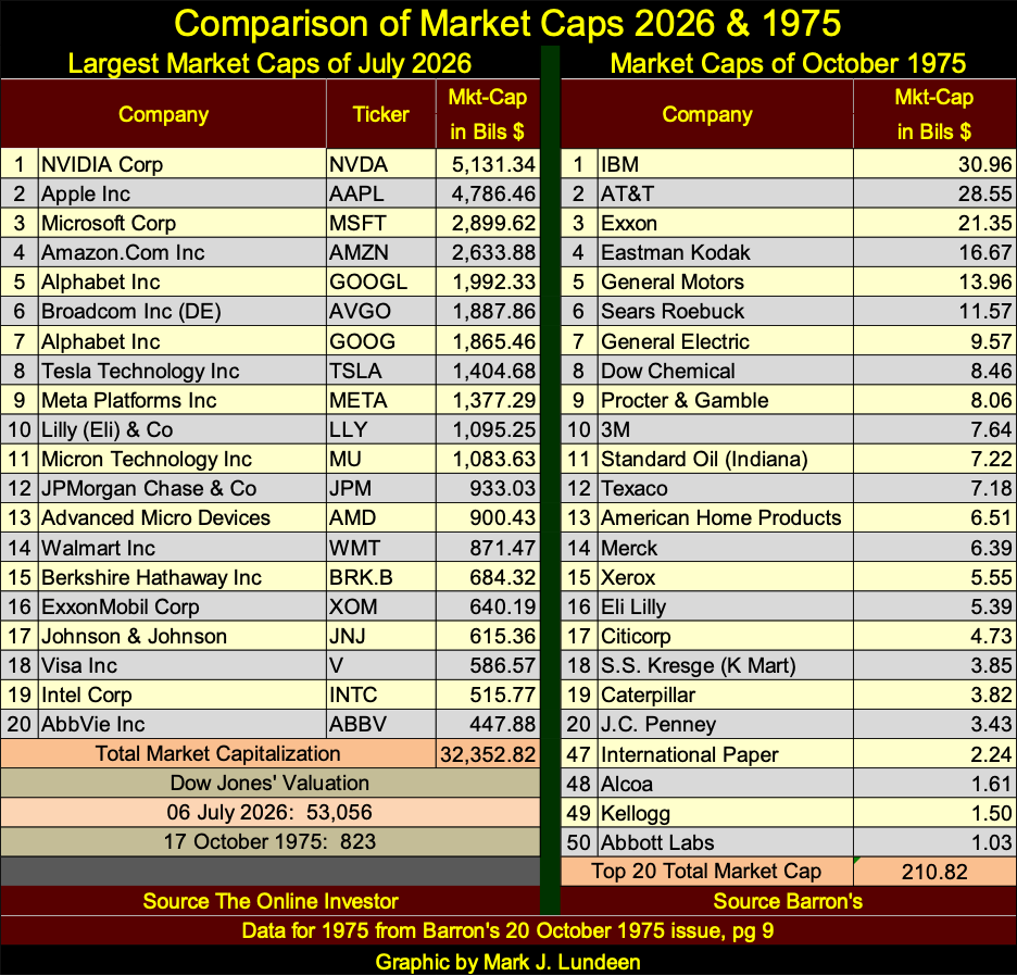
In July 2026 (above), the top eleven market caps are over a trillion dollars. One trillion dollars, is also defined as a thousand, billion dollars, a valuation that was said to be Elon Musk’s personal net worth a few weeks ago, after the SpaceX IPO.
- Where are all of these dollars coming from? “Economic growth?” I wish! *
The sad fact about all of these dollars is; the US dollar is no longer defined in terms of gold, as the old $35 gold peg defined it. The gold peg also provided a check on the dollar’s issuance. The dollar constrained by a $35 peg to gold, instead of being “managed” by a bunch of idiots at the FOMC, would have prevented the grotesque, multi-trillion-dollar market caps seen above, now in 2026.
Every time I see an economist, or “market expert” describe the Federal Reserve as an inflation fighter, I just curl up my eyebrows, and chuckle, as I think of how ignorant these mortals, these “experts” be. Look at the expansion of market capitalization seen in the table above from 1975 to 2026, it all inflation. Monetary bubble finance flowing from the FOMC.
So, post 1971, the Federal Reserve System, and the idiots at the FOMC, can, and do create as many dollars as they feel is appropriate, and those dollars have been flowing into stock-market valuations.

Today, we see multi-trillion-dollar market caps, and so far, one trillionaire walking around, fifty-five years later in 2026.
Why would that be a problem? Since the dollar was decoupled from its old $35 gold peg in August 1971, people and the economy have more money, and more money is a good thing, isn’t it?
For some people that is true. But for most people, that is not true.
To make my case, look at the chart below. Since March 1993, CinC (paper dollars in circulation) is up by a factor of 7.45, while personal income is up by a factor of only 4.89. These dollars-of-inflation are not flowing towards the wage earners, as you may like to believe they are. Note too, consumer debt since 1993, is also up by a factor of 7.11.
So, wage earners’ income my be up by a factor of 4.89, but a significant portion of that increased income, is going to provide profits to their credit card companies, #18 in the table above for 2026.
Note too; in the list for 1975, most of those companies were manufacturers, or retail outlets, with only one bank. That in 2026, financial companies, including Berkshire Hathaway, Visa, & JPMorgan Chase, and many high-tech (digital) companies now dominate this list, suggest the American economy has changed dramatically, and I believe not for the better for most people.
The national debt is up by a factor of 9.46. The national debt, as is all debts, must be serviced. But by who? Well, the tax payers of course, with their lagging personal income.
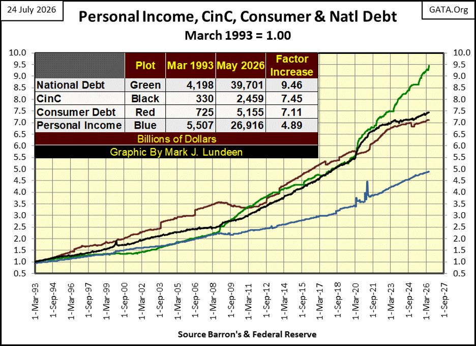
The chart above tells a tale-of-woe for America’s middle class, a story that will only get worse with the passage of time. Okay, so what can people do to prevent that from happening to them? I’m no “market expert,” so don’t expect me to recommend investing in a high-tech company at the NASDAQ, a hot new company no one knows anything about yet.
I’m still recommending investing money into gold and silver bullion, as well as the companies that mine for them.
Let’s look at a chart for silver below, going back to 1969. From 1969 to 2025, for fifty-six years, silver could not trade above $50 an ounce. Following the two attempts at $50 silver seen below, silver entered into massive bear market declines.
• a 90% bear market decline in the 1990s,
• a 70% bear market decline from 2011 to 2020.
But all that changed last October, when for the first time ever, silver closed at over $50 an ounce, to then surge to $118 an ounce three months later, in January.
Silver is currently in a 50% bear-market decline. However, I note silver has yet to close below $50 an ounce, the red line in the chart below. I doubt silver will ever again trade below $50 an ounce, and its current new all-time high of $118, will not stand for long.
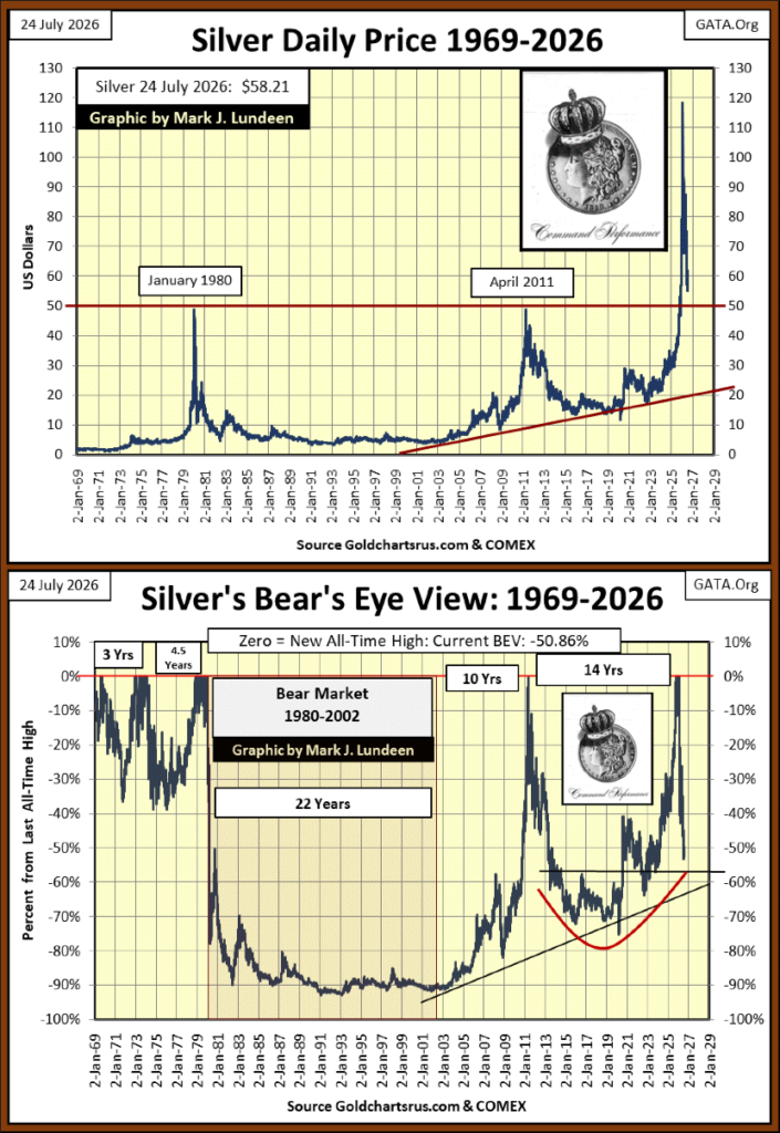
Above is silver’s BEV chart, a fifty-seven-year history of new all-time highs in the price of silver, and negative percentage claw-backs from those new all-time highs. Take a moment to study this chart. Do you believe silver is going to test its lows of 2020, or worse yet, of 1993?
I don’t. I expect silver is currently very near its lows of its present claw-back. This is especially so when one considers that 40%, of this 53% claw-back, happened in the first six days in the decline from silver’s January 28th last all-time high (table below).
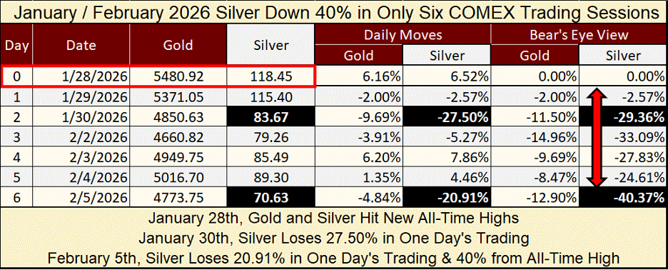
In the following six months, silver’s current decline has seen an addition of only 13%. Odd, very odd. This failure for the bears to follow up on their original 40% decline in the months following January, is an indication of exhaustion on the part of the bears in the silver market.
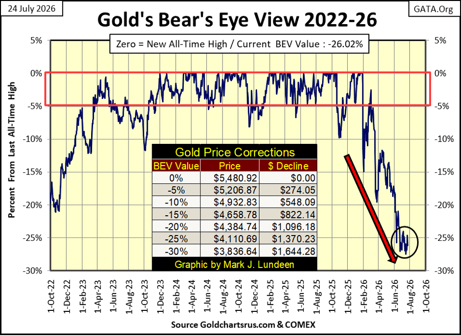
Next is my Bear’s Eye View (BEV) chart for gold. Since gold’s last BEV Zero on January 28th, it has sliced through its BEV -10%, -15%, -20% & -25% lines without hesitation. But since June 10th, following the breaching of its BEV -25% line, I see a lot of hesitation going on within the black circle. The bears must want to breach gold’s BEV -30% line, as they did with all the others above it – so, why don’t they?
Maybe they will, and then maybe they won’t. But for gold below, and silver above, I suspect we are currently very near to the lows of their bear markets. We may see some excitement in the precious metals in the weeks, and months to come, as the old monetary metals rebound off their lows.
For gold on its side of the step sum table below, daily declines that have dominated the gold market since last February are slowing in frequency. Gold is yet to be dominated by advancing days, days with gold’s 15-count at +5 becoming a common occurrence. But looking at gold’s BEV chart above, we can understand why that has been so for many months now.
When gold once again advances to new all-time highs, the volume of daily declines will diminish significantly in gold step sum table below.
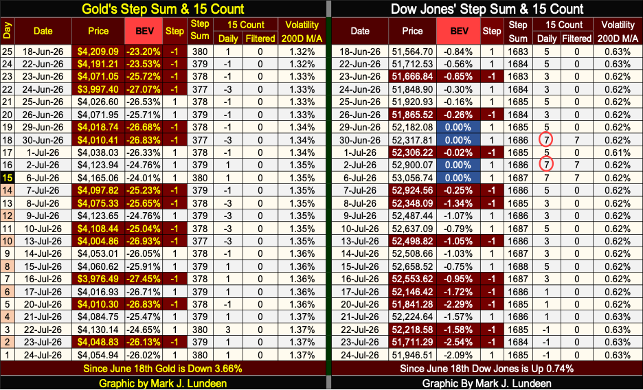
For the Dow Jones, it is seeing an increase in the volume of daily declines. Its 15-count went negative this week. Well, that is something that can happen even during big advances in the stock market. What I’m looking at for the Dow Jones, is its daily volatility 200D M/A. It closed the week at a 0.63%, which is low daily volatility. And low daily volatility is bullish for the Dow Jones, my proxy for the broad stock market.
Until this metric of daily volatility begins trending up towards 1.00%, and then beyond, I don’t think anything particularly bearish is going to happen with the stock market.
If history is any guide to our future, and it usually is, we are * NOT * going to see a major decline in the stock market as 2026 flows on to 2027 * UNTIL * the Dow Jones once again see its days of extreme market volatility. The dreaded Dow Jones 2% days, days the Dow Jones moves +/- 2%, or more, from a previous day’s closing price. In the table below, here is what the March 2020 Flash Crash look like in terms of Dow Jones 2% days.
During the March 2020 Flash Crash, the Dow Jones daily moved well in excess of 2% per day. During this crash, on March 24th, the Dow Jones ADVANCED from one day to the next, by 11.37%! Historically, all the big daily advances have been bear-market events.
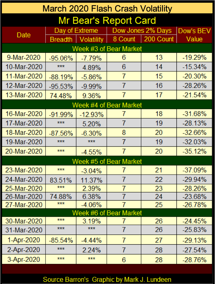
Should the Dow Jones see a handful of its 2% days in the coming weeks and months, watch its daily volatility’s 200D M/A spike up dramatically. If an investor hasn’t done so before, following the formation of a Dow Jones daily-volatility spike, they have best exit the stock market, and not ask for anyone permission to do so.
__
(Featured image by lonely blue via Unsplash)
DISCLAIMER: This article was written by a third party contributor and does not reflect the opinion of Born2Invest, its management, staff or its associates. Please review our disclaimer for more information.
This article may include forward-looking statements. These forward-looking statements generally are identified by the words “believe,” “project,” “estimate,” “become,” “plan,” “will,” and similar expressions, including with regards to potential earnings in the Empire Flippers affiliate program. These forward-looking statements involve known and unknown risks as well as uncertainties, including those discussed in the following cautionary statements and elsewhere in this article and on this site. Although the Company may believe that its expectations are based on reasonable assumptions, the actual results that the Company may achieve may differ materially from any forward-looking statements, which reflect the opinions of the management of the Company only as of the date hereof. Additionally, please make sure to read these important disclosures.













Market Faces Potential Shift as Secular Bull Ages and Gold, Oil Gain Attention
Markets alternate long secular bulls and bears; 1982–2000 bull then 2000–2009 bear. Current bull is 17 years old, raising concerns...


Rising Bond Yields Signal Potential Trouble Beneath a Calm Stock Market
This week’s market was calm, but underlying conditions may be weakening. The Dow Jones has stalled without new highs, while...


Blockchain Evolves Toward AI, Finance and Quantum Security
Blockchain is evolving beyond crypto into finance, AI applications, and digital markets, while security and regulation remain challenges. Quantum threats...


The Italian Crowdinvesting Market Faces Sharp Decline in 2026
Italian crowdinvesting market continued to decline in 2026, with fundraising falling 36.8% year-on-year to €164.19 million. Platforms and active campaigns...


Sartorius Stedim Biotech Maintains Growth Momentum in H1 2026
Sartorius Stedim Biotech reported solid H1 2026 results, with revenue reaching €1.527 billion and EBITDA rising to €479 million. Growth...
 |
|
 |  |
 |
|
-

 Fintech2 weeks ago
Withings Achieves Profitability in 2025 with 90% Growth Since 2018
-

 Cannabis4 days ago
Switzerland’s Medical Cannabis Reform Advances Access, But Barriers Remain
-

 Biotech2 weeks ago
Emily.AI: Personalized Oxygen Therapy Earns Global AI Recognition
-
 Business6 days ago
The $40 Trillion Trap: Disinflation Is Not Deliverance