Featured
Silver remains undervalued, but the silver to gold ratio suggests huge profits could come its way
Given silver’s undervalued prices today, the gains would be remarkable should the silver to gold ratio low from four decades ago be matched in the coming years.

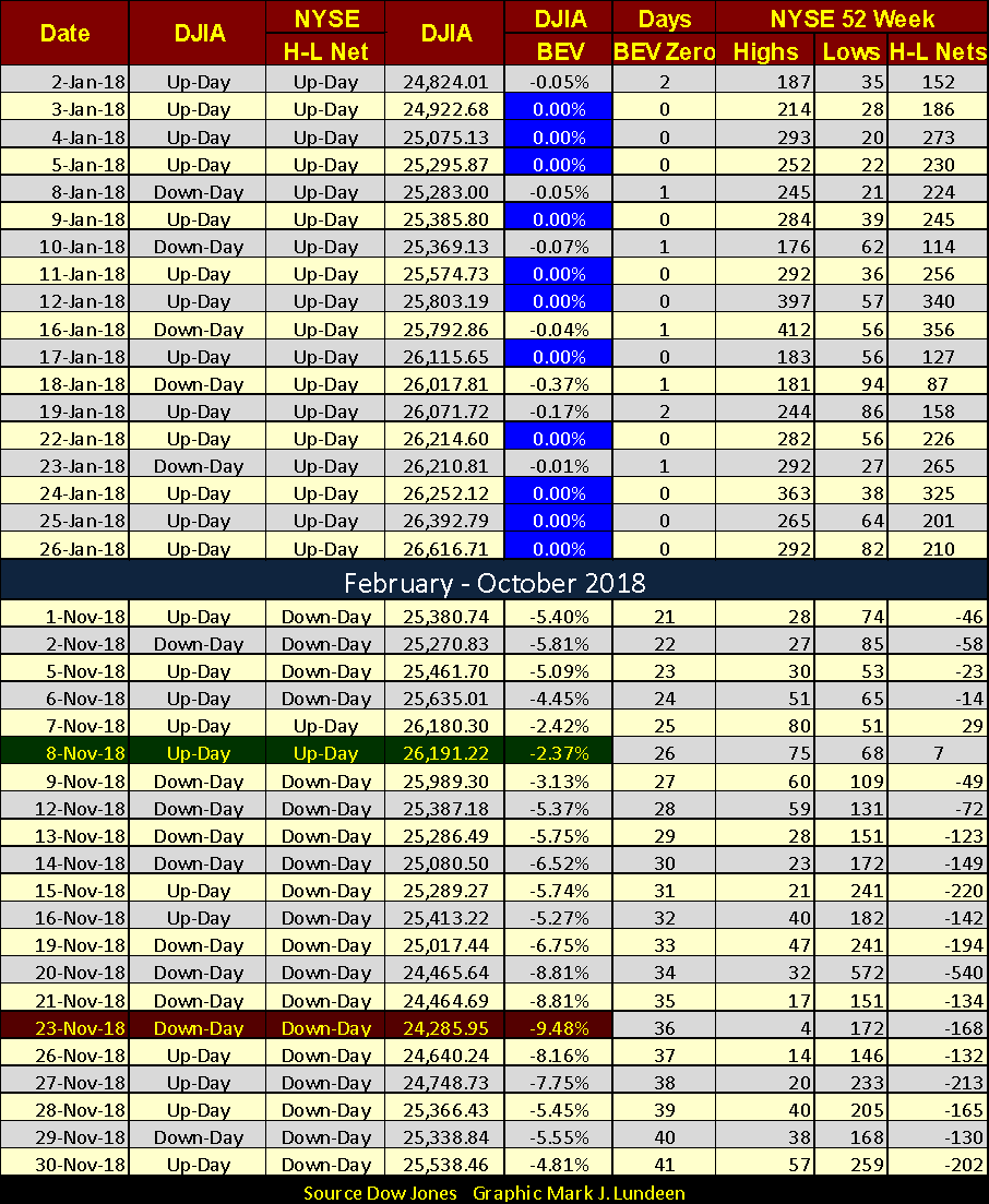
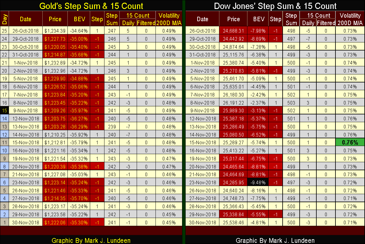
I last wrote an article on Friday, November 9th as the Dow Jones closed with a value of -3.13 percent in the BEV chart below. Three Friday’s later and the Dow Jones closed today with a value of -4.81 percent. Not much of a difference, until we note between these two Fridays, the Dow Jones almost broke below its BEV -10 percent line only six NYSE trading sessions ago, last Friday, November 23rd.
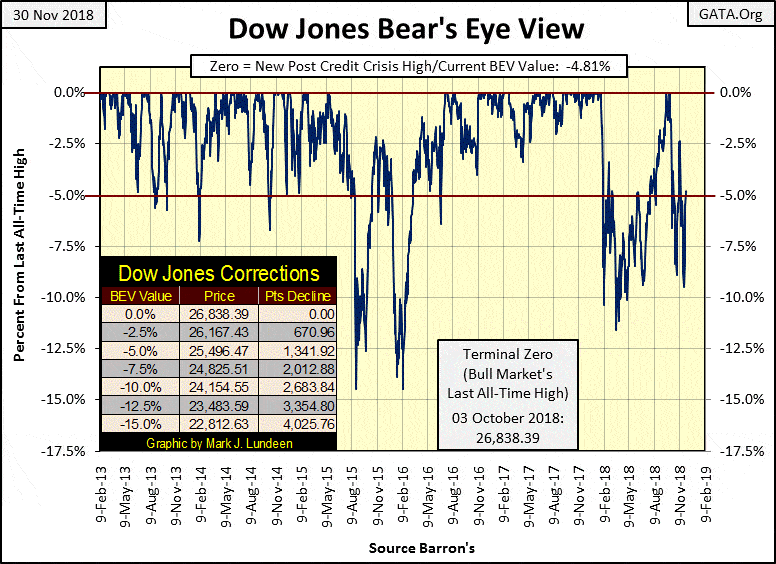
© Mark Lundeen
Then, beginning Monday this week, the Dow Jones recovered 1,252 points, a full five BEV points in only five trading sessions: very impressive. CNN took note, and reported exactly why on Wednesday the Dow Jones jumped over 600 points (a Dow Jones +2.50 percent day); the Federal Reserve intends to slow down increasing interest rates.
Per CNN, the Federal Reserve intends not to pop the bubble they inflated into the stock market any time soon, though CNN chose to describe the Fed’s action differently than I have. That’s good news, but somehow looking at the Dow Jones in daily bars below tells me the problems the stock market is currently facing may not be as simple to solve as the “market experts” at CNN would have us believe.
Look at the increase in market volatility for the Dow Jones since its October 3rd last all-time high. For the past two months, it’s been classical bear market action, with eight new Dow Jones 2 percent days. During market advances, we can go for years without seeing even one Dow Jones 2 percent day, and now we’ve seen eight of them in the past two months?
I’m out of the market prediction business. I haven’t a clue what’s to happen next with the Dow Jones. So I’m not predicting it, and I think it unlikely, but should the Dow Jones see a new all-time high before Christmas, I wouldn’t be surprised. Should the Federal Reserve “inject” sufficient “liquidity” into the stock market, anything is possible.
However, when comparing the daily bars below before October 3rd with those after, the only thing that comes into my mind is BEAR-MARKET ACTION. This is the type of market where the Dow Jones could collapse into panic selling without further notice, taking other financial-market assets down with it.
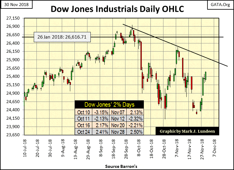
© Mark Lundeen
With a market and economy carrying as much debt as is ours, a catastrophic market collapse is something to be anticipated. Take for example former blue-chip stock General Electric, formerly a solid company which today is leading the charge down into the abyss. In July 2016, it traded at $32; today it closed at $7.50, a loss of 76.6 percent.
What happened to GE? I don’t exactly know, but in time, I expect we’ll discover a large factor in its demise was GE assuming more debt than it could service.
Here’s an article from Wolfstreet.com explaining the problems bond ETFs are having. But the exact same thing could be said for the pending debt problems many large blue-chip companies are now facing. The only difference is these corporations are the issuers of the bonds, while the ETFs are their current holders.
Individuals, as well as corporations, carry more debt than they can reasonably service. But a CNBC “market expert” tells us it’s nothing to worry about.
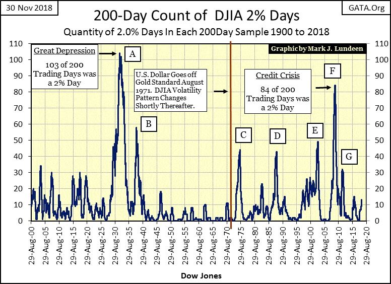
Here’s a bear-market fact of life: During market declines daily, volatility in the Dow Jones increases, and the Dow Jones will begin experiencing daily moves of +/-2 percent or greater from a previous day’s closing price. I call these days Dow Jones 2 percent days or days of extreme market volatility. An interesting market fact is historically the Dow Jones has seen its largest daily percentage advances during bear markets, not during bull markets as one would expect.
Large daily percentage moves in the Dow Jones can occur during market advances, but rarely. However, during market declines, their occurrences become common market events, as seen in the chart below.
The plot below is from January 1900 to today, 119 years of market history, and we are looking at the number of Dow Jones 2 percent days in a running 200 day sample. Market advances occur in the declines from peaks in the Dow Jones 200 count, and market declines can be identified as the 200 count begins to increase, with bear market bottoms occurring near peaks in the plot.
© Mark Lundeen
This data is invaluable, though it won’t get an investor out of the market at the absolute top or back in at the absolute bottom. Still, the increase of volatility seen at a market top is a reliable indicator that a top is at hand or actually in, though not necessarily that a massive bear market is pending.
Then there’s the question of how high any particular bear market will drive the Dow Jones’ 200 count? In October 1929, who knew the count would soar to 103, or that the sub-prime mortgage bear would take the count up to 84? But for every peak seen in the past 119 years, once market volatility has peaked, it begins to decline rapidly as the bear-market bottom passes into history.
So, this indicator has provided an excellent metric for gauging bear-market bottoms, thus signaling a safe return to the stock market. Though in actual practice, one may want to wait a few months into the post-peak decline to be sure the bottom is actually in.
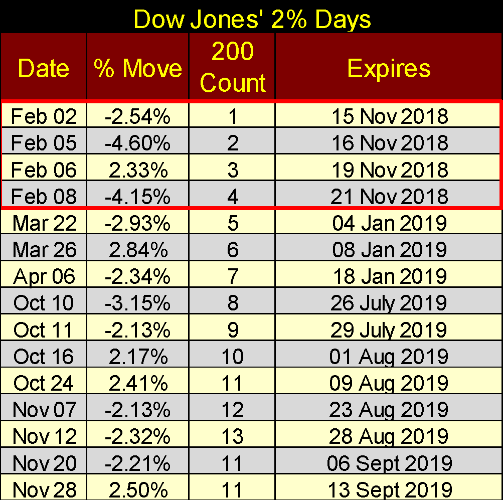
The current advance in the Dow Jones’ 200 count began on February 2, 2018, an additional 14 Dow Jones 2 percent days followed with the last seen this Wednesday, November 28th (Table Below). Of the seven Dow Jones 2 percent days made earlier in 2018, the first four have expired, the others will in January 2019. This is why the current count is at 11, and will go down to 8 on January 19th should the Dow Jones stop seeing daily moves of 2 percent or more.
© Mark Lundeen
But I don’t think that is going to happen, not after valuations in the financial markets have been inflated to historic levels following the post-credit-crisis bear market bottom of March 2009. In fact, the debt markets have been deflating since the summer of 2016, as is evident in the following chart of a US T-Bond, but the same is true for any debt contract.
Bond yields and mortgage rates have been increasing for the past two and a half years. As a result, the following bond’s valuation (Blue Plot) has deflated by 22.24 percent. Yet for someone who purchased this bond in July 2016, it has only twice paid its owner a yield of 1.94 percent (an annual income of $19.40 / $1,000 of the purchase price), and will never yield more as bonds are “fixed income.” That’s a two year income of 3.88 percent from a principle that has deflated 22.24 percent since July 2016. Ouch!
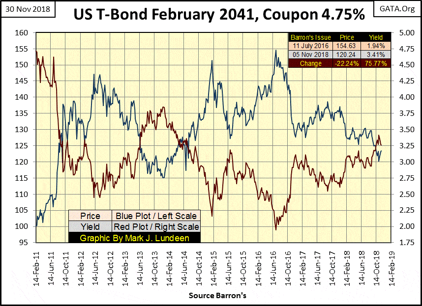
© Mark Lundeen
It’s important to realize the housing market also feels deflationary forces when mortgage rates increase, and the higher bond yields and interest rates climb, the more these market valuations deflate.
Don’t think fixed-income investors haven’t noticed the haircut Mr. Bear has given their principle. Wall Street can’t hide how since 2016, a $100,000 investment in bonds or mortgages has become worth only $78,000 without a compensating increase in income. Fixed income is just that: fixed income. This will continue for as long as yields and rates continue to increase, and at some point spark a selling panic that will develop in the debt markets that will feed back into the stock market.
Maybe it already is, as seen by the NYSE 52Wk Lows in the table below. I highlighted the November 8th high-point below; it occurred with only a H-L Net of +7. As the Dow Jones declined by 5 BEV points on November 23rd (also highlighted) NYSE 52Wk Highs contracted as 52Wk Lows expanded. However, since Monday of this week, the Dow Jones has leaped a full 5 BEV points in the table, as NYSE 52Wk Lows continued to expand and 52Wk Highs remain moribund.
© Mark Lundeen
This conflicting trend in rising NYSE 52Wk Lows as the Dow Jones advances may just be a temporary anomaly in the market, which at the close of this week I expect will prove to be the case in the coming weeks. So I’m still short-term bullish, but ready to change my position on a moment’s notice. After all, the possibility that the future may prove that it was the rising number of NYSE 52Wk Lows, not the rising Dow Jones that best predicted where the stock market was to go in the coming year.
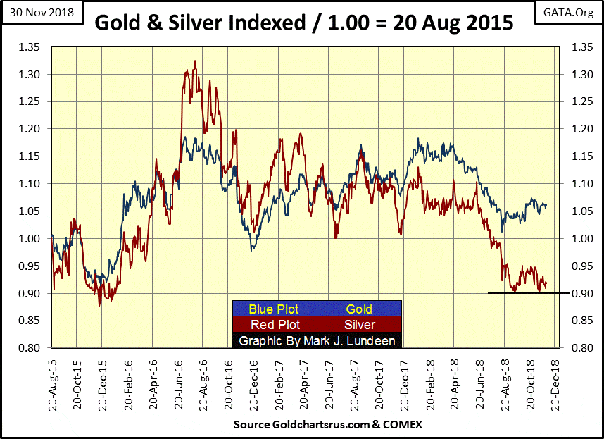
Let’s move on to gold and silver. Next is a chart plotting the daily indexed values of gold (Blue Plot) and silver (Red Plot) since August 2015. Why August 2015? Both gold and silver hit a very, very hard bottom in December 2015. Indexing gold and silver to August 20, 2015, allows us to see the final decline into the 2011-2015 bear market bottom, and how the old monetary metals have done since.
For both metals, the December 2015 bottom has held. For gold, it saw another higher bottom in December 2016, and then again another higher bottom in August 2018. All in all, gold is progressing upward, but watching it rise is like watching paint dry.
Silver too has held above its December 2015 bottom, but just barely. In this past August and again last month, it attempted to break below its 0.90 line, failing to do so on both attempts. But I have a hard time watching the market action for silver, as it’s like watching baby seals getting clubbed by fur traders.
© Mark Lundeen
Be-that-as-it-may-be, I still prefer silver to gold as an investment for what silver did after both gold’s and silver’s December 2015 bottom. I just accept what we see in the chart above as a fact of life in the precious metals markets: silver outperforms gold during both market advances and declines.
It’s been that way since the U.S. government ceased fixing the price of gold at $35 an ounce in the early 1970s. And then there is the fact that silver’s last all-time high price still dates back to January 1980. Nothing else does. Not the price of gold or the Dow Jones, or even cabbage sold at grocery stores cost less today than it did in January 1980. That nothing other than the price of silver is cheaper today than it was in January 1980 (39 years ago), seems an important point to keep in mind when thinking about silver.
When silver does break above its last all-time high of $48.70 an ounce, and it will, I expect the price of silver will explode.
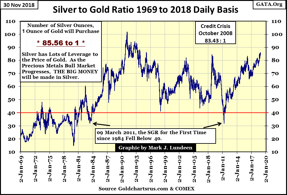
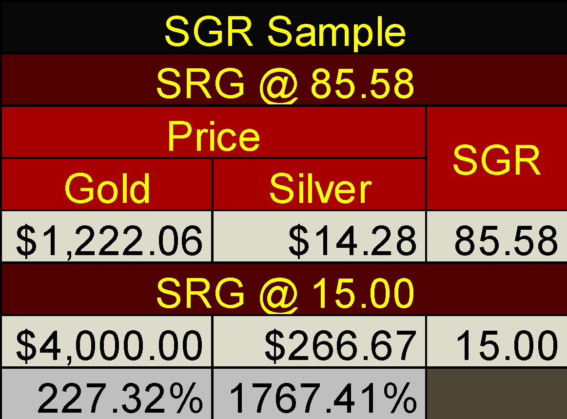
One way of seeing how undervalued silver is today is by looking at how many ounces of silver a single ounce of gold can purchase, or the Silver to Gold Ratio (SGR Chart below). Currently, the SGR of 85.56 ounces of silver for one ounce of gold is at levels not seen since 1995.
It could go higher, but what I’m thinking of is what happens when Mr. Bear begins in earnest to deflate valuations in financial assets, like stocks, bonds and real estate (mortgages). If you think about it, investment capital is always seeking a market that is being inflated, while avoiding those that are deflating. Getting that right is the difference between receiving capital gains one can boast about, or taking capital losses.
What happens when trillions of dollars, yen and euros begin fleeing deflation trading in the global financial markets? History strongly suggests that much of this flight capital will flow straight into gold and especially silver, as silver always outperforms gold.
© Mark Lundeen
One remarkable feature of all big-bull markets is they always set new records. What if the next bull market in gold and silver sees a new record low in the SGR? The current low in the SGR is 15.47 seen in Barron’s 31 December 1979 issue. Should that SGR low from four decades ago be matched in the years to come, the gains seen in silver from its current undervaluation prices will be remarkable.
Here’s an example: at weeks close the SGR was 85.58, because an ounce of gold at $1,222.06 could also purchase 85.58 ounces of silver at $14.28. But what if at some future date the price of gold increases to $4,000 an ounce, and an ounce of gold could then purchase only 15 ounces of silver (a SGR of 15). That would fix the price of silver at $266.67, but not just for the 15 ounces in the new SGR, but for every one of the 85.58 ounces of silver our current SGR gifts current investors of silver.
© Mark Lundeen
This is all conjecture of course, as I don’t know what prices gold and silver, as well as exactly what the SGR, will be in the future. But history tells us when the price of gold once again resumes its bull market, the gains in silver will be multiples of whatever gold does, so the assumptions made in the SGR table above are not unreasonable.
-
That buying one ounce of gold at today’s $1,222.02 will become worth $4,000 sometime in the future.
-
However, by choosing to purchase 85.58 ounces of silver at today’s price of gold ($1,222.02), this investment in silver will become worth $266.67 X 85.58 ounces of silver = $22,821 is also a reasonable assumption.
So, in the above example, an investment of $1,222.02 in gold today offers an increase of $4,000, while investing $1,222.02 in silver could return $22,821.
I say again: keep in mind the conditions seen in the table above are only conjecture on my part. I’m sure the price of gold will someday see $4,000, but what the SGR will be when it does is currently not knowable. However, seeing the SGR break below its lows of the late 1970s as the bull market in gold and silver resumes is not an outlandish assumption, and would rocket the price of silver to levels not even I dare guess. So even purchasing a few hundred ounces of silver at today’s SGR of 85.58, a couple of thousand dollars of silver could have an oversized impact on most retail investor’s future net worth.
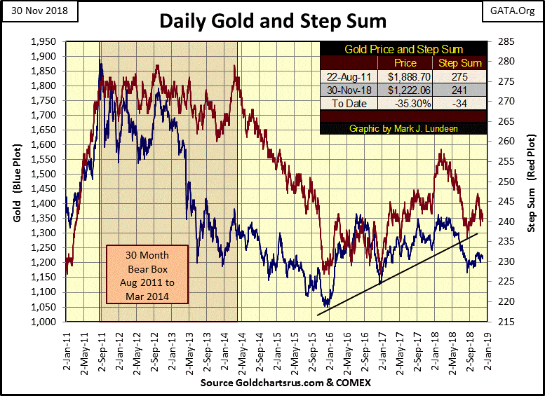
Here’s gold and its step sum plots. Not much has changed since my last article three weeks ago.
© Mark Lundeen
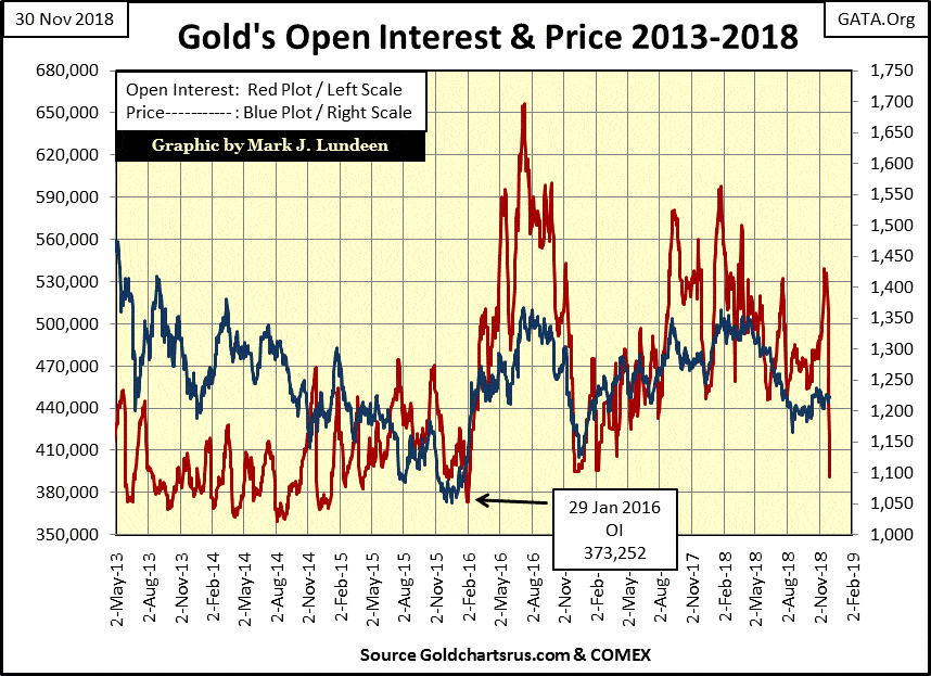
Which is surprising as open interest (OI) for gold has collapsed in the chart below. Jeeze Louise, this collapse in OI happened in only six COMEX trading sessions! Usually, such a collapse in OI goes hand in hand with a collapse in the price of gold, and silver and their miners. However, this time seems to be different, at least so far.
© Mark Lundeen
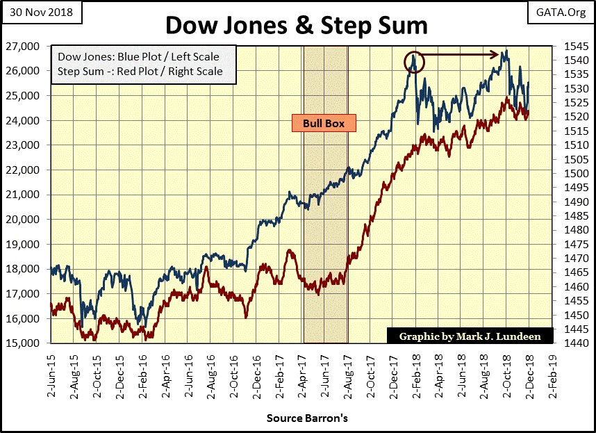
Moving on to the step sum chart for the Dow Jones, the venerable Dow is working on a double-top formation. Also, its step sum is faithfully following the Dow Jones price trend. No step sum box in the making below.
© Mark Lundeen
Here’s another view of market volatility in the Dow Jones. Plotted below aren’t Dow Jones 2 percent days, but the actual 200 day M/A for volatility in the Dow Jones itself. I’m publishing this chart as this is the data seen in Dow Jones Step Sum Table, in its Volatility 200D M/A column.
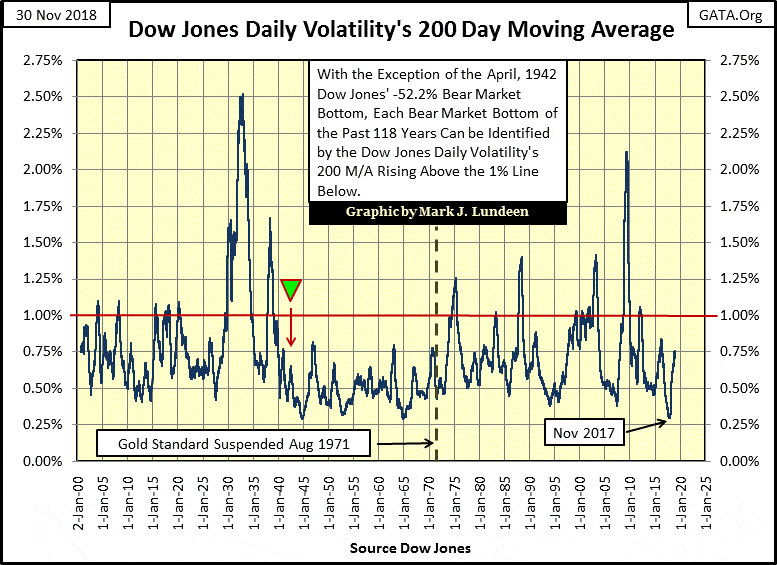
© Mark Lundeen
Daily volatility for the Dow Jones in November 2017 declined to levels seen only twice before, in late 1944 and again in January 1965. And as in 1944 and in again 1965, this low volatility in November 2017 occurred near a market top. In other words, provided excellent opportunities to lock in profits and avoid a nasty market decline.
Just looking at the data plotted above, should this volatility metric remain below 1 percent, there shouldn’t be a massive deflationary bear market coming our way. However, should this plot break above its 1 percent line, the financial markets are going to undergo serious deflation in market valuations.
That’s why I include the daily value for this data series for the Dow Jones below because it’s that important. Remember: gold, silver and their mining shares don’t benefit from monetary inflation flowing from the Federal Reserve system; the stock and debt markets do. What provided rocket fuel to the old monetary metals and their miners is DEFLATION in the previously inflated financial markets.
Currently, daily volatility peaked @ 0.76 percent on November 15th and has declined to 0.71 percent at week’s close. But keep in mind that the four Dow Jones 2 percent days from last February expired this November, and are now out of the 200 day moving average.
© Mark Lundeen
If we really are facing a massive bear market, the Dow Jones will continue making 2 percent days, and its daily volatility 200 day moving average will continue advancing ever higher. God help us if daily volatility for the Dow Jones 200 day moving average break above 2 percent, as it did during the Great Depression and again during the sub-prime mortgage bear market.
But should we come face-to-face with the worst in the stock and bond markets, I expect we’ll see gold and especially silver at prices far above where they are now.
(Featured image by DepositPhotos)
—
DISCLAIMER: This article expresses my own ideas and opinions. Any information I have shared are from sources that I believe to be reliable and accurate. I did not receive any financial compensation for writing this post, nor do I own any shares in any company I’ve mentioned. I encourage any reader to do their own diligent research first before making any investment decisions.


Terre et Lac Launches Crowdfunding for a Photovoltaic Power Plant
Terre et Lac, a Lyon-based company, launches a crowdfunding campaign for a solar plant in Voreppe. Residents of Isère and...


Qonto, Ledger, and Younited Credit, Leading Trio of the French Fintech Ecosystem
Qonto emerges as the top fintech in the latest rankings after its successful Series D funding. The 2024 Fintech 100...


Cannabis Clubs: Germany Introduces Strict Regulations
Germany introduces new regulations aimed at tightening control over cannabis clubs, following recent reforms. The Cannabis Act (CanG) allows limited...


Merck Invests Over 300 Million Euros in a New Research Center in Germany
Merck invests over 300 million euros in a new biotech research center in Germany, part of a larger 1.5 billion...


E-commerce: Sustainability Becomes a Key Purchasing Criterion in Large Emerging Countries
The report found that 31% of consumers evaluate sustainable packaging options when shopping online, while 30% consider sustainable shipping options...
 |
|
 |  |
 |
|
-

 Cannabis1 week ago
Oktoberfest Without Cannabis: German Authorities Are Considering Introducing a Ban
-

 Biotech1 day ago
MSD Gets Green Light from the European Commission for Keytruda, the World’s best-Selling Drug
-

 Biotech1 week ago
Vithas and MSD Join Forces to Train and Innovate in Oncology Matters
-

 Business2 weeks ago
Gold & Silver Continue Looking Strong
You must be logged in to post a comment Login