Featured
Stocks and bond markets face pending losses
Dow Jones could deflate as the economic debts start to default. Stocks and bond markets have pending losses, which will be a boon to precious metals.

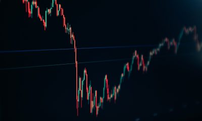
After bouncing off the bottom of an 18 percent correction late last December, and a minor 7.5 percent correction on May 31st, the Dow Jones is losing steam as it began making new all-time highs in early July. Taking into consideration how many years this advance has been ongoing, I’m not surprised how since the beginning of July the Dow Jones has so far only been able to produce four new BEV Zeros in the BEV chart below.

Maybe the biggest problem with this market isn’t that the bulls are tired, but rather who the bulls are and what they want from the stock market. It’s been ten years since this advance began at the bottom of the -54 percent credit-crisis bear market, the second-largest percentage decline in the Dow Jones since 1885.
A decade ago there was plenty of reasons to have expected the Dow Jones would have declined at least to its BEV -70 percent level, had not Doctor Bernanke began his program of quantitative easings. The Doctor flushed three QEs down Wall Street, flooding the market with trillions of dollars to first break the decline, and then reflate market values in the stock market.
Here’s a chart of the Dow Jones with its 52 Wk High & Low lines going back to 1991. Since January 2018, the Dow Jones has lost momentum to the upside. I’m not married to my market opinions. All the Dow Jones has to do is take off and I’ll go up with it, but for a year and a half it hasn’t done much to provide profits to the retail investment public. It could break above 29K or even 30K, but a move to 30K is only a 10.3 percent advance from today’s closing price.
Look at this monster move. Since 1991 the Dow Jones has been up 900 percent, and the credit-crisis bear market, which in percentage terms is the second deepest bear market since 1885, is only a correction within it. When this bubble pops it will be historic.

I still believe the Dow Jones could deflate by 70 percent or more as the debt burdens now carried by the economy begin to default. And yes, Mr Bear’s ambition for his next big-bear market will be to purge from all balance sheets unviable debts and assets. At the end of the coming bear market, there won’t be as many billionaires as are running around now.
As terrible as that would be, it’s an ill wind that blows no good. I expect the pending losses in the stock and bond markets will prove to be a historic boon to precious metal investments, with holding gold and silver bullion a special blessing. After all, counterparty failure is destined to be the primary feature of the coming market decline. As gold and silver are pure wealth, wealth free from any risk from counterparty failure, they’ll do just fine in the coming troubles.
Gold has broken above its BEV -27.5 percent line, something that for six years seemed impossible. Currently, it is holding close to its BEV -25 percent line as it thinks over its options. This could go on for a few more weeks; but one can’t be a gold bug without being an optimist, and the optimist in me is thinking by October gold could easily break above its BEV -20 percent line, about $1510. From today’s closing price that’s a $93 move in the next eight weeks. Maybe I should push my optimism to gold’s BEV -15 percent line; $1605, and then maybe not.

The Silver to Gold Ratio or the number of ounces of silver one ounce of gold can purchase peaked at 93.36 on July 5th. Sixteen COMEX trading sessions later and the SGR has declined to 86.6. Should this trend continue, it will be a confirmation of the bull market for gold and silver has resumed after a pause of eight-years.

Another market event I’m waiting for to confirm the resumption of the bull market in gold is for it to once again begin seeing days of extreme market volatility; days where the price of gold moves (+/-) 3 percent or more from a previous day’s closing price.
We haven’t seen a 3 percent day in gold since October 2016; almost three years that did little for the bulls in the gold market. As gold bull markets are volatile markets, if this advance in gold is real we’ll soon see some big daily moves in the chart below.

The same is true for silver, except its threshold for an extreme market event is a 5 percent move from a previous day’s closing price. Like gold, silver’s last day of extreme market volatility was seen in late 2016.

Next is the daily price of silver going back to 1969. Interestingly, silver’s last all-time high is still from January 1980, a few months short of forty years ago. And not just that, but currently silver’s BEV value at the close of the week was a -66.39 percent. What today can be purchased at a 66.39 percent discount from where it was selling in January 1980? I suspect that even horseshoes and buggy whips cost more today than they did in January 1980.
When you realize the huge industrialize demand for silver, and how most of the above-ground stocks of silver have been sent to landfills in these past forty years, as silver is rarely recycled when people buy new cars, cell phones, or indoor copper plumbing, which uses silver solder to connect its joints, the potential for gains in the price of silver is stunning.

In gold’s step sum chart, the bulls remain pessimistic, and I like it.

Not much has changed from last week in the step sum chart for the Dow Jones.

From June 21st to July 18th in the table below, gold saw a lot of selling (down days); still, it advanced $46 as its step sum fell from 251 to 249. This is an excellent market action.

Market commentators spend a considerable amount of time commenting on bond yields and interest rates; is the FOMC going to raise or lower its Fed Funds rate? How long will the ECB continue with its negative interest rate policy? One should note how rates and bond yields today are set by central banks, but it wasn’t always that way.
What are bond yields and interest rates? In the debt markets, yields and rates are the rent borrowers pay to lenders for the use of their money. Rates and yields were once set by the free market, where lenders would charge as much, and borrowers pay as little as they could; the sweet spot was where lenders and borrowers agreed.
However, during the 20th-century central bankers began dominating the debt markets by flooding it with cheap money and credit that cost them nothing to produce (aka: monetary inflation) to drive rates and yields down, or withdraw this same monetary inflation from the debt market to drive rates and yields up.
It’s this flow of monetary inflation from central banks that actually stimulates economic activity as interest rates are managed down, and the withdrawal of monetary inflation from the economy is why recessions result during periods of rising rates.
Truth be told since before the Great Depression the Federal Reserve has injected more monetary inflation into the economy via the banking system it controls than it has withdrawn. Below are the indexed values of Currency in Circulation (CinC / Blue Plot: volume of paper money circulating in the economy) and the price of gold (Red Plot). In the blue plot below we see the unrelenting flow of monetary inflation flowing into the global economy from the Federal Reserve since 1920.

I note how the indexed price of gold (Red Plot) caught up with and actually surpassed the rate of CinC inflation at the top of the 1969 -1980 bull market in gold. Will advances in the price of gold once again surpass the rate of CinC inflation? I doubt it will this year or next, but someday I expect it will. At what price would that be?
If we look at the Red Table at the upper righthand of the chart, we see CinC has increased by a factor of 389 since January 1920. Multiply that 389 by the price of gold in January 1920 and we see the potential of $8,040 for an ounce of gold.
But it will be much higher than that, as during the 1970s central banks were actually selling gold to suppress its rising price, increasing the supply of gold to the market. The next gold bull market will be completely different, as since the Credit Crisis of 2007-09 central banks have become huge buyers of gold, drastically reducing the supply of gold in the market.
Before 1934, CinC was linked to the price of gold as gold was money, while paper money (CinC) was only a liability for the US Treasury payable in gold. In other words, before 1934 you could take $20 in paper money to a bank and walk out with a $20 gold coin. Under a gold standard, the government is fearful of issuing more claims on their gold (paper money) than they have gold (gold coins) to redeem them, as failure to redeem their paper money in gold was a legal definition of bankruptcy for a government in a gold standard.
Then in March 1934, the US Treasury demonetized gold to the US domestic population, and again in August 1971 when it did the same to the rest of the world. What are the connections of CinC and gold to interest rates and bond yields? There is a concept called the Natural Rate of Interest, which is covered in the following publication from the Federal Reserve Bank of San Francisco.
“Unfortunately, the ‘natural’ real rate of interest is not observable, so it must be estimated. Monetary policymakers are interested in estimating it because real rates above or below it would tend to depress or stimulate economic growth; financial market participants are interested because it would be helpful in forecasting short-term interest rates many years into the future in order to calculate the value and, therefore, the yields of long-term government and private bonds,” said John C. Williams in the FRBSF Economic Letter 2003-32, October 31, 2003.
However, to calculate my natural rate of interest, I use the published values of CinC, dividing each weeks value by the value published 52Wks prior to it.
The result (Blue Plot below) is not an interest rate, but the weekly percentage change in CinC from a year ago, which has a remarkable coincidence to the yields for Barron’s Best-Grade Bonds (Red Plot). My theory being (common sense tells me) when the annual rate of inflation exceeds that of the yield of a fixed-rate financial instrument, such as bonds or mortgages, ultimately those bonds and mortgages will become losing investments. Seeing best bond yields below annual increases in CinC inflation since 2010 in the chart below is a warning to bondholders of what will be in the years to come.

Let’s take a look at the blue plot above. The large +10 percent spike seen in the late 1930s was from FDR attempting to inflate his way out of the Great Depression. We then see the inflationary consequence of WWII with an inflationary spike in CinC of +40 percent. From 1934 to the early 1960s there was no correlation between the annual growth in CinC and Barron’s Best-Grade Bond Yields, and for much of this time bond yields were higher than the annual growth in CinC.
However, beginning in the early 1960s, around the time the London Gold Pool was established, this all changed. Annual increases in CinC became greater than yields from best-grade bonds. Worse, the inflation flowing from the FOMC was flowing into consumer goods.
It wasn’t until late 1981 when annual CinC growth declined to 5 percent as best-grade bond yields peaked at 14 percent that something amazing happened; monetary inflation flowing from the Federal Reserve stopped flowing into consumer goods and began flowing into financial asset valuations.
Leveraged Buyout Bubble (1982 to 1987)
High-Tech Bubble (1992 to 2000)
Single Family Home Mortgages (2002 to 2007)
- A reprise of all the above / and then some (2009 to ????)
I haven’t covered municipal bond yields for well over a year, so its time I construct a chart plotting muni-bond and Barron’s Best Grade Bond Yields going back to 1937.
Bond yields and interest rates are rather complex, as there is a lot to consider when lenders and borrowers set them.
Is the borrower already heavily in debt?
What are the prospects the borrower can service the loan to term in good times and bad?
The rate of inflation as lenders will never get paid back in full if the yield they’re receiving is less than the rate of inflation.
Municipal governments (local and state government) have a lot going for them. Their source of income is tax receipts, and come hell or high water they aren’t going to close up shop and go out of business. That plus income from muni-bonds is tax-free. Recognizing this, the bond market has for decades, except on rare occasions, offered yields to municipal governments at lower rates than it does for the best grade, and taxable corporate bonds (Red Plot), as seen in the chart below.

To gain a better understanding of this data we should study the spread of these two yields in the following chart. Those times where muni-bond yields are below best-grade corporate bond yields (as things ought to be) are seen in negative values. Those times where muni-bond yields are higher than best-grade bonds (when things aren’t as they should be) are seen in positive values.
Since 1937 there have only been three times where bond buyers would favor the purchase of corporate bonds with taxable income than muni-bond offering tax-free income, as seen by muni-bond yields higher than best grade corporate bond yields.
The first was during the depression era, but this anomaly lasted for only a few weeks. The second time was when bond yields peaked in the early 1980s, where during a forty-six week period, nineteen of those weeks saw muni-bond yields higher than best grade corporate bonds.
However, since November 2010 muni-bond yields have been higher than best-grade corporate bonds, as bond buyers have forsaken the pleasures of tax-free income. What’s wrong with bond buyers? Or maybe I should be asking: what’s wrong with America’s cities and states?

—
DISCLAIMER: This article expresses my own ideas and opinions. Any information I have shared are from sources that I believe to be reliable and accurate. I did not receive any financial compensation for writing this post, nor do I own any shares in any company I’ve mentioned. I encourage any reader to do their own diligent research first before making any investment decisions.


PayPal’s Slowdown: From Fintech Leader to Low-Growth Dividend Stock
PayPal has shifted from fintech leader to low-growth, value-style stock, losing over 25% in market value and trading at a...

Tilray (TLRY) Falls as Bearish Momentum Persists Despite Marketing Push
Tilray (TLRY) fell 3.32% to $4.44, remaining below key moving averages and signaling continued bearish pressure. Despite a £1 million...


ESG Gap Persists as Firms Struggle to Link Sustainability to Financial Value
KPMG’s Global Survey shows a major gap between ESG awareness and financial integration. While 72% of managers understand sustainability strategies,...


Bitcoin and Ethereum Slide as Market Pressure Builds Amid Strategy Concerns and Layer 2 Disruptions
Bitcoin fell below $60,000 with heavy ETF outflows, pressured by concerns over Strategy’s finances and its STRC stock decline. Ethereum...


AI Venture Builder Launches €600K Crowdfunding Round to Scale Secure AI Solutions
AI Venture Builder, an Italian-British firm developing AI applications and vertical startups, returns to CrowdFundMe with a equity campaign. After...
 |
|
 |  |
 |
|
-

 Crypto1 week ago
Bitcoin and Ethereum Markets Steady as Strategy and Bitmine Expand Holdings Amid World Cup Crypto Activity
-
 Impact Investing20 hours ago
ESG Gap Persists as Firms Struggle to Link Sustainability to Financial Value
-

 Crowdfunding1 week ago
Temotiva Launches Crowdfunding Campaign to Advance Preventive Mental Health
-

 Impact Investing2 weeks ago
Eni Advances Energy Transition with Major Investment and Emissions Cuts