Business
The Dow Jones & Gold to See New All-Time Highs
Since February’s peak, the Dow Jones has corrected about 10 percent but remains within 2 percent of its high, keeping it in scoring position. Historically, this suggests likely new highs soon. Despite occasional gaps between records, current trends and strength in other indexes indicate the Dow could soon reach another all time high again soon.

Since the Dow Jones’ last all-time high on February 10th, its eighty-first BEV Zero since entering scoring position in November 2023, it has been correcting; a 10% claw-back from its last all-time high. This week the Dow Jones closed with a BEV of -1.91%, less than 2% from its February 10th BEV Zero.
What does the Dow Jones do from here? The Dow Jones is deep inside scoring position, within 5% of its last all-time high. What does any stock index do when it closes inside scoring position – they go on to new all-time highs. Or, we should assume they will, until they once again deflate below their BEV -5% lines in their BEV charts.
So, at the close of this week, I’m assuming the Dow Jones will soon see its eighty-second BEV Zero, one more new all-time high since entering scoring position in November 2023. Maybe next week, or the week there after. Why not? The S&P 500, and the big NASDAQ indexes have already been making new all-time highs for the past two weeks. Assuming the Dow Jones will soon follow their example, is a completely reasonable assumption.
To pass along a better mental picture of exactly what the concept of “scoring position” is to my readers, I placed a second chart to the bottom of the Dow Jones BEV chart below, one that plots the Dow Jones in dollars, along with its 52Wk High and Low lines.
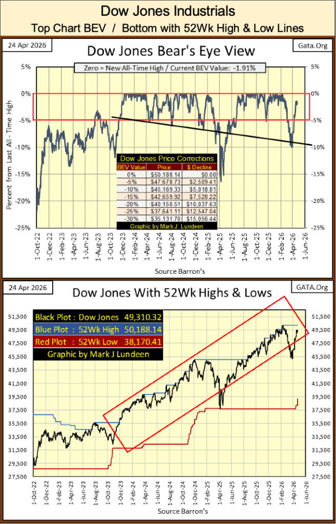
Above, in dollars, we see the Dow Jones advance since November 2023, within the Red Rectangle containing the period of time the Dow Jones has been in scoring position, when the Dow Jones was pushing its 52Wk High Line ever higher in the chart. Last April’s 15% correction is plainly seen, as is this year’s 10% correction.
Following last April’s 15% correction, the Dow Jones once again began pushing up its 52Wk High Line, beginning in August, with the Dow Jones’ fifty-sixth new all-time high of the advance. But the Dow Jones’ fifty-fifth new all-time high of this advance happened in early December. So, last year’s 15% correction, left a gap of eight months between this advance’s fifty-fifth and fifty-sixth new all-time highs.
That is how things go in any market advance, not every day sees a new all-time high, and months can span between one, and the next.
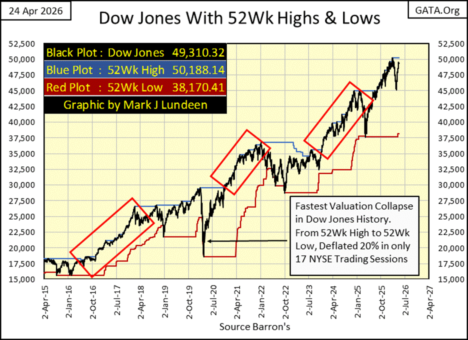
Next is a chart plotting the Dow Jones, with its 52Wk Highs and Lows for the past eleven years, of the massive Dow Jones’ bull market that began in August 1982.
I like this chart, as it is an excellent illustration of what a bull market looks like. Note; bull markets don’t only go up, there are times where they go down too, when they see corrections. Some of these corrections may last a long time, as happened below from January 2022, to November 2023.
I placed three Red Rectangles on the chart, over laying those times where the Dow Jones was actively pushing up on its 52Wk High Line, those times when the Dow Jones was in scoring position. There are others, should one look for them.
The March 2020 Flash Crash is also seen below, where from an all-time high, or a 52Wk High as seen below, the Dow Jones experienced an explosive deflation in its valuation, that saw the Dow Jones do something it has never done before. Since February 1885; the Dow Jones has never gone from a 52Wk High, to a 52Wk Low, in only seventeen NYSE Trading Sessions. The entire March 2020 Flash Crash, from its last all-time high, to its 38% market bottom took only twenty-eight NYSE Trading Sessions. This was the most vicious market decline in Dow Jones history!
You may not be impressed. But FOMC Idiot Primate Powell used this breath-taking implosion in market valuations, as an opportunity to implement his “Not QE#4” (his description of it), to “stabilize market valuations” with a massive “injections of liquidity,” $1.63 trillion dollars of inflation in April 2020 alone.
How much longer before some future deflating market event in the stock market, requires the idiots at the FOMC to implement another QE? It might be years. Then it might be sooner than that. We live in interesting times.
But, if all it takes is a “massive injection of liquidity” by the idiots at the FOMC, to once again “stabilize market valuations,” how is it possible for the stock market to crash? Why is a plus 100K Dow Jones not possible?
Given the current construction of the global financial system, where central banks are allowed to inflate their money supplies, and flood their banking systems with credit, unchecked by a precious metal standard, maybe 100K on the Dow Jones is inevitable.
Even so, there is a check on any central bank’s currency and credit creation; the credit they so effortlessly create, and then “inject” into the body economic, must be assumed as a debt by someone, or something. This debt MUST be serviced, with regular-scheduled payments for its interest and principal by the holder of the debt, or the debtor goes into bankruptcy, and the debt itself goes into default.
The day that happens, on a massive scale, governments fail, billionaires become millionaires, if they are lucky in this process, and regular folks like us, just try to survive as best we can.
It was credit creation by the Federal Reserve that made the 1920s roar. It was the inability of the holders of this debt to service its principal and interest payments, that made the 1930s so depressing.
Here is the Dow Jones in daily bars below. It has yet to make a new all-time high. But as mentioned above, and seen below, other major stock indexes are already making new all-time highs.
But this week, the Dow Jones took a break. Maybe next week it will take out its last all-time high at 50,188.14, on its way to who knows where? Dow Jones at 60,000? From 50,000, that is only a 20% advance. There is something so wrong with thinking such a thing is even possible.
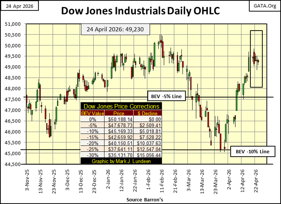
Here is my weekly table listing the BEV values for major market indexes I follow. The stock market is once again generating BEV Zeros (0.00%), new all-time highs. The S&P 500, and NASDAQ 100 & Composite indexes closed the week at a new all-time high, along with the Russell 1K, 3K, and Value indexes.
This week on Thursday, the XAU almost broke 20% below its last all-time high of February 27th. What is notable about the XAU’s last BEV Zero on February 27th, is a week later, in FIVE TRADING DAYS, it had deflated to a BEV of -12.11%. I don’t like that, but it’s what one should occasionally expect for an industry group as volatile as is gold and silver mining.
What one would never expect to see is, an old fogey-stock group, such as transportation companies, as seen in the Dow Jones Transports (#19 below) go from a new all-time high on Tuesday this week, to then close the week with a BEV of -12.71% * IN ONLY THREE NYSE TRADING SESSIONS. *
Whiskey-Tango-Foxtrot is with that!! I haven’t a clue. Possibly a reaction to what is happening at the Straits of Hormuz? Higher fuel costs, as seen below have a huge impact on transportation companies.
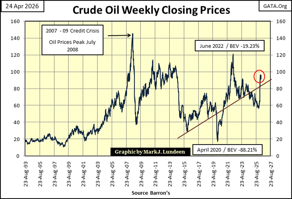
But crude oil has seen higher prices. Has any of the other spikes in crude oil prices seen above, resulted in the Dow Jones Transportation Average seeing its valuation collapse by 12% in only three days, as other indexes continue rising to new all-time highs? I haven’t checked this out, but I think not.
Maybe the difference between peak crude oil prices seen in July 2008, and now for these transportation companies, is in the past eighteen years, they have assumed additional debts. Debts whose interest and principal payments currently consume additional income from operations, income that formerly flowed to their profitability. I’m not stating this as fact. But it’s a fact that something very odd is happening with the Dow Jones Transport Average, and there must be a reason for it.
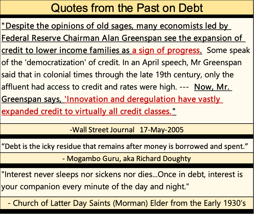
Here are some quotes on debt from the past. The top quote by the Wall Street Journal from May 2005, noting then FOMC Idiot Primate, Alan Greenspan seeing the “expansion of credit to lower income families as a sign of progress,” was in reference to sub-prime mortgages.
As I recall, many, if not most of those sub-prime mortgages were in default by May 2009. So, it appears making $250K mortgages for people earning only $10 an hour, or even $0 an hour, wasn’t such a good idea after all. But whose idea was that to begin with? Obviously, some idiot. Very likely, one employed by the FOMC.
Returning to the table below, whatever caused the Dow Jones Transports (#19 below) to lose 12% of its valuation in only three days of trading, if you’re a bull, you have to hope whatever it is, it isn’t contagious.
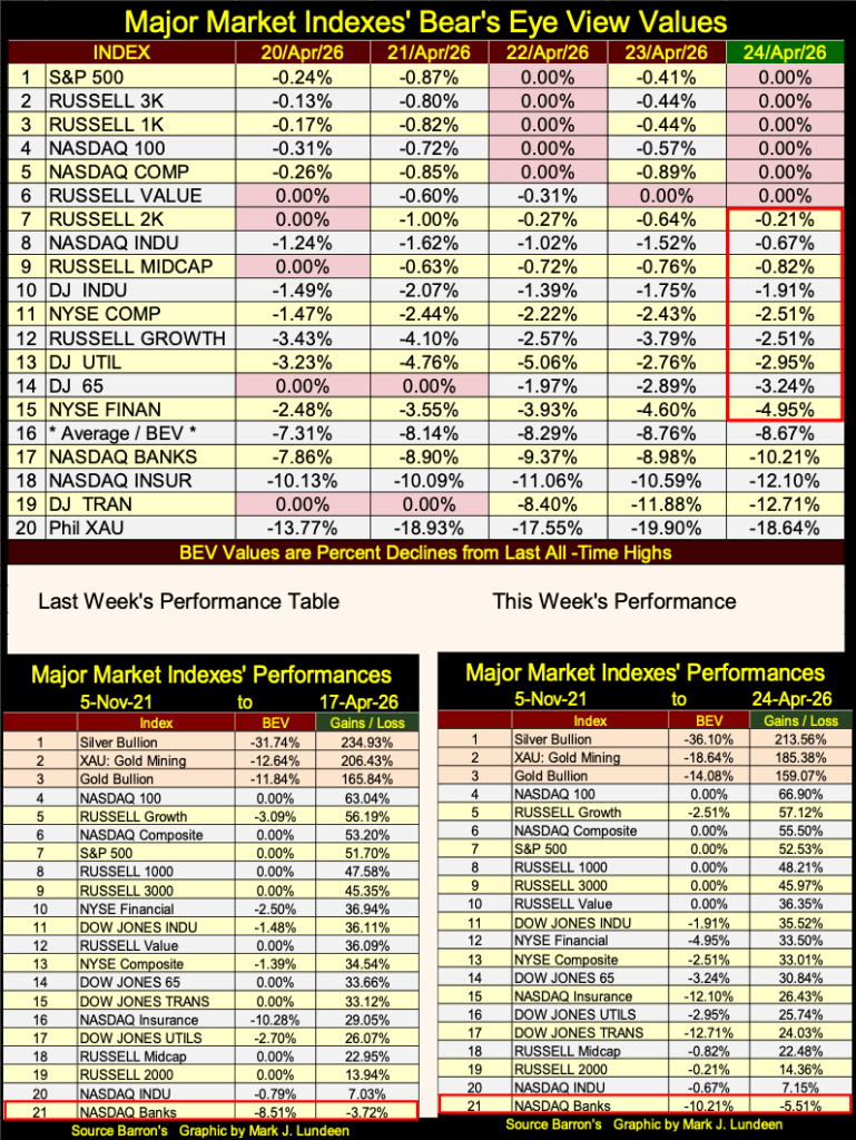
In the performance tables seen above, silver, the XAU and gold still hold on to the top three spots, but were down this week. For the other stock indexes in the table, except for the Dow Jones Transports and XAU, most were up this week.
It’s been a few months since I looked at COMEX gold and silver inventories. As things have changed since then, let’s revisit them this week.
The top chart plots COMEX gold, in thousands of ounces since December 1974. Inventories during the 1969 to 1980 gold bull market peaked at around 5,000,000 ounces of gold at the top of the bull market in early 1980, too then fall dramatically during the following twenty-year bear market in gold and silver.
COMEX inventories once again began accumulating as our bull market in gold began in 2001, which makes sense, as higher prices brought gold, by the ton to the wholesale market (COMEX) for sale. However, to this market enthusiast, there is a lot in this chart that doesn’t make sense.
Beginning in March 2020, as I eyeball this chart, COMEX stored 7,500,000 million ounces. One year later, in March 2021, gold inventories spiked to just under 40,000,000 ounces, a one-year increase of 32,500,000 ounces, or 1,015.63 tons of gold.
To place some scale to that huge amount of gold being sent to the COMEX, a WWII Fletcher class destroyer’s displacement (weight in tons) was 2,050 tons, or twice that of the gold shipped to the COMEX, from March 2020 to March 2021. That is a lot of gold.
In October 2024, inventories declined to 17,500,000 ounces, to then spike up to over 45,000,000 ounces of gold in a year ago in April 2025. A year later, today, inventories declined to under 30,000,000 ounces of gold, a reduction of 15,000,000 ounces of gold, or 468.75 tons of gold.
I imagine shipping that much gold, to and from North American COMEX storage facilities costs a lot of money. So, why are the owners of this gold doing this; transporting it into, and then out of the COMEX? Maybe gold by the ton is being sent to COMEX for sale by someone. After the sale, the new owner takes their gold somewhere else.
Whatever it is that is causing the huge in & outflows of gold seen below at the COMEX, seeing it plotted on a chart, appears a bit odd.
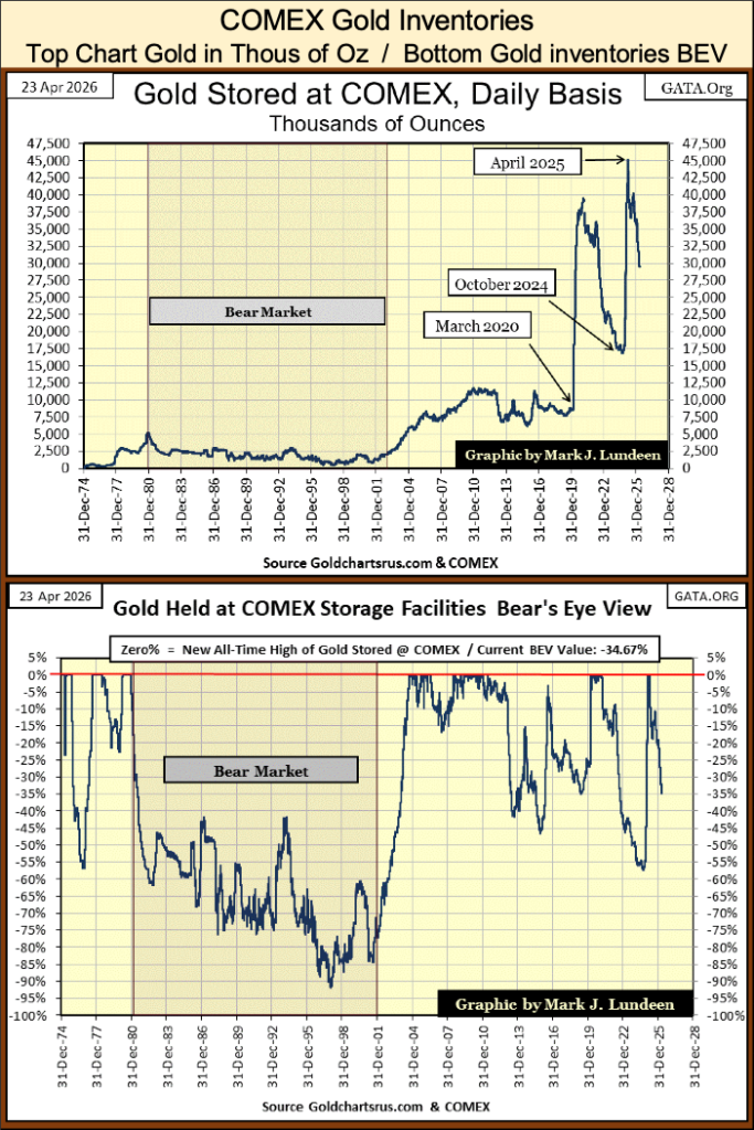
The chart above is the Bear’s Eye View of the data plotted in the top chart. In the BEV chart, during the 1980 to 2001 gold bear market, COMEX inventories were reduced by over 90% by late 1997. How far will the current movement of gold out of COMEX, draw down COMEX inventories this time, and what will that all mean? I don’t know. But it looks very interesting, in a historical sort of way.
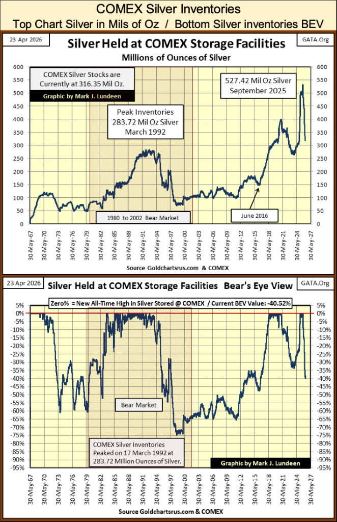
Below is a chart plotting COMEX silver inventories. Typically, silver is a more extreme market than is gold. But until 2024, the sharp increases and decreases seen in the gold inventories above, were absent in the COMEX silver inventories.
I don’t have much to add to the chart below. I’m including them as I’m sure some of my readers will like to see them.
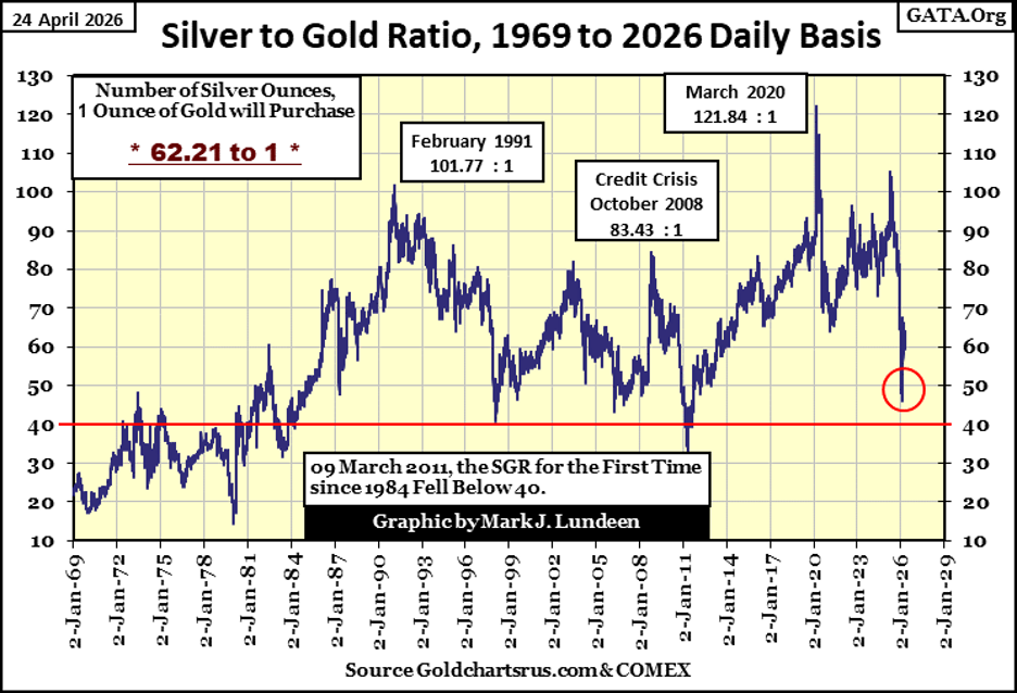
Next, is my chart plotting the Silver to Gold Ratio (SGR), from 1969 to this week’s close. As expected, when the bull market in gold and silver resumed last Autumn, when gold and silver once again began making new all-time highs, the SGR began to decline.
The last spike in the SGR peaked on April 21st 2025, a year ago with 105.13 ounces of silver, for one ounce of gold. It bottomed on January 27th (Red Circle), at 46.43 ounces of silver, for one ounce of gold. This decline in the SGR resulted in the following performance in gold and silver;
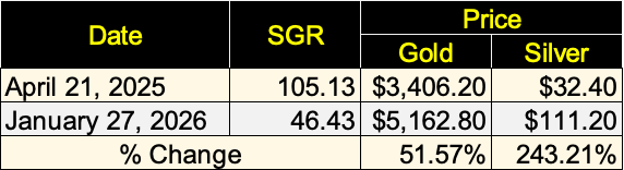
If you like gold in a precious metal bull market, you have to love silver, as in a gold bull market, silver is a leveraged play on gold, as seen in the table above.
Last year was a hot market for gold, silver and the precious metal mining shares. They’ve cooled off some these past few months, but give them some time, and they’ll be at it again.
Anyway, this week, the SGR closed at 62.21 ounces of silver, for one ounce of gold. Before this correction in precious metals ends, we may see the SGR break above its 70 line, and then maybe not. I expect to see it break below its 40 line, as it did in 2011, as their bull market continues.
At the top of the 1970 to 1980 gold and silver bull market, the SGR broke below its 20 line! Had it done so on January 27th of this year, with gold at $5162.80, silver would have been at $258.14.
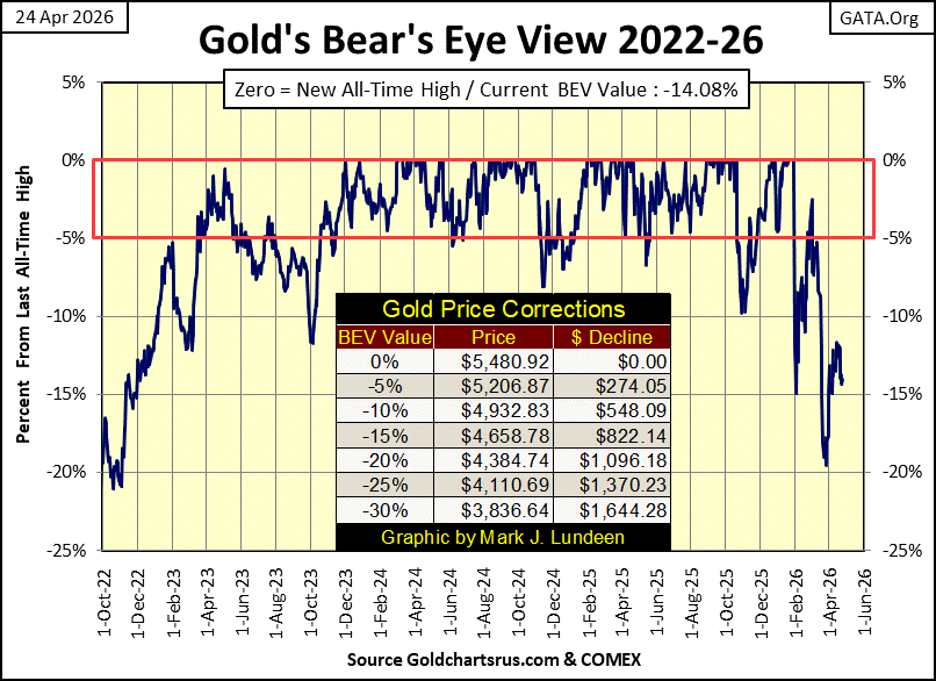
Here is gold’s BEV chart. Just looking at this chart, I can make a case for deeper market declines for the price of gold, the case of a continuing pattern of lower highs and lower lows in the BEV plot below. But I don’t believe that will be proven to be the correct assessment of gold’s BEV chart below. But should gold break below its BEV -20% line, on its way to its BEV -25% line, I’m holding on anyway.
In a world pregnant with massive debt default, as is ours in 2026, assets with ZERO COUNTERFAULT RISKS, such as gold and silver bullion, are truly precious. Even if most investors and money managers don’t currently see precious metals that way, I believe someday they will.
Looking at gold’s step sum table below, gold became very oversold on March 23rd, when its 15-count saw a -9. A 15-count of -9 indicates declining days are overwhelming advancing days, by a large margin. A 15-count of -9, is a bullish leading indicator of better days to come for the price of gold.
But in the twenty-five trading days seen below, gold’s 15-count has yet to increase to positive values, and stay there, because gold continues correcting, by seeing more down, that up days.
Well, that is only to be expected during a correction in the price of gold. Sometime in the weeks to come, we’ll see gold’s 15-count shift to positive values, more daily advances than declines, and stay there, as the bull market in gold resumes.
As a working theory on what is to expect from the gold market in the coming weeks and months, I like it. Should it work out as I expect it too, we can forget about gold in its BEV chart above, breaking down to its BEV -25% line ($4,110.69).
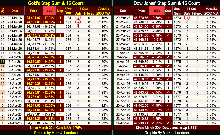
On the Dow Jones side of the step sum table above, its 15-count saw a -7 on March 20th. A 15-count of -7 indicated the Dow Jones was oversold. Not very oversold, as a -9 would have it, but oversold.
The difference can be seen in the table below. The Dow Jones has closed with a 15-count of -7 in only 361 of its 13,905 daily closings since December 1970. While the Dow Jones closed with a 15-count of -9, in only 116 of its 13,905 daily closings since December 1970.
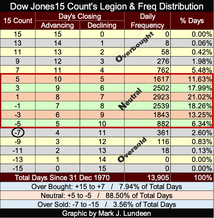
A fact of market life is; the Dow Jones, as well as gold, don’t like being oversold. Seeing a 15-count of -7, and especially the -9 gold saw on March 23rd, strongly hints that the selling the market has endured, has reached a bottom, and will soon reverse.
That certainly has happened with the Dow Jones, which at this week’s close, was only 1.91% from making a new all-time high. But not so for gold, which closed the week with a BEV of -14.08%, far from being in scoring position.
Looking at their 15-counts, in the weeks to come, both of these markets are due for seeing advancing days, to outnumber their daily declines. So, I’m optimistic the Dow Jones will soon go on to new all-time highs, and the correction in the price of gold has seen its bottom, and gold will soon see new all-time highs in May or June. Yes, I expect silver, and the XAU too shall have a very rewarding summer.
I’ll tell you all about it come August.
__
(Featured image by Romulo Queiroz via Pexels)
DISCLAIMER: This article was written by a third party contributor and does not reflect the opinion of Born2Invest, its management, staff or its associates. Please review our disclaimer for more information.
This article may include forward-looking statements. These forward-looking statements generally are identified by the words “believe,” “project,” “estimate,” “become,” “plan,” “will,” and similar expressions, including with regards to potential earnings in the Empire Flippers affiliate program. These forward-looking statements involve known and unknown risks as well as uncertainties, including those discussed in the following cautionary statements and elsewhere in this article and on this site. Although the Company may believe that its expectations are based on reasonable assumptions, the actual results that the Company may achieve may differ materially from any forward-looking statements, which reflect the opinions of the management of the Company only as of the date hereof. Additionally, please make sure to read these important disclosures.


Blockchain Evolves Toward AI, Finance and Quantum Security
Blockchain is evolving beyond crypto into finance, AI applications, and digital markets, while security and regulation remain challenges. Quantum threats...


The Italian Crowdinvesting Market Faces Sharp Decline in 2026
Italian crowdinvesting market continued to decline in 2026, with fundraising falling 36.8% year-on-year to €164.19 million. Platforms and active campaigns...


Sartorius Stedim Biotech Maintains Growth Momentum in H1 2026
Sartorius Stedim Biotech reported solid H1 2026 results, with revenue reaching €1.527 billion and EBITDA rising to €479 million. Growth...


Bank of Africa Launches BOA MDM Network to Boost Diaspora Investment in Morocco
Bank of Africa launched the BOA MDM Network to channel diaspora remittances into productive investment, aiming to raise their share...


Switzerland’s Medical Cannabis Reform Advances Access, But Barriers Remain
Switzerland’s 2022 medical cannabis reform improved patient access by removing federal approval requirements, but challenges remain. MEDCAN highlights barriers including...
 |
|
 |  |
 |
|
-

 Biotech2 weeks ago
Alzheimer’s Study Reveals Immune Pathway Behind Women’s Higher Vulnerability and Potential New Treatment Approach
-

 Crowdfunding1 week ago
Avant Devices Moves Toward Electric Wheelchair Kit Production with New Funding Drive
-

 Cannabis4 days ago
Ali G Makes Surprise Wimbledon Appearance with Cannabis-Themed Satire
-

 Impact Investing2 weeks ago
Vexuvo Secures €39M UniCredit Financing to Drive Agrivoltaic and Storage Expansion in Italy