Business
Dow Jones Nears New Highs as Bull Market Momentum Signals Potential Rise Toward 55,000
Dow Jones nears its high, suggesting a month 10 percent correction has ended, with expectations of reaching 55000 within a year. Historically, markets approach or hit highs, reflecting bull phases. Nearly half of trading days since 1978 show advancing conditions, though concerns remain that an inflation driven boom could eventually shift into a severe bust.

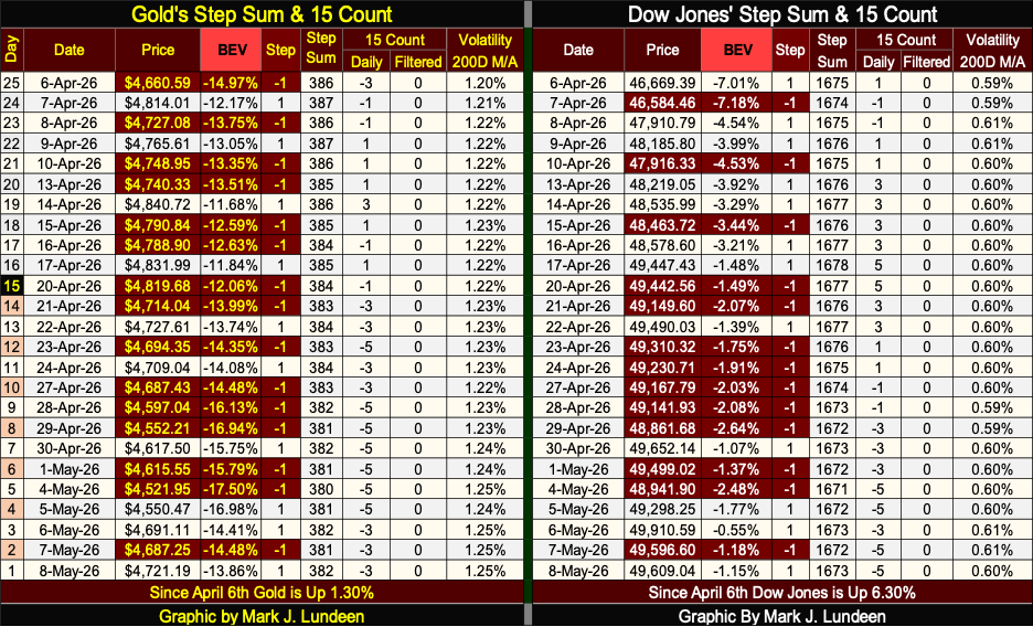
As it has been since February 10th, when the Dow Jones hit its 81st new all-time high since November 2023, we’ve seen another week without the Dow Jones making its 82nd BEV Zero. This week closed with the Dow Jones only 1.15% from its last all-time high. So, I’m going to assume this three-month, 10% correction is over, and we’ll soon see the Dow Jones trade somewhere above 50,188, its last BEV Zero.
Then what; the Dow Jones at 55,000 sometime in the year to come? That is an advance of only 10% from Dow Jones 50,000. Unless something unfortunate happens that causes the Dow Jones, and the rest of the stock market to deflate significantly to the downside, I expect seeing 55,000 on the Dow Jones, and then some in the coming year, maybe before Christmas of this year.
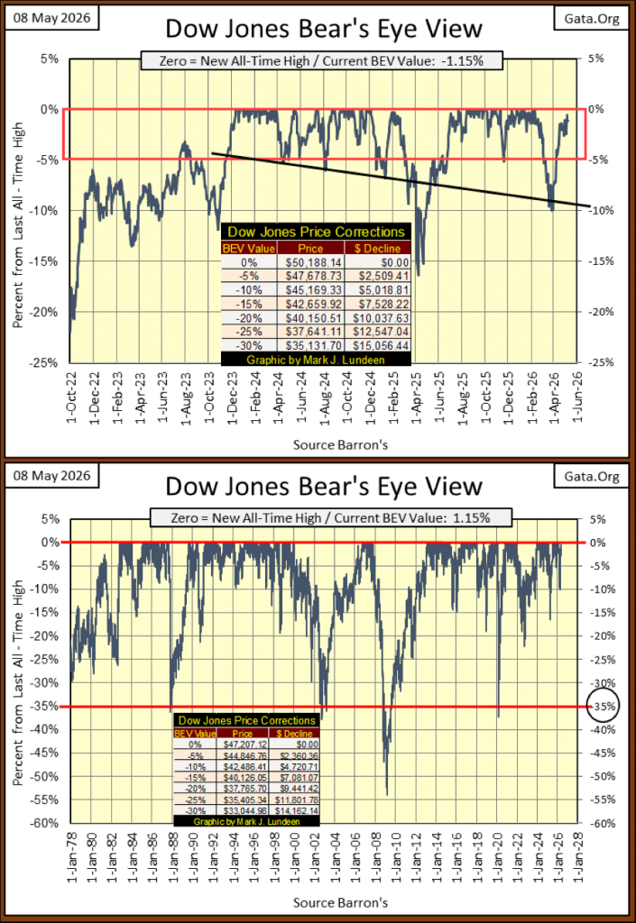
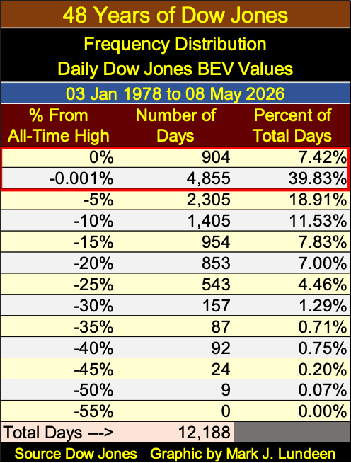
For a little historical perspective on the stock market, I included a BEV chart of the Dow Jones going back to 1978 above, and its BEV values’ frequency table below. Above, every time the Dow Jones made a new all-time high in its BEV plot above, a 0.0% was placed on the red line. Looking at the Dow Jones freq table below, the 0% row, since January 3rd 1978, the Dow Jones has seen 904 new daily all-time highs, or 7.42% of all daily closes since January 1978, were all-time highs.
With the Bear’s Eye View, we also closely follow the daily closes in the -0.001% row, as those are the daily closes in scoring position; daily closes not at new all-time highs, but within 5% of being one. Daily closes in scoring position, typically happen during advances in the Dow Jones, and everything else, as not every day in an advance is a new all-time high. Most daily closes during an advance, close in scoring position in the -0.001% row.
In scoring position below, the -0.001% row, the Dow Jones closed in scoring position for 4,855 daily closing since January 1978, or 39.83% of all daily closing for the past 48 years. To see how often the Dow Jones was advancing in a bull market since January 1978, we add the Percent of Total Days in the 0% and the -0.001% rows. Since 03 January 1978, the Dow Jones has been advancing in a bull market for 47.25% of all daily closes for the past 48 years.
What that looks like, when the Dow Jones is plotted in Dollars, can be seen below; a huge inflationary bubble, blown into the stock market by the idiots at the FOMC.
As currently we are still in the * BOOM * phase of this bubble, everyone is enjoying the ride up in the market. But a day is coming when this BOOM turns into BUST. As surely as a century ago, the Roaring 1920s, turned into the Depressing 1930s, another Boom-Bust cycle engineered by the same idiots at the FOMC.
One thing to keep in mind, as any market advance approaches its ultimate market top, especially a huge inflationary market bubble as seen below;
• opportunities to realize profits approach Zero,
• risks to invested funds approach Maximum.
The Dow Jones’ ultimate market top? When will that be? How much farther can the Dow Jones rise, before it can advance no more? Sorry, I’m not the guy who knows the answer to that question. However, I think about that a lot, even if the “market experts” out there don’t.
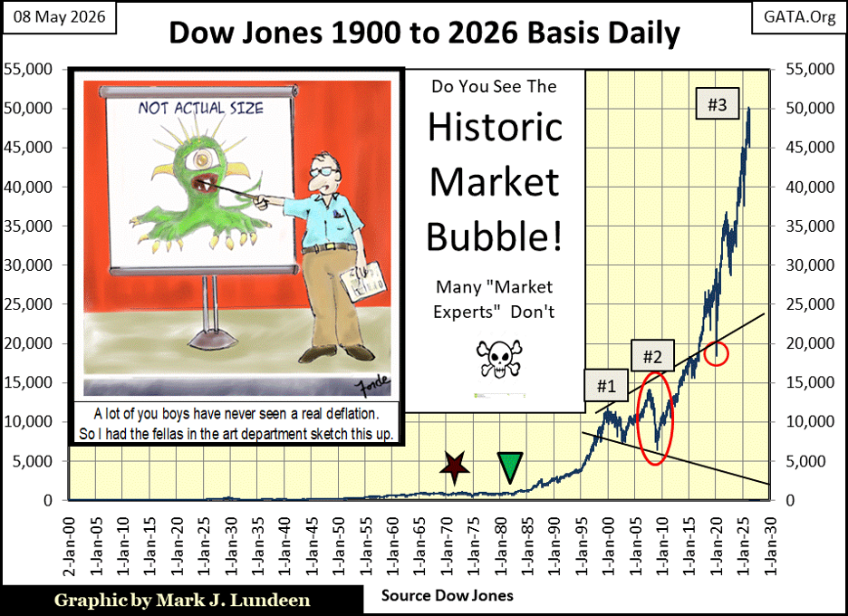
The termination of this inflationary nightmare will be the same as it was following the September 3rd, 1929 top in the Dow Jones. A century ago, all too many people discovered it would have been much better to have sold too soon, than to have sold too late, as most investors discovered to their dismay, in the early years of the 1930s.
So be careful out there. The day is coming when people will be happy they sold a significant position, or better yet sold everything, when the Dow Jones once again closes below its BEV -10% line, seen in its BEV charts above. But it appears in May 2026, this stock market still has more to go; more BEV Zeros and daily closes in scoring position for the Dow Jones.
This is a fact of life that doesn’t appeal to me in the least, as there are better opportunities to make money in precious metal assets; gold, and silver bullion, and the companies that mine them for the market.
I have a short video for Eskay Mining at the end of this article that should interest my readers. But exploration is a risky business. It’s best to keep 90 to 95% of funds intended for gold and silver mining in established mining companies. But a small position in an exploration company, like Eskay Mining, can supercharge one’s portfolio should an exploration company hit it big. And Eskay Mining with its very competent management, is pregnant with possibility.
Below, is the Dow Jones in daily bars, and it closed the week at 49,609, only 579 points from is last all-time high. It could do that in a single day, and hopefully will do that sometime next week.
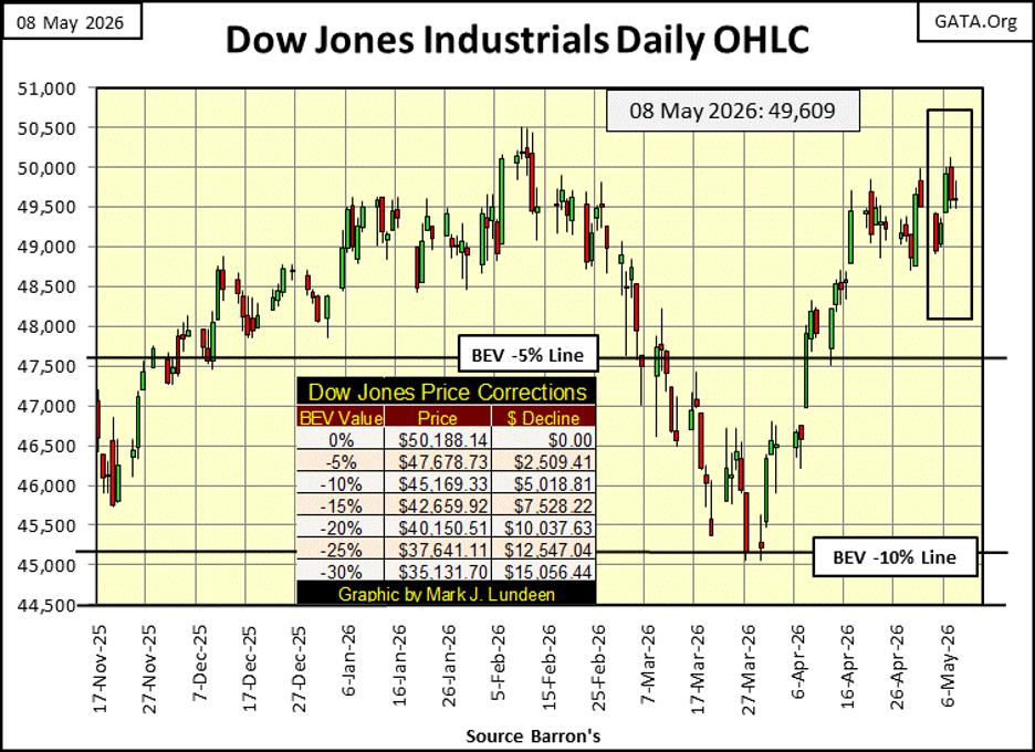
And why not, when we study my table listing the BEV values for the major indexes I follow below, many of these indexes are once again generating new all-time highs (0.00% / BEV Zeros). In the table, the Dow Jones (#11), came close to doing so on Wednesday, with a BEV of -0.55%, just a little more than a half of a percent from a new all-time high.
I’m not predicting this. I can’t see how the Dow Jones in the weeks to come, can’t see a new all-time high. If it doesn’t, but continues teasing us as it has for the past three weeks, is it trying to tell us something the S&P500 (#1), and the big NASDAQ indexes (#4&5) are ignoring?
At the close of this week, I’m not going to dwell on this. But if this continues, should the Dow Jones continue coming just short of a new all-time high for another week, or two, well I don’t like thinking about that.
But at this week’s close, fourteen of these indexes closed the week at a new all-time high, or in scoring position, with Tuesday and Wednesday also being strong days in the market. These indexes have been doing this for weeks now.
I love this table, as it really provides an excellent view of how the stock market has performed during the week. Using the BEV values of the major market indexes, as seen below, provides a truly unique view of the market, not seen anywhere else in the financial media.
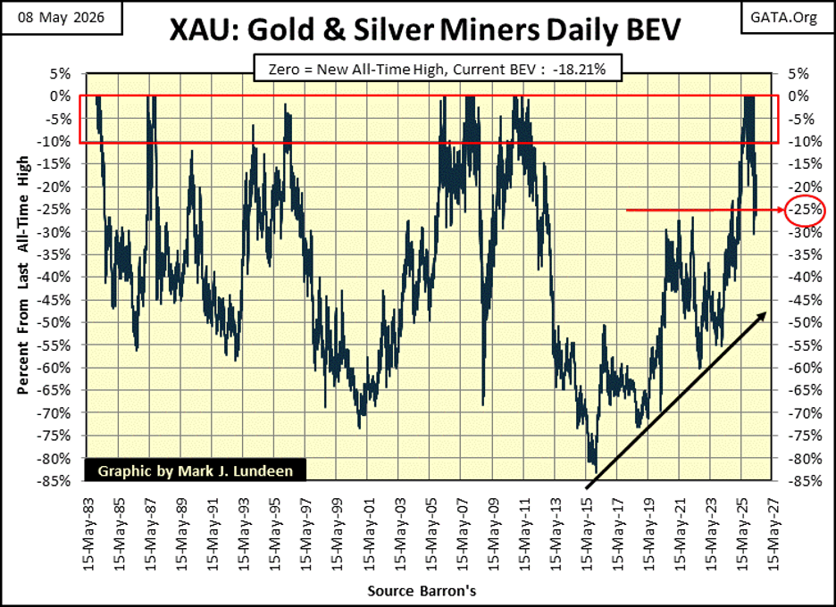
Look at Tail-End Charlie, the XAU at #20 below. Yes, it is at the end of this list, but look at what it did this week; rise from a BEV of -26.02% on Monday, to close the week with a BEV of -18.21%. That is a huge inter-week advance of 10.56% for the XAU. And since its March 20th BEV bottom of -30.21%, a stiff 30% correction from its last all-time high seen on February 27th, the XAU has advanced 17.19%.
The Dow Jones Transport Average (#18), is down by double-digit percentages. It was making multiple new all-time highs in mid and late April, just a couple of weeks ago. Why aren’t these transportation companies doing that now? The blockade of the Strait of Hormuz comes to mind. Could this be a bearish precursor of what is to come for the rest of the indexes seen below, those now making new all-time highs? Maybe, but probably not.
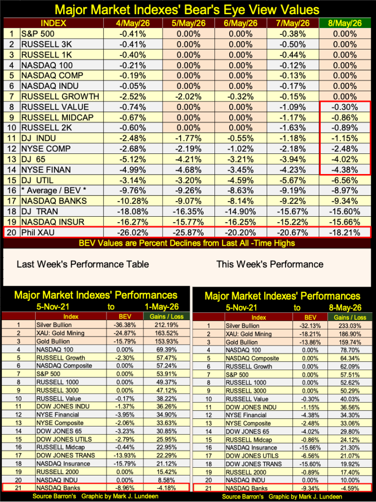
In the performance tables above, the XAU remained at the #2 position, and like silver bullion (#1), was up sharply this week. Of the top three in the table above, this week gold was the underachiever, and has been for a while. I still like gold, but not as much as I like the XAU and silver bullion.
For all the advances seen in the XAU since its 80% bear-market bottom of January 2015, below, the gold and silver miners are still considered a toxic asset to hold for most individual investors, and money managers. They haven’t been buying, yet the XAU continues advancing in a BIG WAY, even without them.
The gold and silver miners are like a barnacle on the side of a whale, with the market being the whale, and the gold and silver miners being the barnacle. What happens when the day comes, when the whale attempts to squeeze into the barnacle? I don’t know, but I want to own a piece of the barnacle when it does! And that day will come, when the huge bubble in the stock market goes bust, as all market bubbles must one day do.
Below is a chart for the NYSE Margin Debt, March 2026 is the latest data available. As of March, there is over $1.2 trillion dollars of credit, held by investors, inflating market valuations. That is a lot of potential deflation in the stock market, when the day comes where the stock market begins going down in a big way.
If investors don’t close their margined position during a market decline, their brokers will provide that service for them, whether they like it or not. Liquidating margin debt, is a big reason some days in a market decline are so vicious; the forced selling of stocks in margin accounts – at any price the market offers.
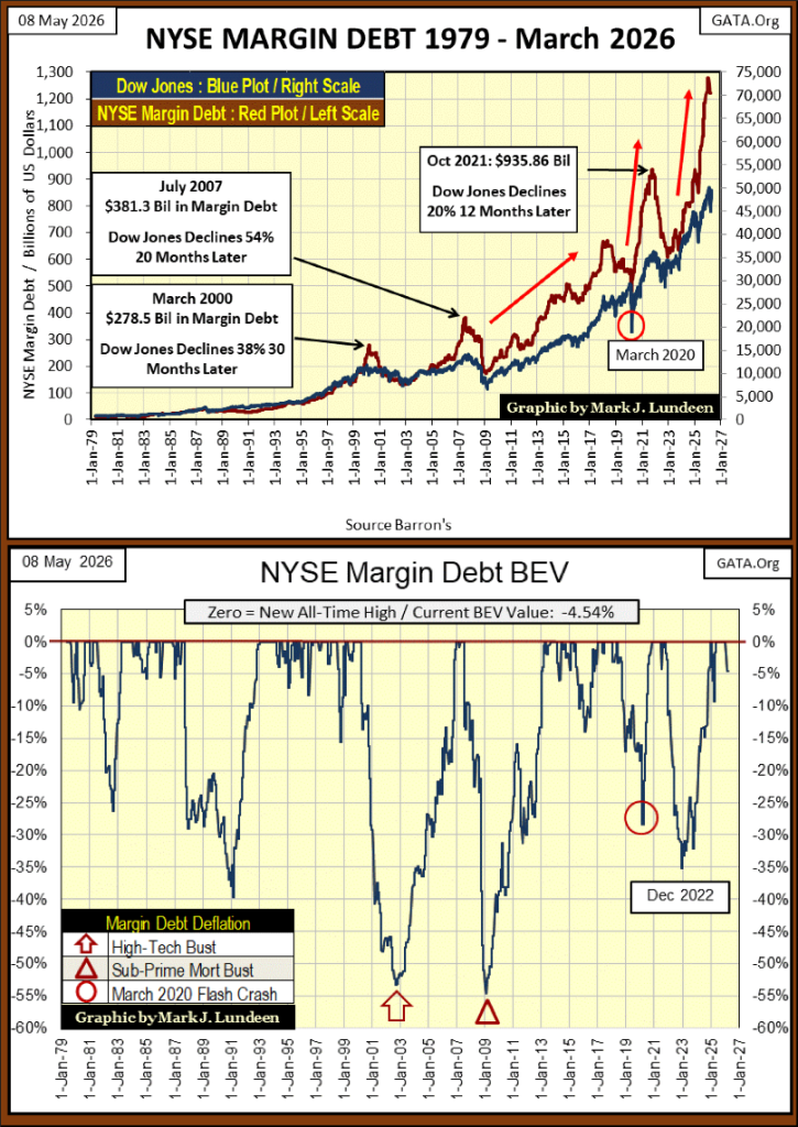
Looking at NYSE Margin Debt in the Bear’s Eye View above, during both the NASDAQ High-Tech and Sub-Prime Mortgage Debacle, margin debt was reduced by over 50%. Rising margin debt provides significant leverage to the upside during market advances, just as the liquidation of margin debt provides significant leverage to the downside during market declines.
Above, we see the huge amount of margin debt currently supporting in the stock market. One day, as one day it must, NYSE margin debt is going to decline steeply. What happens to the stock market then?
I don’t know what happens then, but I know investors won’t like it. I do know what happen during the Great Depression of the depressing 1930s, see chart below. During the 1929 to 1932 market crash, the Dow Jones deflated by 89%, as NYSE Margin Debt contracted by 95%.
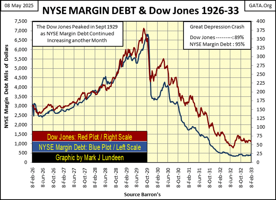
For an idea of how great the monetary inflation has been since 1929, NYSE Margin Debt peaked at around $7 billion dollar in 1929. Today, margin debt is over $1.2 trillion dollars.
Geeze Louise, what a mess we are in. Well, it is what it is. These are the cards fate has delt to us, and the trump cards people will someday be glad to have in their hands, will be gold, silver bullion, and the precious metal miners.
Let’s move on to gold’s BEV chart below. These past few weeks, I’ve been concerned about the bearish technical pattern seen below, the pattern of lower highs and lower lows. With gold closing above its BEV -15% line this week, this pattern will be disrupted, should in the weeks to come gold closes above the Red Circle seen in the chart below. Will it? I’m optimistic it will.
Studying gold’s BEV chart above, going back to 1999, includes the entire gold bull market that began in February 2001. Remember February 2001? When for $253, anyone could buy an ounce of gold. But in 2001, $253 was a price few were willing to pay for an ounce of gold. Our twenty-five-year progression of gold, from $253 to $5,480.92, is displayed above, as seen in terms of new all-time highs, and percentage claw-backs from those new all-time highs.
Advances in the price of gold are seen as clusters of BEV Zeros on the red 0.0% line, and corrections in the price of gold in the percentage declines from these new all-time highs.
In a Red Rectangle above, I placed gold’s BEV plot from November 2023, when it entered scoring position, to this week’s close. Take a moment to study it. Do you noticed something interesting. Comparing the current advance since November 2023, with the other advances seen above; the other clusters of BEV Zeros since 1999, the current cluster of BEV Zeros is the most massive cluster for this twenty-five-year advance * AND * gold’s claw-backs since November 2023 were shallow pull backs, until its recent 20% market correction. Since 1999, a 20% correcting in this gold bull-market hasn’t been a big deal.
What does this mean? I believe this 20% correction in the price of gold was only to be expected, in fact overdue. Don’t believe me. Take a moment to study gold’s BEV chart going back to 1999, how the other advances, as seen in clusters of BEV Zeros above, all saw deeper corrections in the price of gold.
It will be interesting seeing what gold does when it once again begins making new all-time highs. The gold market following its 20% market correction is now refreshed, and may enter a period of accelerated advancement sometime this summer. I’ll tell you all about it come this September.
In gold’s step sum table below, gold has been dominated by daily declines for the past five trading weeks. Look at gold’s 15-count, it’s been positive for only six of the twenty-five days seen below. Still, since April 6th, gold has advanced by 1.30% at the close of this week. As James Dines said many years go; “it’s a game fish that swims upstream,” as gold has done for over a month, advance even after all those red down days in the table below.
In the natural flow of the market, come bull or bear markets, it sees periods of time when daily declines overwhelm daily advances, exactly as gold has seen below. But following periods of overwhelming daily declines, are followed by periods of overwhelming daily advances. What will this game fish do, when it once again swims with the flow of the stream, when daily advances overwhelm daily declines?
This summer should be exciting for us precious metal bulls.
Like gold, the Dow Jones too is swimming upstream. Actually, even more so. At this week’s close;
• gold advanced 1.30% since April 6th, with a 15-count of -3,
• the Dow Jones has advanced by 6.30% since April 6th, with a 15-count of -5.
I’m not going to argue with success. Look at the Dow Jones daily volatility’s 200D M/A. It closed the week with a 0.60%, very low daily volatility, and low daily volatility is a hallmark of Dow Jones bull markets, and have been since February 1885.
So, I remain short-term bullish for the stock market, and will continue to be so UNTIL the Dow Jones once again sees it dreaded 2% days in the market. Days of extreme volatility, where the Dow Jones moves +/- 2% or more, from a previous day’s close. Oh, they are out there somewhere, just over the horizon where they are currently out of sight. But when Dow Jones 2% days once again become a daily reality, and these days of extreme volatility drag the Dow Jones daily volatility’s 200D M/A up above its 1.00%, as seen many times in the chart below, bad things happen in the stock market.
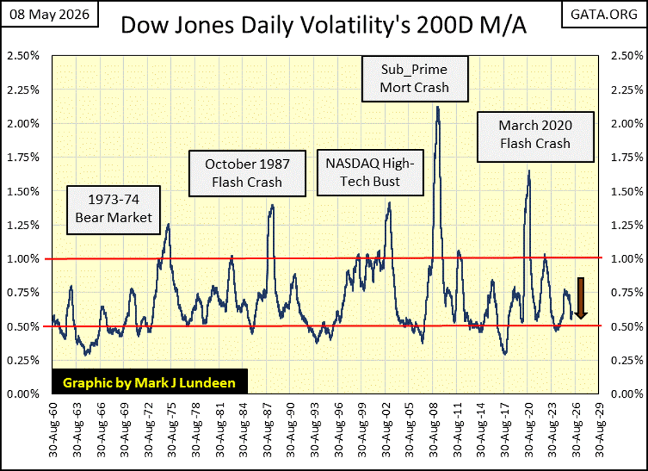
But when? I don’t know. So, why be a bear when one doesn’t have to be? Dow Jones closing above 55,000? I can live with that. In fact, I may have too in the year to come. But you can be sure, I’m keeping an eye on the stock market’s exit door, because I still don’t like this market.
__
(Featured image by Harri P via Unsplash)
DISCLAIMER: This article was written by a third party contributor and does not reflect the opinion of Born2Invest, its management, staff or its associates. Please review our disclaimer for more information.
This article may include forward-looking statements. These forward-looking statements generally are identified by the words “believe,” “project,” “estimate,” “become,” “plan,” “will,” and similar expressions, including with regards to potential earnings in the Empire Flippers affiliate program. These forward-looking statements involve known and unknown risks as well as uncertainties, including those discussed in the following cautionary statements and elsewhere in this article and on this site. Although the Company may believe that its expectations are based on reasonable assumptions, the actual results that the Company may achieve may differ materially from any forward-looking statements, which reflect the opinions of the management of the Company only as of the date hereof. Additionally, please make sure to read these important disclosures.


Virginia Cannabis Market Could Reshape Regional Competition
Virginia’s planned recreational cannabis market could reshape the Washington region’s economic landscape. With nine million residents, it may draw consumers...


Bitcoin’s Price Drops as Investors Turn to Layer 2 Solutions
Bitcoin fell toward $63,000 after leveraged liquidations erased recent gains, while geopolitical tensions between the US and Iran pressured risk...


Emily.AI: Personalized Oxygen Therapy Earns Global AI Recognition
Emily.AI, Quirónsalud’s explainable AI medical device, became a global finalist at the AI for Good Summit 2026 after competing with...


Advanced Blockchain Under Pressure Amid Crypto Market Shifts
The crypto market shows diverging trends: Advanced Blockchain faces heavy pressure despite restructuring, weak finances, and ongoing transformation, though analysts...


Cannabis Regulation in Germany and Switzerland Shows Early Benefits of Legalization Models
Germany and Switzerland’s cannabis reforms suggest regulated access can reduce criminalization without increasing consumption. Germany saw fewer cannabis-related prosecutions, while...
 |
|
 |  |
 |
|
-

 Crypto1 week ago
Crypto Platforms Expand Stock Perpetual Trading
-

 Crypto7 days ago
SpaceX Bitcoin Move Sparks Debate Amid Market Uncertainty
-

 Impact Investing2 weeks ago
ReLife Recycling Acquires Palcart Recycling Operations in Verona
-

 Crypto3 days ago
Bitcoin Rally Faces Tests from Fed, ETFs, and Market Fear