Business
Understanding the Bear’s Eye View: A Clearer Perspective on Market Trends
The stock market and precious metals are recovering calmly, offering a chance to review the Bear’s Eye View (BEV) chart. Inspired by Richard Russell, BEV measures declines from all-time highs as negative percentages, filtering inflation effects. It highlights true market moves, revealing events like the 1929 crash and 2007–09 decline more clearly for clarity today.

The stock market, as well as the precious metals, and their miners are recovering nicely, nothing really exciting is going on. Making this is a good opportunity to review my Bear’s Eye View, or BEV charting technique, before we move on to the Dow Jones’ BEV chart below.
I did not invent my Bear’s Eye View format. I was reading one of Richard Russell’s Dow Theory Letters in the late 1990s, where he published something that caught my eye, a barebones chart of the S&P 500 going back over a decade. This chart was really strange. Its axes were calibrated in percentage terms as I remember, spanning from 0% down to -40%.
I looked at it for a while, considering what the heck was I looking at, and then a light turned on in my head. I figured out how to construct it using daily data of the Dow Jones. Jazzing up the chart a bit to make it more informative, and named it; the Bear’s Eye View format.
That is what a BEV chart displays; the Dow Jones, or anything else, as Mr Bear looks at it. Each new all-time high registers only as a 0%, as that is what all new all-time highs are worth to Mr Bear; a Big-Fat Zero. All daily closing * NOT * a new all-time high, registers as a negative percentage claw-back, from its previous all-time high.
What makes the BEV format so useful, it filters out the many decades of inflation “injected” into market values, by the idiots at the FOMC, since the Federal Reserve was legislated in to existence in December 1913.
Looking at the Dow Jones, as publish in dollars from 1900 to 2026 below, the Dow Jones doesn’t appear to have done much, before the current bull market began in August 1982 (Red Star). But that isn’t true, as seen in the chart’s insert of the Dow Jones during the Roaring 1920s and Depressing 1930s.
The Roaring 1920s Bull Market, driven by monetary inflation, saw valuations for the Dow Jones inflate from 100 to 381.17. Before the 1920s (and the Federal Reserve System) the Dow Jones had never seen such explosive, and prolonged “growth.” As it turned out, the stock market boom of the 1920s was just a bubble inflated into the market’s valuation, by you know who. As such things go, following the boom in the 1920s, came the bust of the 1930s.
The Great Depression Crash saw valuations for the Dow Jones deflate from 381.17 in early September 1929, to 41.22 in early July 1932, a market crash of 89%. However, note when looking at the Dow Jones, plotted in dollars from 1900 to 2026 below, neither the Roaring 1920s Bull Market, or the Great Depression Crash are seen in it.
What is seen below, is the 2007-09 sub-prime mortgage bear market, a market decline of 53.78% in the Dow Jones (Red Oval). This market crash was the second deepest percentage bear-market decline, by the Dow Jones since 1885.
In the chart below, does the sub-prime mortgage bear market look like the type of market event, where in a state of panic, Congress would a would authorize the Federal Reserve System, to flood the financial system with hundreds-of-billions of inflationary dollars, to “stabilize market valuations?” Well, it was.
When viewing the Dow Jones below, plotted in the dollars it was published in, from 1900 to today, we see a very distorted view of the Dow Jones, my proxy for the broad stock market. There is a superior way of looking at the past 141-year history of the Dow Jones; using the same dollar data seen below, but converting it into the Bear’s Eye View, next chart below.
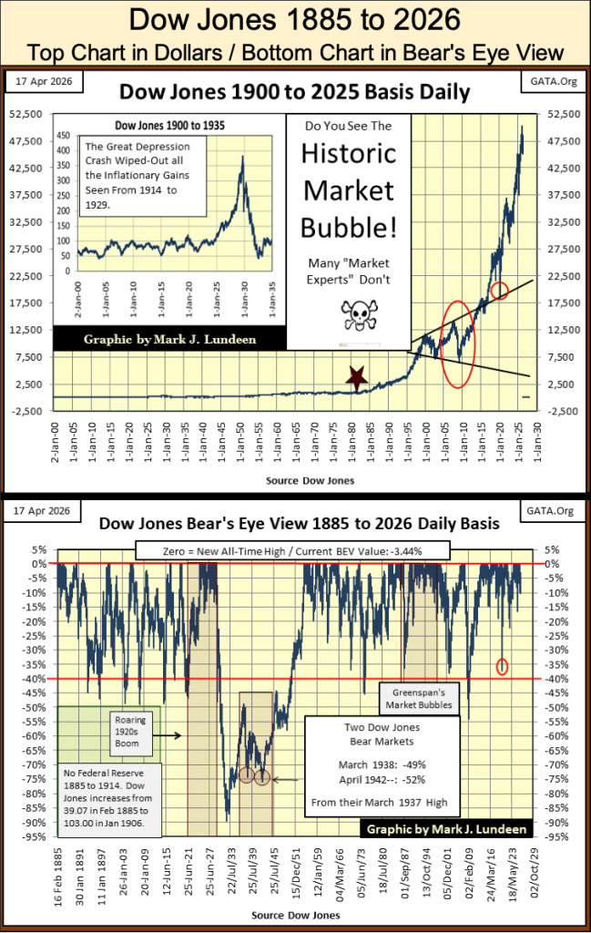
What’s displayed above, is every Dow Jones’ bull and bear market since 1885. Bull markets are identified by clusters of new all-time highs (BEV Zeros), along the red 0% line at the top of the BEV chart. Major bear-market bottoms are identified by percentage claw-backs below, the also red BEV -40% line.
This is an amazing chart, one that illustrates a remarkable historical fact about Dow Jones’ bear markets; following a 40% decline in the Dow Jones, the bottom is very close at hand, providing an excellent opportunity to buy shares at deep discounts. At such times, only the few buy such bargains, when the many are selling at great loss. But that is what happens at bear-market bottoms.
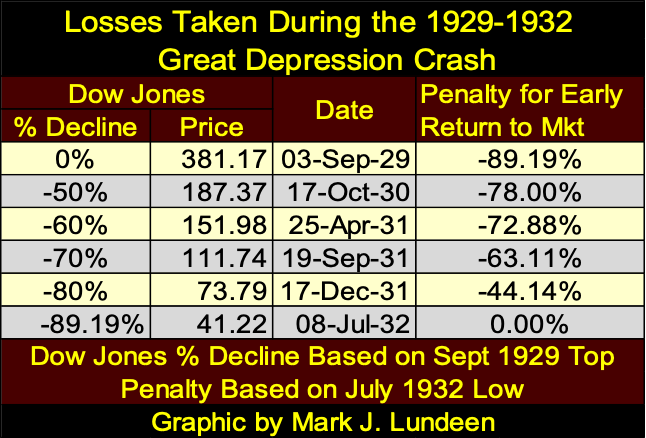
However, since 1885 there has been only one bear market where that wasn’t true; the 1929 to 1932, the 89% market decline during the Great Depression Crash. When buying following a 50% decline in the Dow Jones, ultimately resulted in a disaster.
To have returned to the stock market following the Dow Jones decline of 50% during the Great Depression Crash (Dow Jones at 187.37), resulted in a 78% loss of invested funds, when the Dow Jones saw its ultimate bottom at 41.22, as seen in the table below. Even buying following an 80% decline, resulted in a 44.14% loss in invested funds.
The point to be taken when considering buying during a massive deflationary market collapse, as seen from 1929 to 1932; the bear market becomes a meat grinder for invested funds – all the way down.
At first view, the Bear’s Eye View (BEV) looks complicated and confusing. But with a few moments of study, all becomes clear, where;
• new all-time highs (aka BEV Zeros) = 0.0%, and never more,
• daily closes * NOT * at a new all-time high = a negative percentage claw-back from their last all-time high.
In effect, the BEV format compresses dollar data into a range of only 100 possible percentage points;
• 0.0% = new all-time high,
• -100% = total wipeout in valuation.
Dollar prices, and dollar inflation in a BEV chart, become irrelevant. Let’s examine three bear-market declines, visible in the BEV chart above, in the table below. The first is the Bear Market of 1907, a famous bear market, market historians say motivated the creation of the Federal Reserve System. The second, the 1973-74 bear market, the first greater than 40% decline in the Dow Jones, since 1942. The third, the 2007-09 Sub-Prime Mortgage bear market.
The first bear market below, took place when the dollar was gold and silver coinage – the actual dollar was a thing of precious metal. Paper money in 1907, was legally a non-interest-bearing debt on the US Treasury, payable in gold and silver coin to the holder of the paper money. In 1907, people had the option of exchanging their paper money for real money; gold and silver coins at their bank.
The second bear market below, took place only a few years after the US Treasury decoupled the dollar from its $35 gold peg. Due to the many decades of inflation “injected” into the economy by the idiots at the FOMC, Dow Jones’ dollar valuations from 1973 were larger than they were in 1907. However, a case can be made that $103 in 1907 (4.98 ounces of gold, at $20.67 / ounce of gold), had more buying power than $1,051.70 had in 1973.
Historically, this is ultimately how monetary inflation works for most people; more units of money, that purchase less over time, until these units-of-inflation become worthless.
The third bear market below is measured in dollars, that for decades, lost any connection to a monetary-metal standard. Since 1971, the volume of dollars circulating in the US economy, has been set by a gaggle of idiots at the FOMC. In 2007, dollars were no longer limited by the supply of gold and silver coins minted by the US Mint, as the US money supply was in 1907.
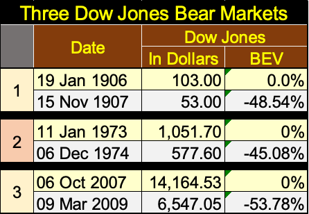
Looking at these bear markets, these inflationary booms & busts in dollar terms above, from the last all-time high of a bull-market top, to the bottom of the following bear market, all three bear markets are different from each other by orders of magnitude, because of the dollars used measuring these Dow Jones bear markets, are not compatible with each other.
Now look at these three bear markets, as Mr Bear sees them with the Bear’s Eye View, which completely ignores dollar values. The bull market advance, preceding the bear market decline, see its * LAST * new all-time high, always a 0.0%. Note, the bull market’s last all-time high, is also known as the advance’s Terminal Zero (TZ) in BEV lingo, followed by the deepest percentage decline, the Dow Jones saw at the bottom of the following bear market.
In the table above, it’s easy seeing which of the three bear markets, separated by decades was the worst, the one that had the deepest percentage decline from the Terminal Zero of the previous bull market.
Another nice feature of using the Bear’s Eye View is, we can analyze market history, using Excel’s Frequency Function, as seen in the tables below. In the far-left table, we see the entire history of the Dow Jones, going back to February 1885, 141 years of market history.
Looking at the table’s 0% row, since February 1885, the Dow Jones has seen 1,595 daily new all-time highs. The -0.001% row, includes daily closes just short of a new all-time high, down to BEVs of -4.99%; or daily closes in “SCORING POSITION.” What is scoring position? During all bull market advances, most daily closings * ARE NOT * new all-time highs, but daily closings within 5% of their last all-time highs.
To see how bullish a period of market history was, we add the percentage of day’s in the 0%, and -0.001% rows. Since 1885 (left table), the Dow Jones has been in a bull market for 26.48% of its daily closings, or one out of four NYSE Trading Sessions. Not bad, when we consider all the daily closes far below the BEV -40% row, from the Great Depression Crash.
The middle table looks at the Dow Jones, up to where the US Treasury decoupled the dollar from its $35 gold peg, 13 August 1971. From February 1885, to August 1971, the Dow Jones had seen only 674 new all-time highs. When adding new all-time highs, to daily closes in scoring position, from 1885 to 1971, the Dow Jones was trading in a bull market for only 15.99% of the NYSE Trading sessions, or about one day out of six.
By today’s standards, the stock market before August 1971, was a very boring place to invest money. But then before August 1971, finding financial excitement in the stock market, or anywhere else was very hard to do. I bitch a lot about the Federal Reserve. But one thing I’ll admit too, it makes life exciting when it inflates market valuations to the upside, as it has since 1971, to this week’s close.
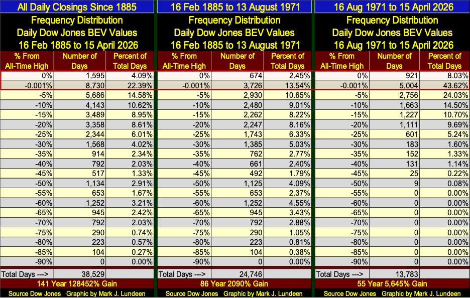
Looking at the third table above, right side for 1971 to this week. We add the percent of days for this table’s 0% & -0.001% rows (BEV Zeros & closes in scoring position), to discover the Dow Jones has been advancing in a bull market, for 51.65% of total days, more than one out of every two NYSE trading sessions for the past fifty-five years.
But these amazing advances in the Dow Jones, my proxy for the broad stock market, are just manifestations of FOMC “monetary policy,” which does have its effects on the market.
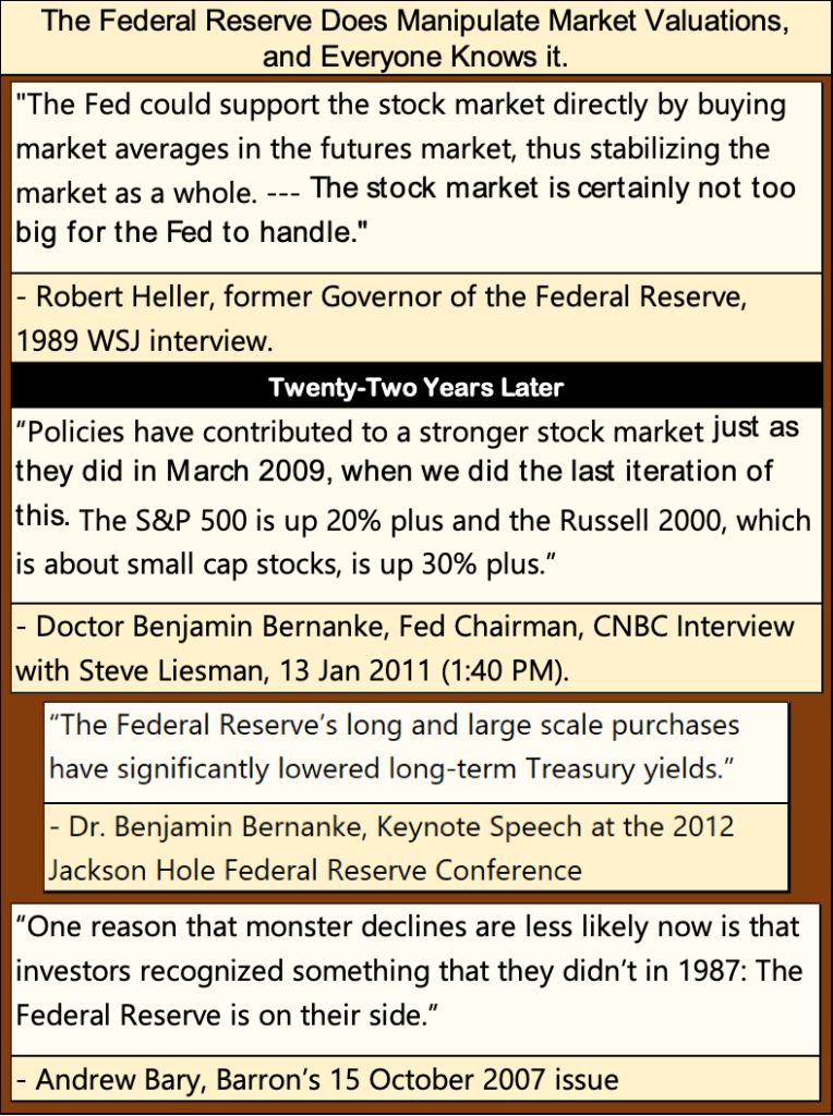
The above quote from Barron’s Andrew Bary, is from the issue of Barron’s that recorded the Dow Jones’ top, the Terminal Zero of the sub-prime mortgage bull market.
A year later, FOMC Idiot Primate, Doctor Bernanke would begin his infamous Quantitative Easings, that “injected” hundreds-of-billions of inflationary dollars into the financial system, to “stabilize market valuations” as the global financial system melted down. Good call Andrew!
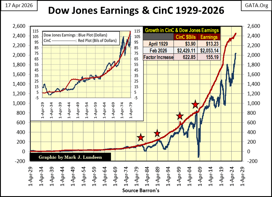
Below, when plotting Currency-in-Circulation (Red Plot; CinC = dollars in circulation), with the earnings for the Dow Jones (Blue Plot), from 1929 to 2026, it becomes obvious monetary inflation from the FOMC, is a significant factor not only to the valuations for the Dow Jones, but also for the “growth” in its earning since 1929.
The linkage between CinC and Dow Jones earning aren’t bolted together. But the Dow Jones receives about $1.00 in Earnings, for every $1,000,000,000 ($1 billion) increase in CinC. However, since 2009, earnings for the Dow Jones have not kept up with the expansion in CinC, and the gap between them has widen, and may at some future point, decouple from each other. This has happened four times before (Red Stars).
This seems like a good time to cease my primer on the Bear’s Eye View, and finally move on to the Dow Jones BEV chart.
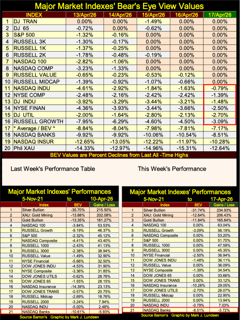
The Dow Jones has yet to see a new all-time high in its BEV chart below, but it closed the week deep inside scoring position, with a BEV of -1.48%. But as you’ll see below, many of the market indexes I follow * DID * close the week at a new all-time high, suggesting future prospects for the financial market are looking good.
Ditto for President Trump and the Republicans, come this year’s mid-term elections in November. No guarantees on that. But here in April 2026, that is how I read the market’s tealeaves following President Trump’s massive strikes, and very successful campaign against Iran’s Islamic Republic’s nuclear infrastructure, and the Islamic Republic itself.
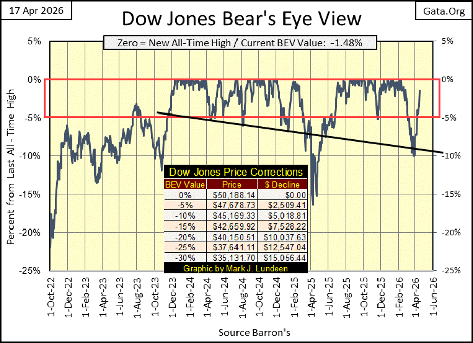
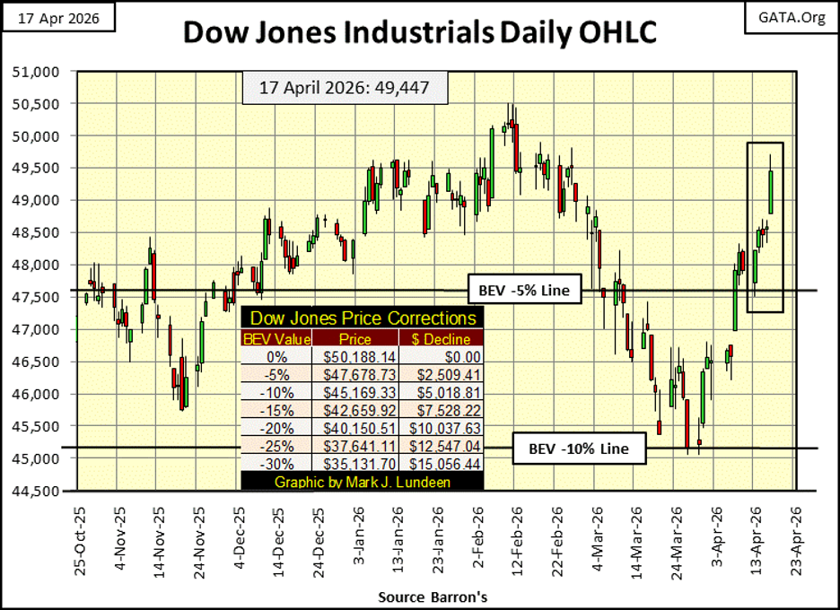
In the chart below, plotting the Dow Jones in daily bars, this week the Dow Jones bounced off its BEV -5% line, and moved towards making a new all-time high.
Currently, the Dow Jones last all-time high is 50,188, only 741 points above where the Dow Jones closed today. A daily advance of only 1.5% from this week’s close is needed to close that gap. Maybe next week? For fear of jinxing the stock market, I’m not going to say anything about that. But if you did, I’d completely understand.
Below is a table of the major market indexes I follow, in terms of the dollars they were published in, from their lows of the March 2020 Flash Crash, to yesterday’s close, sorted by their performance factors. The gold mining indexes took the top two spots, followed by silver bullion.
I don’t like this table, as the individual indexes have nothing in common with each other, as their dollar values range far and wide from each other. But if one is using this data, using the dollars these indexes are published in, this is what one gets. Look at the range of dollar values seen below. On Thursday this week, silver closed at $78.48, while the Dow Jones closed at $48,578. What is the connection between the two? There is none, and can’t be, if one is using dollars.
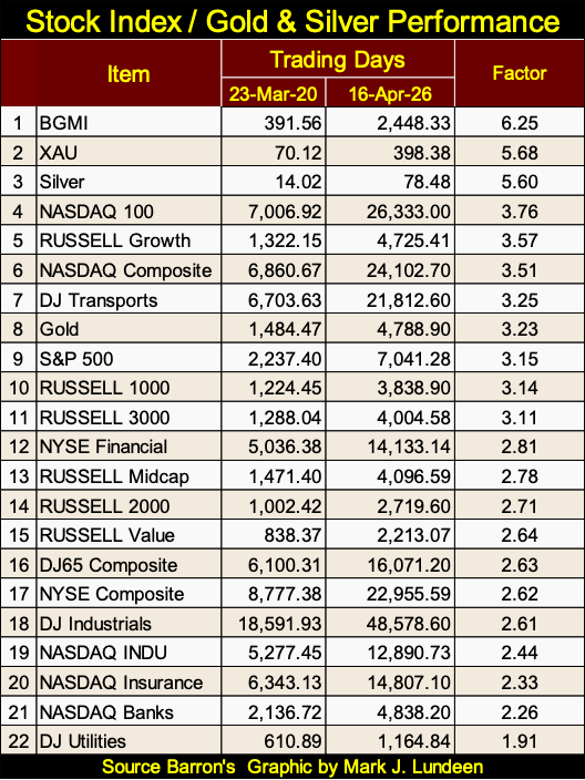
However, if someone was to use something else, other than the dollar data seen above, something like the Bear’s Eye View, that focused on new all-time highs, and percentage claw-backs from those new all-time highs, a more useful view of the market might be available, as seen in my table below, which I publish weekly.
On Friday, ten of the market indexes I follow, closed the week at new all-time highs. A very interesting, and bullish fact totally missed above, when using these indexes’ dollar values. The next six indexes close the week inside scoring position, suggesting their bullish ways, and new all-time highs will soon resume.
What a change from a month ago, when on March 27th, there were no new all-time highs, only one index closed inside of scoring position, and ten of these indexes closed more than 10% from their last all-time highs. The market has recovered remarkable from a month ago, and should continue to do so for the foreseeable future.
Do I like this market yet? I don’t, and won’t until the Dow Jones once again is trading below its BEV -40% line. Possibly below its BEV -70% line. Geeze Louise, the Dow Jones is at the top of a massive inflationary bubble that began in August 1982. How much worse is today’s bubble in the Dow Jones, compared to the bubble the Federal Reserve inflated into it back in the 1920s?
Anyway, I’m not missing out on anything, as gold, and silver bullion, as well as the precious metal miners are currently the best performing assets in the market, and have been for over the past year, as seen in the performance tables below.
How many “market experts,” and retail investors, realize that since November 2021, precious metal assets have been the best performing assets in the market? Not many, which strongly suggest the bull market advance in gold, silver, and their miners, are still in their very early stages.
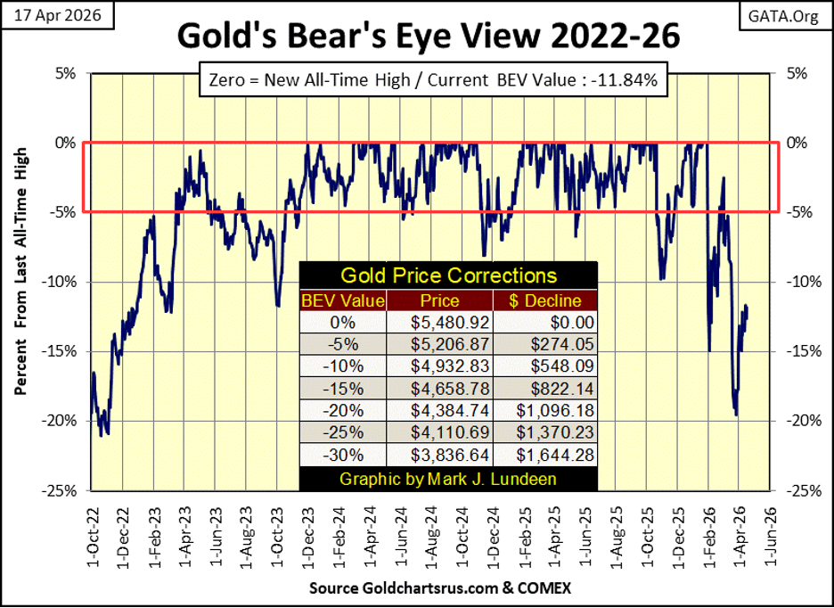
Let’s move on to gold’s BEV chart below. Since November of 2023, when gold first entered scoring position (Red Rectangle below), it has seen one hundred new BEV Zeros, or new all-time highs. The last on January 28th.
Since entering scoring position, gold has advanced from $1,967.11 on 14 November 2023, to its last all-time high of $5,480.92 three months ago. That is an advance by a factor of 2.78 in the past two and a half years. And following the 20% correction seen below, I expect gold will see additional BEV Zeros from current levels, in the weeks, months & years to come.
Looking at gold’s step sum table below, gold has seen more daily declines than advances since April 1st. But here is a little fact I note below, even after all those down days since the first of April, the price of gold is still up by $72.
Here is something else to note. On March 23rd, gold’s 15-count saw a -9, meaning gold was a very oversold market when the price of gold bottomed at $4,436.86. Gold is now working off that state of being “very oversold,” advancing $395 in the process at this week’s close.
It’s only a matter of time before gold once again sees daily advances overwhelm daily declines in its step sum table below. When gold does so well when down days overwhelmed advancing days, what does it do when advancing days once again overwhelm declining days?
This summer should provide some excitement in the precious metals, and their miners. I’m ready for it!
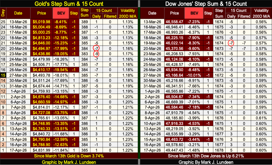
On March 19th, the Dow Jones’ 15-count hit a -7, meaning the Dow Jones became an oversold market. As seen in the table below, since 31 December 1971, 13,900 NYSE trading sessions ago, the Dow Jones closed with a 15-count of -7 in only 361 of those NYSE trading sessions, or 2.60% of all daily closes since December 1971.
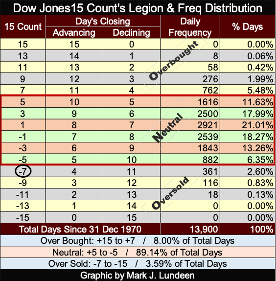
The Dow Jones doesn’t like being oversold, closing with a 15-count of -7, or greater. So, it was only expected it would work off that oversold condition, with an increase in advancing days. Which it has, and the valuation of the Dow Jones has advanced accordingly.
What is the Dow Jones daily volatility’s 200D M/A doing? It closed the week at 0.60%, which is low daily volatility, and low daily volatility is what stock-bull markets are all about. Until we once again see Dow Jones 2%-days, days of extreme volatility where the Dow Jones sees daily moves of +/- 2%, and more from previous day’s closes, I expect the stock market will continue advancing to new all-time highs.
Just keep in mind; on Wall Street they never ring a bell when it’s time to sell. But when it’s over, the Dow Jones always begins seeing plenty of days of extreme volatility, as its daily volatility’s 200D M/A trends swiftly upwards towards its 1.00% line. A good thing to keep in mind.
__
(Featured image by LeeLoo The First via Pexels)
DISCLAIMER: This article was written by a third party contributor and does not reflect the opinion of Born2Invest, its management, staff or its associates. Please review our disclaimer for more information.
This article may include forward-looking statements. These forward-looking statements generally are identified by the words “believe,” “project,” “estimate,” “become,” “plan,” “will,” and similar expressions, including with regards to potential earnings in the Empire Flippers affiliate program. These forward-looking statements involve known and unknown risks as well as uncertainties, including those discussed in the following cautionary statements and elsewhere in this article and on this site. Although the Company may believe that its expectations are based on reasonable assumptions, the actual results that the Company may achieve may differ materially from any forward-looking statements, which reflect the opinions of the management of the Company only as of the date hereof. Additionally, please make sure to read these important disclosures.


Bank of Africa Launches SME Pact to Boost Business Growth
Bank of Africa launched the “SME Pact, BOA & Maroc PME” to support Moroccan MSMEs through financing, advisory services, partnerships,...


ECB Adds Climate Risk Factor to Collateral Rules
The ECB has introduced a climate factor into its collateral framework, applying additional haircuts to corporate bonds exposed to transition...


SpaceX Bitcoin Move Sparks Debate Amid Market Uncertainty
SpaceX’s recent small Bitcoin transfer sparked speculation about a possible future sale, though analysts view it as a test transaction....


Payhawk Reaches $100M ARR Milestone with AI-Driven Growth
Payhawk surpassed $100 million in annual recurring revenue, achieving rare “Centaur” status. Growth was driven by restructuring around autonomous AI,...


BIP Sells BIC Incubator to Innova, Refocuses on Core Innovation Areas
Biovalley Investments Partner (BIP) sold its entire stake in BIC Incubatori FVG to Innova, both Trieste-based firms and longtime users...
 |
|
 |  |
 |
|
-

 Biotech4 days ago
Karyopharm Therapeutics: High-Risk Growth Play in Cancer Drug Development
-

 Fintech2 weeks ago
PayPal’s Slowdown: From Fintech Leader to Low-Growth Dividend Stock
-

 Africa2 days ago
UCITS Funds Drive Casablanca Market Activity in Q1 2026
-
 Africa1 week ago
Morocco’s Growth Holds at 4.6% as Agriculture Offsets Economic Pressures